


Island Logoing- 06.08.05
 Bahama-mama… Ok i don’t know, just felt like having that in type. As you’ve probably noticed i peruse the internet in spurts of inspiration, following bizarre threads that catch my brain… today so far is logo/graphic design. And it brought me back to the Bahamas redesign… its amazing, happy, vibrantly exciting… but to read about its design is also! [logolounge.com] and the SITE is gorgeous…
I’m archiving the article and a bunch of pics below… for my future reference and for you to check out.

An instant classic for sure…
Not sure where these shirts come from, but i kind of want one.
Here is the LogoLounge.com Article…
In many crowded product categories, strong branding is the differentiator which leads the consumer to prefer one product over another-especially when so many of the product attributes and claims are perceived to be identical. This is well understood this in commodity categories like beverages, cereal or other common household goods. But could it be true with such a considered, emotional and expensive consumer choice as the destination for their next tropical vacation?
That was precisely the case when Duffy Worldwide began to work with the Bahamas Ministry of Tourism. The island-nation was competing for tourism dollars with branding and communication which was virtually identical in imagery and messages as its competitors. As a result, consumers concluded The Bahamas were interchangeable with other warm weather destinations like Jamaica, Mexico or many other Caribbean Islands. And while the Bahamas does offer the tantalizing promise of a sensory, emotional and physical vacation, they are perceived to be a “stereotypical paradise.” The challenge for the Ministry: How could they differentiate The Islands as the preferred vacation destination?
“As you can imagine, in this category, there is a sea of sameness among all sand and sea destinations-tropical colors, water, sun, palm trees,” Joe Duffy, chairman of Duffy Worldwide, says. “With our client’s previous approach, you could have pulled out the name ‘Bahamas’ and substituted ‘Jamaica’ or ‘Barbados,’ and the identity would have worked just as well. It was not unique or grounded in any differentiated truth which makes the Bahamas a unique destination.”
Contributing to the Ministry’s challenge was that, although the Bahamas had an existing identity, it had never been used consistently. Essentially, the previous brand identity was just a tagline, “The Islands of the Bahamas: It Just Keeps Getting Better”-undistinguished at best. And it was applied in hundreds of different ways, with different typefaces and colors, driven by different consistencies with different needs.
Duffy concluded the Bahamas needed an entirely new brand identity, one that not only made the country stand out from other equally pleasant vacation spots, but that was also actually useful and practical for many different constituencies to use. The Duffy team began with a complete visual audit of all former uses of the identity. “It quickly became clear everyone from the tourism office to souvenir manufacturers would have to be able to work with the new design. Making it appealing and flexible for all was critical to get the consistency they had missed in the past. That was central to our thinking and the creative challenge,” said Duffy.
Duffy determined the Bahamas did have one distinguishing factor, one that no other vacation destination offers: It is not one place, but many places. A map of the island nation reveals that it is actually made up of 700 islands with 17 major tourist destinations. Each with its own special attractions: scuba diving, fishing, sunning, historical sites, luxury accommodations or nightlife. Each destination had its own unique flora and fauna. Expressing the breadth of the offerings of the Bahamas quickly became the most promising and distinctive design direction.
A team traveled from Duffy’s Minneapolis office to the island nation to begin developing a differentiated brand visual language that challenged consumer expectations as well as their own. Creating this brand experience presented a contradiction to the designers.
“One of the things you want to do is distill an identity down to its core essence and rooted in a brand truth” explains Duffy. “The obvious here is the blue water and palm trees and sand. That is what you are initially impressed with when you visit. But it is really important to dig past this common surface to find what can be really unique and special about the brand.”
The team took in the turquoise blue waters. They studied pink flamingoes and the pastel sands. They took hundreds of images of flowers and leaves and other details, of people of all walks of life, and enjoyed the sunshine and the hospitality.
Back in chilly Minneapolis, the team had many positive memories, images, and impressions of shapes and colors from their visit. But one thing stood out: Ê the forms that made up the constellation of islands themselves. They determined the best solution was to create not just a logo, but a more fluid brand expression of the actual geographic positioning of The Islands Of The Bahamas on a map.
“When you compare that map to all of the other island destinations, we win,” Duffy says.
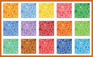
The solution they created is a stylized map using the manner and flavor of the shapes and colors the designers observed in the Bahamas. The collection of islands pulls on visual cues that are already in the consumer’s mind-organic, rounded forms shown in a sophisticated, tropical palette. However, in sum, it is a collection of shapes that is anything but predictable.
Duffy explains. “An actual map of the islands does not look like this. The stylization comes from what we saw-the birds and shells and flowers. Here, we present each of the main island destinations, but in an abstract way. It is a relatively simple solution, but you can feel the flamingoes, the turquoise water and the pink sand represented in the colors and forms,” he says. “This challenges perceptions and creates a new language for the brand.”
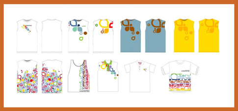
The beauty of the identity is that it sets in motion a entire brand language that is endlessly adaptable-in signage, in patterning for clothing and interiors, in iconography. Especially promising are product applications-swimwear, T-shirts, fabrics, web wallpaper, towels, and more. Each application will further the brand.
“We branded the country, and people will actually end up wearing the brand. Every single element working together will contribute to differentiation and a stronger brand.” Duffy notes.
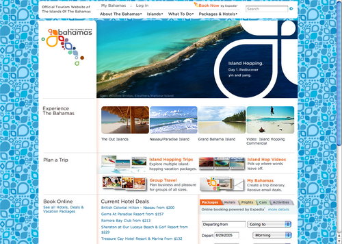
Another practical aspect of the new identity is that it can be used to point to specific destinations within The Bahamas. For example, in an ad or on a web site page where Bimini is being discussed, the rest of the logo is muted in gray while the shape representing that island and its name are printed in color (green, for this island). So various destinations can be graphically pinpointed, from north to south, with their own unique story. The cumulative effect underlines the many different experiences The Bahamas has to offer.
Television ads, some of the first communication to be created with the new brand identity, takes the notion of island hopping literally-again, stressing the many destinations. A happy visitor is shown jumping from one island and experience to another.
“The spots reveal the secret of all there is to do in The Bahamas. They make you think differently,” Duffy says.
Print advertising will highlight various shapes from the identity and use them as frames for photos of wonderful experiences from the islands. The color palette feels natural for a tropical destination, but its complexity makes it special to the diverse nature of The Bahamas.
The program was unveiled on the Bahamas official website (www.bahamas.com) in December 2003, and as of this writing, reactions are just beginning to come in to Duffy. But reception in The Bahamas itself and with The Ministry of Tourism is enthusiastic.
“Strong branding elegantly and simply captures what is unique, special and enduring about the product.” said Duffy, “We’re extraordinarily proud of this approach because we believe it represents the true character and diversity of the Bahamas and that will encourage visitors to return again and again. And it is presented with the flexibility that will stand the test of time.”

