
*notcot in
design
, 18:27
Anatomy of a Typeface- 01.24.08
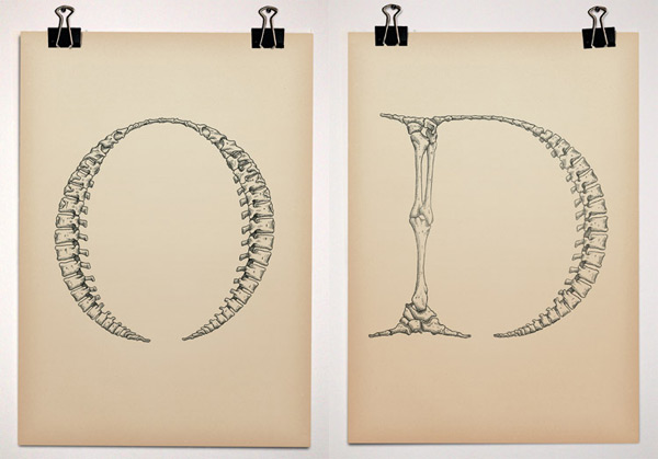
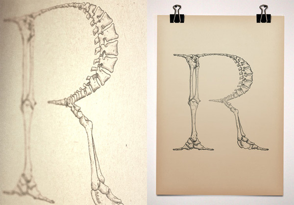
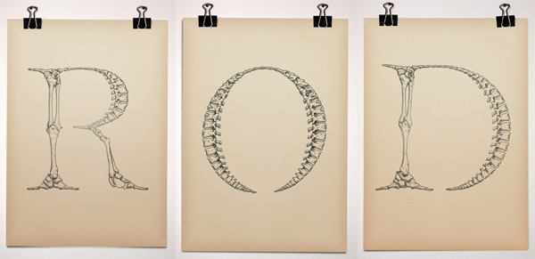 This is Bjorn Johansson’s Anatomy of a Typeface ~ “Triptych made for a gallery exhibition in 2005. The work is playing with the word “anatomy” which in typographic terms is referring to the different parts of a character.” It’s somehow been in an open tab for me all day, and its absolutely mesmerizing, too bad there isn’t a complete font in this style… that could result in some incredible posters! See more close ups after the jump!


Hej,
Lite fint tycker jag.
Sanna
----- Anna Bengtsson 27.01.08 23:50