
Baxter Packaging- 05.06.08
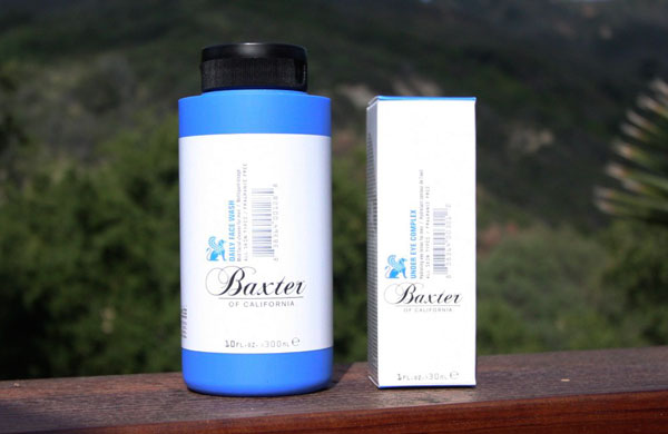
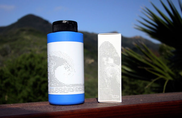
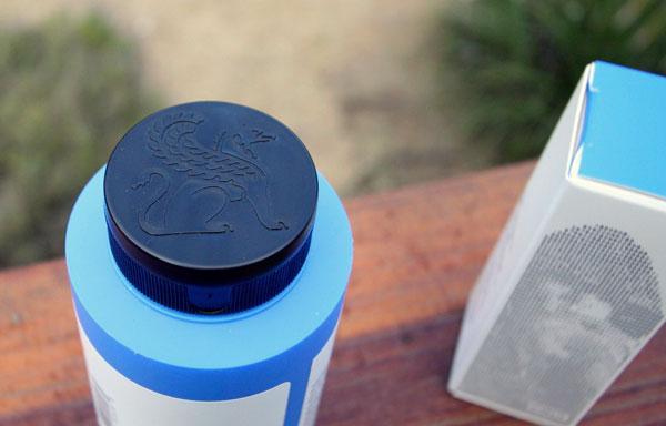
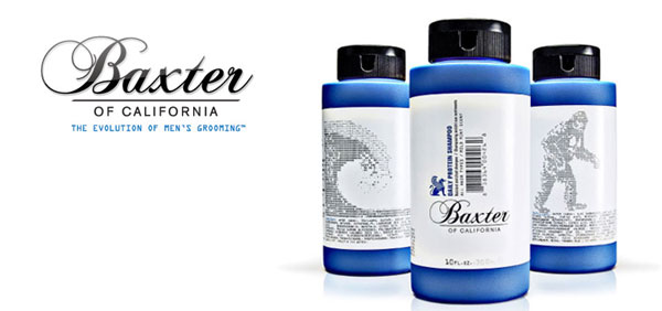
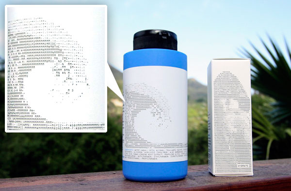 Baxter of California - i’ve been intrigued by their skincare line for men for some time now… and to be honest, the packaging probably had a lot to do with it ~ that vibrant blue and black combo is so enticing? Anyhow, we picked some up the other day, and i suddenly made the connection that the packaging is covered with ASCII ART! The images online of the packaging tend to be so small, i had never really noticed this detail earlier. So took a few close up shots to show you what’s going on. And we’re still testing things out, but so far dan seems to be a fan of the Daily Face Wash and Under Eye Complex. Also unexpected was how soft and smooshy the blue part of the bottle is, with that nice subtly grippy feel - and the gryphon logo on the black cap! This is a packaging post ~ so go see the rest of the pics on the next page!


hands down the best packaging in that market - nice stuff!!!
i have a bottle of the body wash, and in person they look and feel great!
good find.
----- greg 07.05.08 15:31