
*notcot in
design
, 11:40
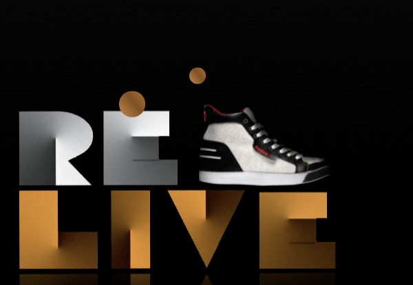
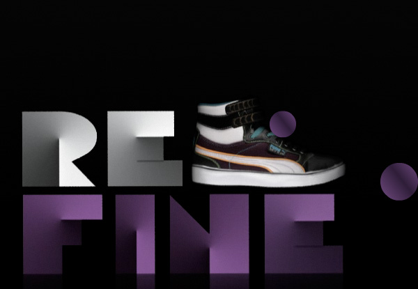
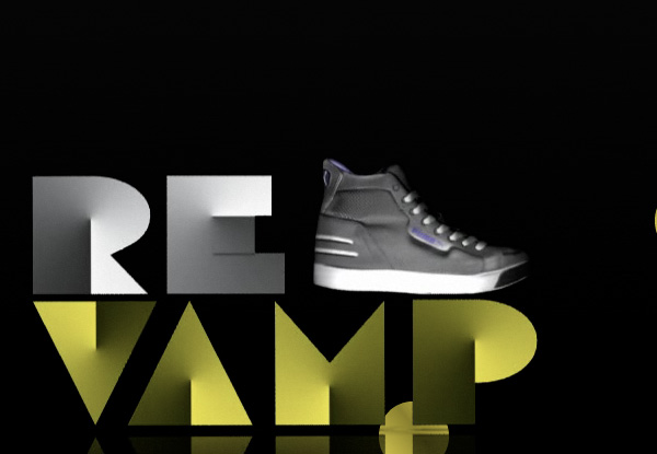
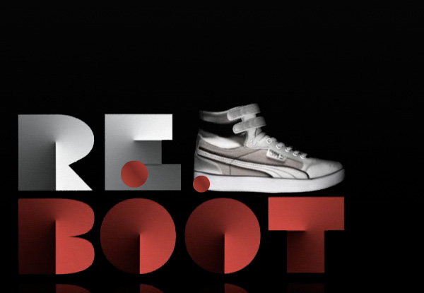
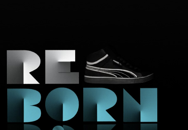
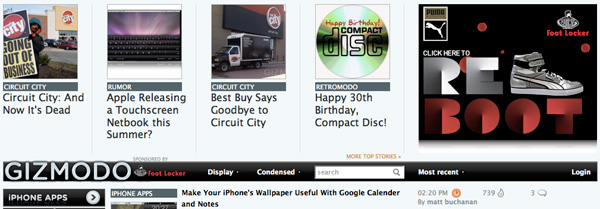
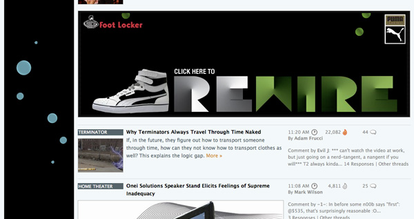
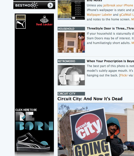
Puma + Foot Locker = Awesome Typography- 03.09.09
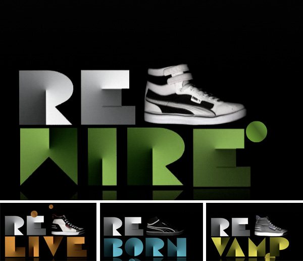 People are always asking me what ads i wish i had on NOTCOT ~ well… this latest campaign from Puma and Foot Locker: “Foot Locker Unlocked - Puma Archive” TOTALLY fits! I was so jealous of Gizmodo when i saw these! The typography is just so so awesome! See more screenshots on the next page ~ including the fun giz placements ~ and if you know who made these, leave a comment!


first of all why would you reference a tutorial? they’re up there for a reason, they wouldn’t be doing their job if people didn’t use them. over-used type? mario hugo? you should focus on the handling of the piece, the “E” yeah not right, perhaps designed by committee… but overall i think the retro-mordern feel of the sneakers the campaign is introducing, the designer did a pretty good job evoking this sentiment. stop hating and do something
----- jaime 06.06.09 13:38