*notcot in design , 09:49

Saks and Fairey’s Studio Number One- 03.17.09

thesaks.jpg I’m sure you’ve seen snippets here and there of Shepard Fairey’s Studio Number One artwork for the Saks Fifth Avenue Spring 2009 WANT IT! Campaign ~ featuring some very propaganda style imagery, but i’ve yet to see it all in one place, or up close… Luckily just got a hold of the high res images of all of the artwork, and freshly couriered over were a copy of the latest catalog as well as some of the bags to check out up close. As you can see, i got indecisive in picking the main image to show first, so you get two!

saks1.jpg It’s a fascinating juxtaposition to see the classy scripty Saks Fifth Avenue logo with the stark black, white, and red clean lines of the graphics… and personally, it doesn’t scream “buy me!” luxuriously to me… in fact it’s a slight turn off as far as my shopping brain is concerned? But from a design perspective, i love the imagery, and the playful integrations, and the possible subversive twist Shepard Fairey’s Studio Number One may have been aiming for… every season trends are constantly shoved down our throats, this merely emphasized it to a point where it’s nearly laughable ~ which then makes you step back and rethink Aggressive Shoes and Arming Yourself (with a slouchy bag) - and then perhaps still give in once you realize you still want them! Anyhow, check out all of the images on the next page, and i’d love to hear your thoughts…


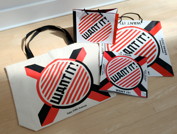
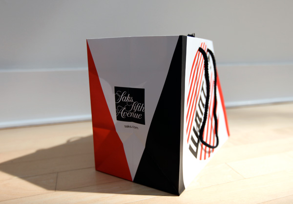
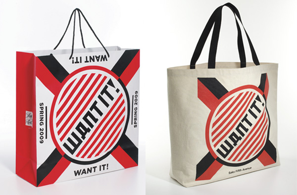
Here’s what was sent over ~ the tote bag is MUCH larger than i expected! Available at the Beverly Hills and New York Saks stores - the tote bag retails for $20 with a portion of the proceeds benefiting HOPE - Helping Other People Everywhere.
thesaks1.jpg

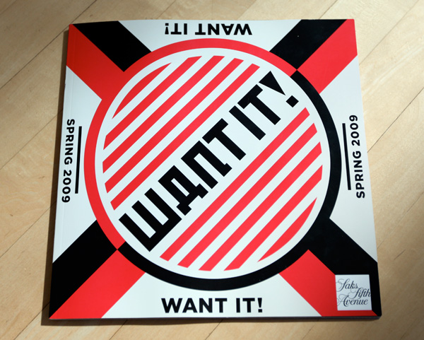
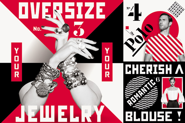
Cover of the catalog… and not ALL of it was in this style, just a few spreads.
thesaks2.jpg

thesaks3.jpg

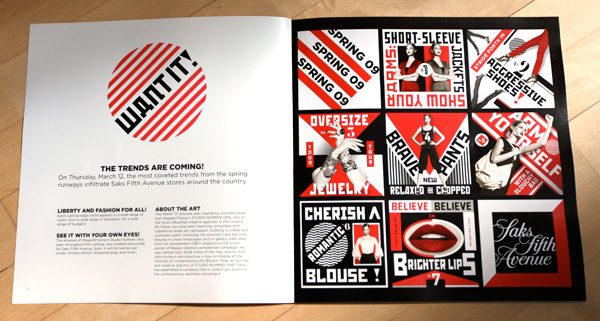
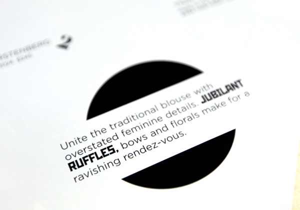
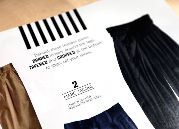
Fun to see how they integrated the propaganda feel by mixing in bold statements in rugged fonts/numbering…
thesaks4.jpg

thesaks5.jpg

thesaks6.jpg

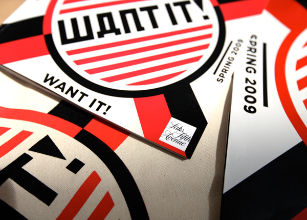
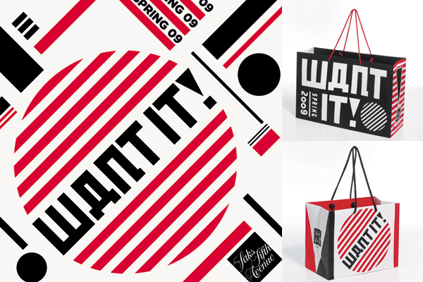
At first i was curious if they scrapped the Saks branding all together on the bags, but there it is, subtly tucked into the sides…
thesaks7.jpg

Here are more close up looks at the graphics and bags designed by Fairey’s Studio Number One!
saks2.jpg

saks3.jpg

saks4.jpg

saks5.jpg

saks6.jpg

saks7.jpg

Tags: - - -

16 Notes

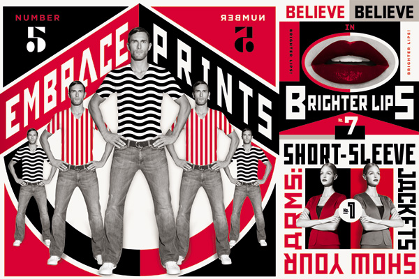
There are two ways of looking at this. One is that the concept of propaganda and a constructivism visual style doesn’t complement Saks Fifth Avenue, that it’s more of riding a trend, of getting that hip artist. The other view is that this is a witty campaign that pokes fun at itself, at the process of advertising and consumerism (as mentioned above). And in so doing is effective in that sense. It’s simply DIFFERENT from the glossy and glam that we expect out of luxury ad campaigns. Therefore it stands out more. It’s not about the brand, it’s about prominence in an increasingly short-attention span market. And I bet Shepard Fairey was initially resistant to idea of selling out but obliged upon seeing the irony, of the opportunity to slip in a commentary about our consumerist culture. Otherwise, I would’ve been dissapointed in him. But I get it.

----- chicob 30.03.09 22:33

I don’t like this at all. Bad concept and design. Maybe they had the right idea to inject someone like Fairey into the campaign because he is “trendy” right now in hopes to attract buyers. But it misses the identity of what Saks stands for and it is not attractive at all in this style of marketing. Overall I give it a: thumbs down.

----- R.T 25.03.09 21:48

Constructivist appropriation and shouting PROPAGANDA. Personally I think it is a witty cultural remark…it makes a statement about consumerism, the luxe culture and our underlying fears as consumers albeit all with a very large grain of salt. This IS an ad campaign for Saks after all. It’s all very tongue-in-cheek, an amalgamation of design + pop culture…I like it!

----- M 25.03.09 15:42

I can see this campaign maybe work for a discounter chain like walmart or even target. This add doesn’t really speak luxury as what saks fifth ave is known for. Perhaps if they used gold in substitute of the all the red, but even that won’t save this campaign.

----- pablo 25.03.09 14:17

I think that this campaign is a total disappointment. This is the official moment that Shepard Fairey has sold out. Not to mention the ad campaign looks like it belongs in the windows of Old Navy.

----- Michelle 25.03.09 13:42

I assume Saks has decided to drop their old audience and pursue an entirely new one. If not, they need some adult supervision.

----- john rieben 24.03.09 13:16

With the economy in it’s current state, the luxurious approach clearly isn’t going to be as efffective. I think the bold, very russian propoganda-esque style is great and a hilarious from the normal overly trendy ‘you NEED this to be taken seriously’ advertising that normally comes from these types of stores.

Will it be as effective? Probably not, but hats off to them for the new direction. Guerrilla-esque marketing has been extremely effective recently, maybe it’ll pay off.

----- Peter 19.03.09 11:28

I agree with all the previous comments - nice from a design perspective, but I’m not tempted to buy. Actually, the campaign reminds me of the movie Repo! The Genetic Opera and its advertising posters in the movie & in real life. (http://is.gd/nWe2)

----- Valerie 18.03.09 15:12

It looks nice, but it seems downright perverse to use Constructivism to sell things, especially Saks.

But then, perhaps that’s the point.

----- Robert 18.03.09 08:47

I agree that this campaign is a bit out of character for Saks, but it’s nicely put together. Subversive is not how I would see using a visual style developed in the ’20s. Maybe I’m just a sucker for Constructivist-influenced design.

My guess is that current Saks shoppers are loyal but dropping off because of the recession, so they’re looking for a younger crowd to help fill the gaps and maintain profits. “hey! let’s get that kid that did the obama thing!”

Will it work? Maybe… I think it shows they’re more than the stuffy land of bank account draining clothes that pops in my head when I look at their logo.

----- keggers 18.03.09 06:38

On my last trip to China, I went to a paper bag manufacturer. I’ve seen what they can do and the design teams they employ. Why would Saks choose such a design? It doesn’t scream fashion luxury. It’s much more reminiscent of the “I want it, I need it, I got it at Deb” campaign.

----- Jo 18.03.09 03:18

Pet hate: Cyrillic abuse. That says, to the extent that it says anything, “SHDPT IT”, not “WANT IT”. Lazy and feeble.

----- samu 17.03.09 19:55

Saks just wasted a whole bunch of money on useless advertising. They need to go back and determine the current physcographic behaviours of their consumer base and find out what is going to make the purchase luxury items. It seems like this campaign is based on two words “want it!”, which would probably work a few years ago, but definitely not in this economy where people are trying to save money. At the bare minimum, even just changing “want” to “need” changes the whole attitude of the campaign from “want it”(because I’m a rich bastard) to “need it” (because I need this item to complete this outfit or I need this item even though I may not have lots of money right now”). The graphics are crappy for an advertising point of view, the bright red and overly cluttered pictures take away from the message being presented to the consumer. Overall, I would rate this campaign 2/10

----- C.N 17.03.09 18:31

I totally agree with you guys ~ its fun to look at on its own ~ but i don’t think it really fulfills the purpose i assume it was hoping to… i just drove by the Beverly Hills store on the way home, and the windows were less exciting/enticing than i’d hoped! While i love the Barbara Kruger/Propaganda look, i think i like my shopping graphics a bit more glam/glossy

----- Jean/NOTCOT 17.03.09 17:13

Do I love it? Yes! Do I think it will appeal to shoppers in a mode of buying fear? Not really, customers left and right are second guessing every possible purchase. They are thinking “Do I really need this?”. While Saks may not be built on a concept of “only the essential” it may do better to focuse on the functionality of it’s and play more on someone’s needs then their Want of style. The brochure graphics here seem to be doing this more, but they do not yell out as a focal point of the campaign.
On the other hand, it’s also possible that the psychotropic affect of these hot graphics may drive the buyer mad with WANT and make them finally choose to slap that voice in the face that says “do you really need that?”

----- Samuel Schimek 17.03.09 15:31

Although I find them visually arresting and attractive, it doesn’t say anything to me about the Saks brand. It’s as though Saks is trying to look like something that they are not. The subversive angle isn’t very effective, it doesn’t connect for me. I’m usually a big fan of Shepard Fairey’s work but this isn’t resonating at all. It does nothing for the products/looks featured.

----- catherine m. 17.03.09 13:52


Copyright NOTCOT INC 2005-2019 - Privacy Policy - Work In Progress! Please be nice!