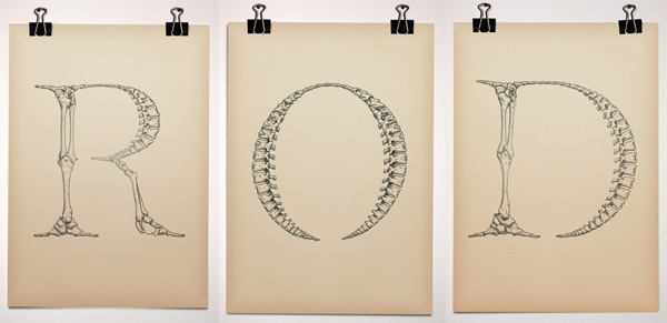
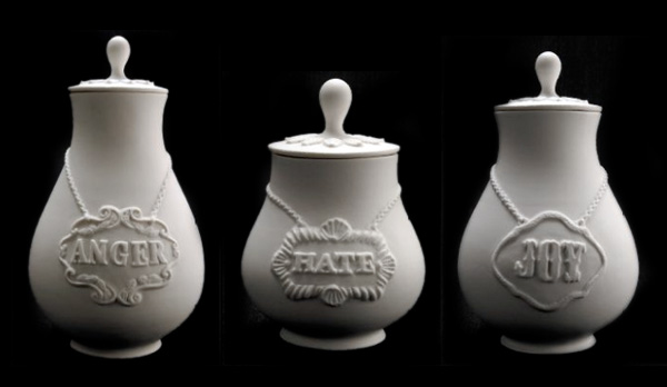
 This is Bjorn Johansson’s Anatomy of a Typeface ~ “Triptych made for a gallery exhibition in 2005. The work is playing with the word “anatomy” which in typographic terms is referring to the different parts of a character.” It’s somehow been in an open tab for me all day, and its absolutely mesmerizing, too bad there isn’t a complete font in this style… that could result in some incredible posters! See more close ups after the jump!
TO PAGE 2 of "Anatomy of a Typeface"! ----->
 Click the pics to find out more! TasteSpotting roundup! Totally late this week, my apologies, but while changing servers, had to rewrite pieces of my magical roundup tool! So here are some deliciously popular posts this week!
*NOTCOT in
design - 01.23.08 -
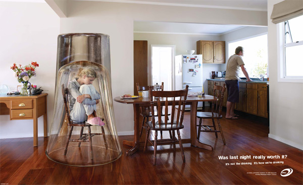 “It’s not the drinking. It’s HOW we’re drinking.” The Alcohol Advisory Council of New Zealand has some great print and tv adverts on creating awareness about drinking. Rather than being completely anti-drinking, they are making people more aware of HOW they are drinking. It seems to be an interesting and effective approach… take a look at their television ads here. Also interesting is their campaign about how its not just kids that drink too much, and show the mirror image of “grown ups”… see the ads after the jump!
TO PAGE 2 of "It’s How We’re Drinking…"! ----->
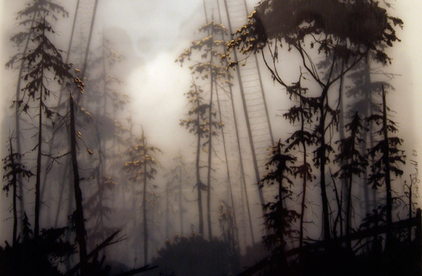 Following up the Jorge Oswaldo post, i’m excited to continue this trend of artwork that is literally layered to create surreal depths… these are the types of works you really need to see in person to fully appreciate.
Remember Brooks Salzwedel? (Of the incredible belt buckles, resin art pieces, and Shane jewelry?) Well, the real reason i headed out to the Tinlark Gallery Anniversary at the Crossroads of the World on saturday night was to see his debut solo show of “By Fault of Its Own”. And it was incredible to see the layered resin pieces up close, in fact one of the coolest things was to see them from the side! You can actually see the layers! And up close, being able to see the details of which trees and tendrils are floating above and below, and that cloudy haze that surrounds them all… well, i tried to get pictures of the whole room to share, and bring you into the tiny details that delighted me at the show… so check out all the pics after the jump!
TO PAGE 2 of "Brooks Salzwedel “By Fault of Its Own”"! ----->
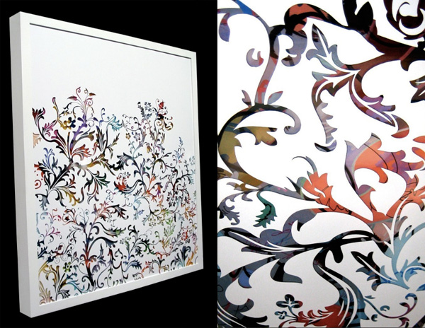 Can you believe that is layered vinyl stickering? Creating that depth through layering? Such a nice mix of the precision of vector lines cut with a vinyl cutter… yet brought back out from the digital to a physical mixed media piece? I discovered the work of Jorge Oswaldo through his video on Current TV (embedded after the jump for your viewing pleasure along with a few more of my favorites from his work!). Talking about ways NOTCOT has inspired me daily… this one takes it to a new level… i received the vinyl cutter for my birthday, made a limited edition series of stickers, one of the guys who bought the stickers tips me off to this awesome video, and now how can i not push the boundaries and start making crazy art with it? Let’s just say i have some silly street art ideas for reflective vinyl stickering… but until then, check out the video below of Jorge Oswaldo’s walk through his studio, his process, and his incredible work with vinyl… unlikely you’ll ever look at stickers quite the same!
TO PAGE 2 of "Jorge Oswaldo: Vinyl Artist"! ----->
*NOTCOT in
tech - 01.22.08 -
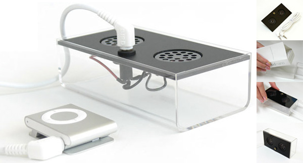 Turn that gorgeous iPod Nano or Shuffle plastic box that you probably kept (if you’re into nice packaging) ~ but had little to use it for ~ into a speaker! With Japanese Bird-Electron’s nearly DIY speaker system that recycles your ipod packaging into your portable speaker system.. For americans check out Audiocubes that has it in stock for $40. The Japanese site, All About, has (what i think is) a review of the speaker over in their men’s style section. Lots of pictures, including one of it installed in a water bottle after the jump! So if you don’t have an ipod box, there are lots of other options to get creative with! via Acquire.
TO PAGE 2 of "iPod Box Speaker"! ----->
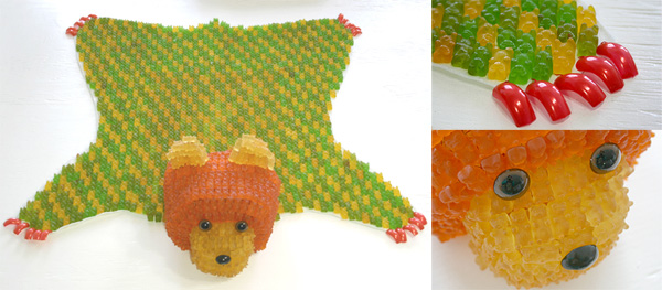 I rediscovered the work of YaYa Chou at the Tinlark Gallery Anniversary Show opening ~ her love of gummi bears is impressive… or perhaps its her hatred of them, constantly molding and manipulating them into new forms. At the show, she was showing her 2006 piece “Simon,” 7”X32”X30”, gummi bears, faux nailtops on wire armature and canvas - a gummi bear rug - and you should have seen these little kids diving at it, dying to lay on it and eat some (i wonder if any ever made it when no one was looking). Closeups from the show after the jump, as well as some of her other gummi pieces you may be familiar with, like the chandelier, creatures, and a porcelain boy covered in gummies…
TO PAGE 2 of "YaYa Chou’s Gummies"! ----->
*NOTCOT in
nature - 01.21.08 -
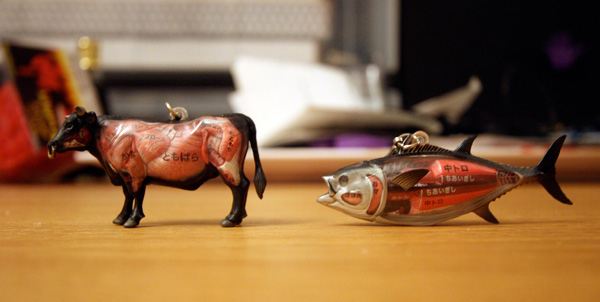 This one goes out to all the carnivores, biologists, and butchers who read NOTCOT… i went by the opening at GR2 saturday night, and when i popped by the original Giant Robot store, i couldn’t help it but i totally had to buy two of these silly Gotochi Dissection Animals… See? I buy things sometimes not because i need or want them, but because i just really want to take a bunch of pictures to share with you. So after the jump you can see my full coffee table photoshoot of a tiny bull and tuna showing what i imagine to be the different edible anatomical portions of both - check out images of the packaging, and fun closeups of both… as well as all the other models GR has in store.
TO PAGE 2 of "Anatomical Bull + Tuna"! ----->
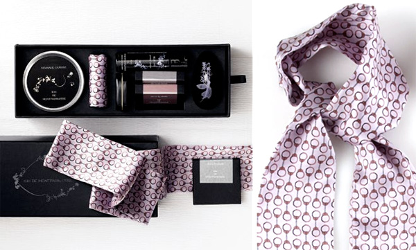 With Valentine’s Day around the corner ~ there are a lot of options out there to get romantic ~ from getaways to roses to chocolates, etc. Here’s a “deluxe intimacy kit” from Kiki De Montparnasse over at Red Envelope, which normally wouldn’t have grabbed me, but the handcuff print on the silk restraints were too fun (see close ups of the rest of the contents of this kit after the jump!). I’d love to see this pattern use as a men’s tie, the interior of a laptop case, in other unexpected contexts of things that “tie us down”?
TO PAGE 2 of "Handcuff Silk Restraints + more"! ----->
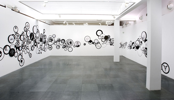 It’s like xmas morning every time i get an email with attachments from artists Petra Mrzyk & Jean-Francois Moriceau ~ i always know inside are jaw-dropping pics of black and white goodness in the form of painting/installation combos. And this latest one does not disappoint! So after the jump you can see many images from their latest show “Golden Eyes” at the Caixa Forum in Barcelona! With a circle motif, this show is a mix “between a wall-drawing and real round drawings framed”… ultimately creating a very surreal sense of depth, while simultaneously appearing incredibly flat… anyhow, it’s mesmerizing to peer into each and every circle to see what unexpectedly twisted/playful drawings are within.
TO PAGE 2 of "Mrzyk + Moriceau “Golden Eyes”"! ----->
*NOTCOT in
design - 01.20.08 -
 NOTCOT Note: Here’s a post from Justine/RUGenius ~ who is running around with our mom in Oxford and the general vicinity…
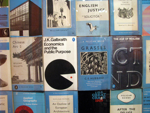
When trying to decide where to take my mother for the day, an ad caught my eye - “Seventy Years of Penguin Design” at the Holburne Museum of Art in Bath. Here was a combination of things we love: books, design…and superficially enough, penguins!
While the exhibit itself was tiny, no more than a room, it was filled with treasures and gorgeously arranged, painted a bright Penguin book cover orange. And what a cover! It’s hard to think of a more iconic design (perhaps the old Campbell’s soup can?). And Penguin has certainly been marketing it design classic, selling Penguin classic book mugs, deckchairs and towels. We all know and love that three panel design, but I, for one, didn’t know much else about Penguin. Did you know that first Penguin paperbacks were just two and a half pence and designed with the goal of making literature affordable and accessible to all. If only that were still true!!! And it’s not JUST penguin, you can also see the development of the Pelican and Puffin lines and logos as well! Read more and see pics of it all after the jump!
TO PAGE 2 of "Seventy Years of Penguin Design"! ----->
*NOTCOT in
travel - 01.19.08 -
*NOTCOT in
tech - 01.18.08 -
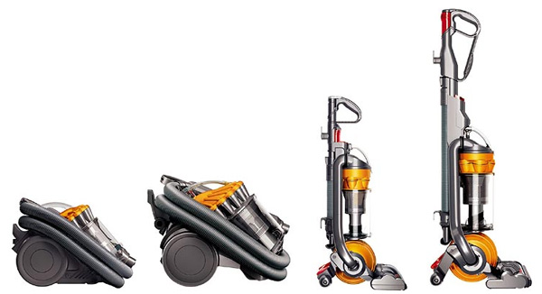 Exciting news in the vacuum department - Dyson’s are getting smaller! One of the biggest problem with all powerful vaccums (not just dyson) is the sheer SIZE of the things, super dustbusters and the lightweight minis are cute but they just don’t get the job done the same way. First in the new models is a smaller form of his classic ball - this DC24 smaller ball vacuum that compacts to a size of 43.3 x 11.0 x 13.7 (HxWxD) inches! Second up is the smaller version of his canister vacuum, the Dyson Baby. For a good sense of how small these really are, see the image of Sir James Dyson with the two after the jump!
TO PAGE 2 of "Two Smaller Dysons"! ----->
 Part of me lives for the neverending hunt for the *perfect* bag… well, perhaps a perfect bag for each and every situation. Anyhow, everyone has their quest, and that seems to be mine. That being said, this new grey Miu Miu bag in the Kirsten Dunst ads is my latest lust object. And while bag hunting and finding this one, i also got sucked into the whole ad campaign imagery for Miu Miu’s spring 2008 with Kirsten Dunst ~ fun photography, loving the eerie red floors and ominously surreal look, and while i feel silly saying every time i see her i still think of Interview With A Vampire ~ she certainly has that pale look about her here! See the whole campaign after the jump.
TO PAGE 2 of "Miu Miu + Kirsten Dunst"! ----->
 This is Bjorn Johansson’s Anatomy of a Typeface ~ “Triptych made for a gallery exhibition in 2005. The work is playing with the word “anatomy” which in typographic terms is referring to the different parts of a character.” It’s somehow been in an open tab for me all day, and its absolutely mesmerizing, too bad there isn’t a complete font in this style… that could result in some incredible posters! See more close ups after the jump!
 Click the pics to find out more!
  “It’s not the drinking. It’s HOW we’re drinking.” The
  Following up the
  Can you believe that is layered vinyl stickering? Creating that depth through layering? Such a nice mix of the precision of vector lines cut with a vinyl cutter… yet brought back out from the digital to a physical mixed media piece? I discovered the work of
  Turn that gorgeous iPod Nano or Shuffle plastic box that you probably kept (if you’re into nice packaging) ~ but had little to use it for ~ into a speaker! With Japanese
 I rediscovered the work of
  This one goes out to all the carnivores, biologists, and butchers who read NOTCOT… i went by the opening at GR2 saturday night, and when i popped by the original Giant Robot store, i couldn’t help it but i totally had to buy two of these silly
  With Valentine’s Day around the corner ~ there are a lot of options out there to get romantic ~ from getaways to roses to chocolates, etc. Here’s a “deluxe intimacy kit” from
  It’s like xmas morning every time i get an email with attachments from artists
  NOTCOT Note: Here’s a post from Justine/RUGenius ~ who is running around with our mom in Oxford and the general vicinity…
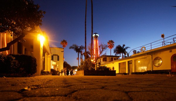 Tonight i was at the Crossroads of the World. And it was surreal. It’s on Sunset Blvd in Hollywood…
  Exciting news in the vacuum department -
  Part of me lives for the neverending hunt for the *perfect* bag… well, perhaps a perfect bag for each and every situation. Anyhow, everyone has their quest, and that seems to be mine. That being said, this new grey Miu Miu bag in the Kirsten Dunst ads is my latest lust object. And while bag hunting and finding this one, i also got sucked into the whole ad campaign imagery for