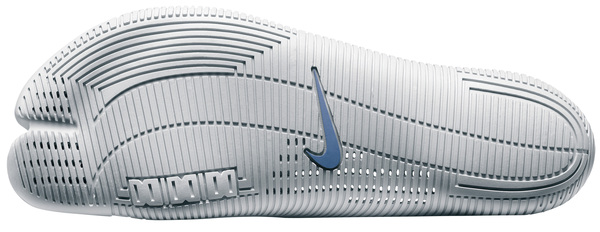
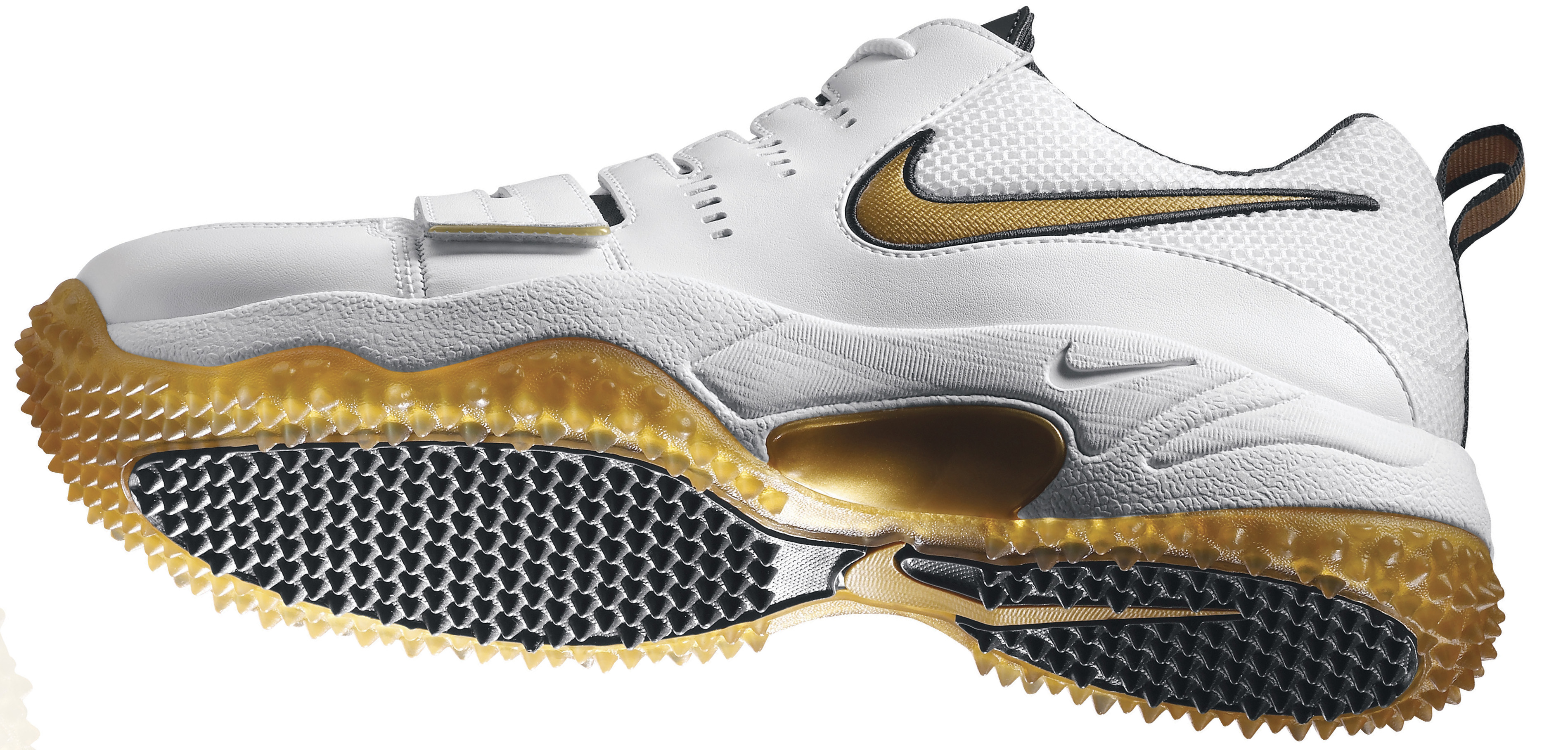
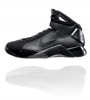
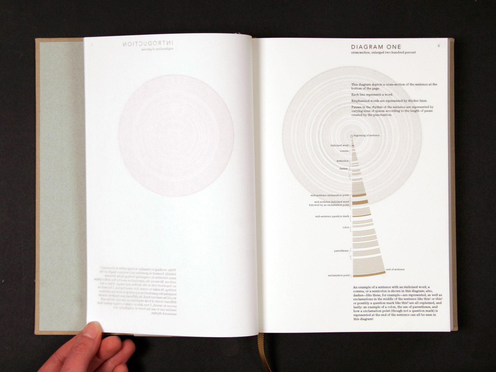
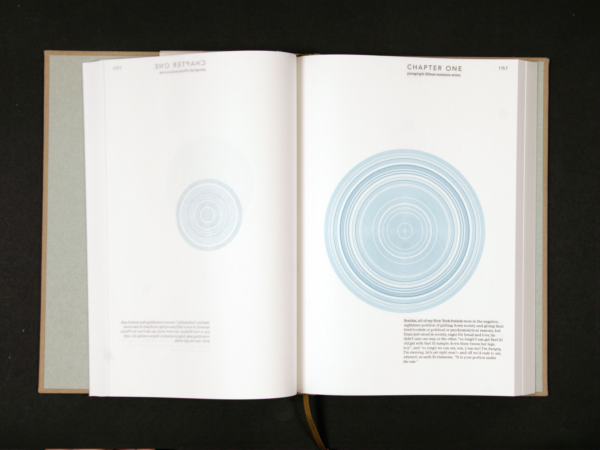
I have that tendency to post things when i get really excited… really really late at night (like 4:30am?)… thing like the Nike 2008 Olympic Footwear collection, which has a new unique shoe for EVERY sport to be represented at the Beijing 2008 Olympics. And then as usual, i wake up, and start reading and clicking and browsing even FURTHER only to find another aspect of the story i just get so giddy about i can’t help posting it. Well today, it was reading the design stories behind each and every shoe, and viewing the extremely high resolution images, have you LOOKED at some of these soles up close?
Shoe and sport aside, there is some fascinating materials design going on here. After the jump are some of the most interesting shoe soles and their Material Design Stories as found in the many press releases.
[Click any of the shoe images to view them in their super high res form, which is the only way to truly appreciate how crazy they are!]
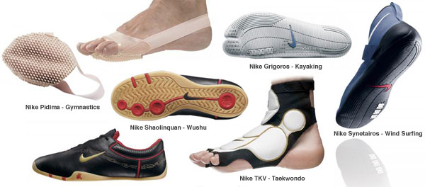
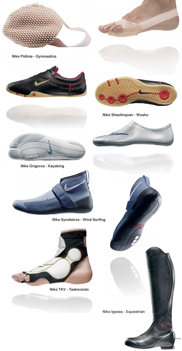
Nike Pidima (Greek for “Leap”)
Sport: Gymnastics
Nike’s smallest shoe being offered to athletes in Beijing, the Nike Pidima, is designed to support the needs of world-class gymnasts during the Vault competition. Much like the long-jump, this sport requires athletes to run as fast as they can in a short distance and leap with intense force off the vault in order to achieve the maximum distance, height, and foot velocity before they “stick” the landing. Inspired by track and field footwear, designers developed the Nike Pidima’s strappy rubber traction system to improve speed and control during approach and landing.
Working with a German sports research scientist, Nike developed a forefoot pad that mimicks the Nike track spike pattern. A split on the outsole allows for pliability between the first and second metatarsals where they spread during impact. Essential to the design is a slightness of material that allows the foot to feel as bare as possible while improving traction beneath the sole. A neutral-color rubber is used in construction to minimize distraction of the athletes and judges.
Each pair of the Nike Pidimas are packaged in a small carrying pouch inspired by Chinese silk to keep the shoes together in gymnasts’ duffel bags.
Nike Grigoros (Greek for “Quick”)
Sport: Kayaking
In Beijing, kayakers will maneuver their boats through gates in a slalom course into manmade whitewater rapids. The athlete’s feet are on pegs inside the kayak braced against the sides of the hull for stability and balance. US kayakers competing in Beijing, accustomed to competing barefoot, asked Nike designers to build them footwear that would provide lightweight protection and traction for their feet during a race. Inspired by the challenge of improving the performance of athletes who normally forgo footwear during competition, designers created the Nike Grigoros.
Made from a single piece of Nike’s stickiest rubber compound, the shoe is a low-profile skin that easily slips over the foot. A web and lug pattern on the sole delivers reliable grip in the boat and on the dock while channels in between allow for water drainage. The anatomical, split-toe design of this fitted silhouette provides natural movement of the foot on the boat’s pegs. As with every world-championship event for which Nike has created shoes, lightweight innovation makes the Nike Grigoros an improvement over any other footwear option available—even an athlete’s bare skin.
The Nike Grigoros is made from one piece of 100% recycled rubber.
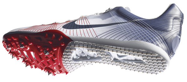
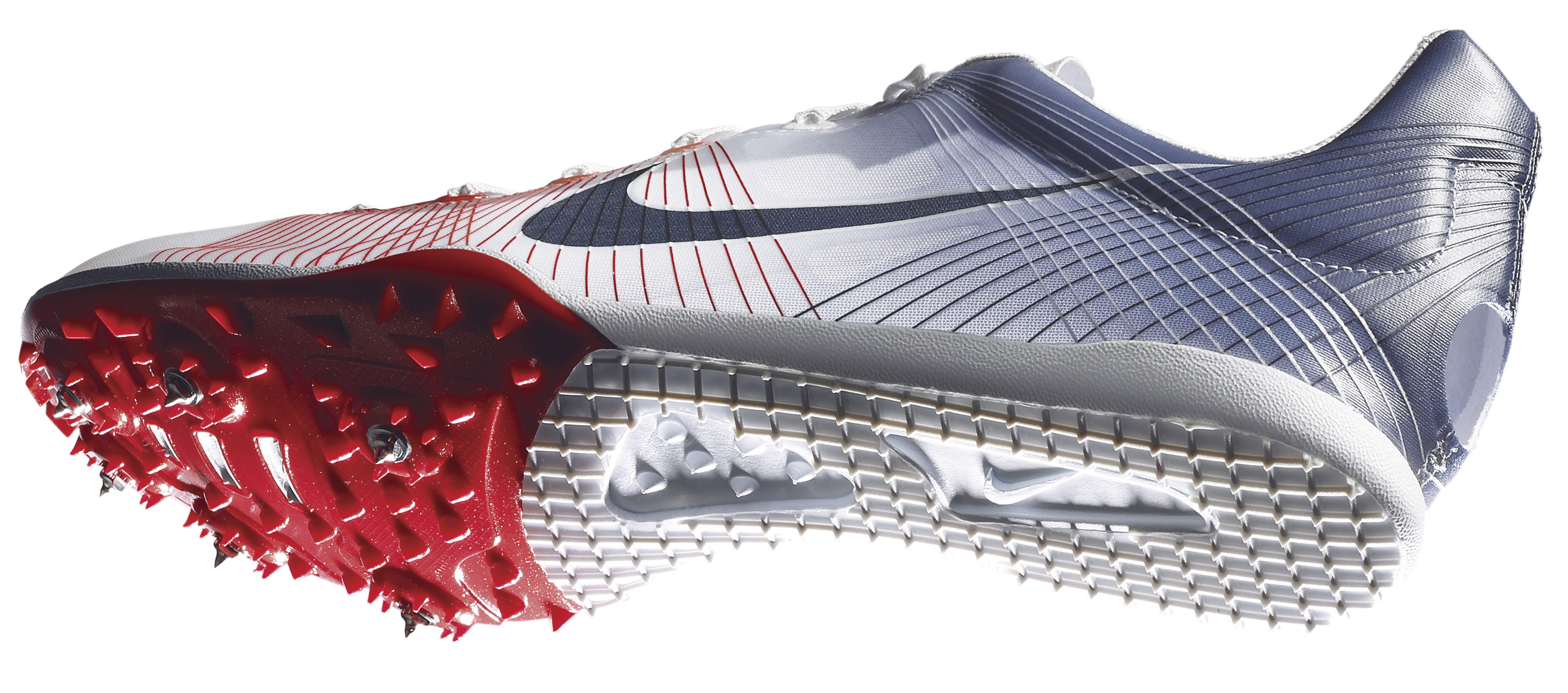
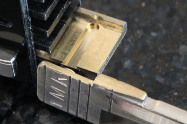
Nike Zoom Victory Spike
Weight wise, 100 grams has always been the Holy Grail for a track spike.
Tom Redding and John Truax, the Nike design and development team on the Nike Zoom Victory, weighed everything that went into the spike. They used lightweight Vectran thread. Stronger than Kevlar, it’s spun from liquid crystal polymers and was used to sew the balloons on the Lunar Rover. The Flywire filaments themselves are covered in a TPU film to ensure they don’t snag. The TPU film determines much of the spike’s weight, so it was paired down to only a couple microns thick. Every part of the shoe that could be, was perfected to cut weight. To cut even more weight, the decision was made to remove the sock liner. Instead of the foam sockliner used in traditional track spikes, a single piece of lightweight suede was used. To get a better fit, the shoe was constructed with a center seam, but then a way was also found to remove the thread itself. The shoe was still sewn up the center, but drafted in a solution more common to surgery—water-soluble thread. Now, just before the factory adds the suede sock liner and puts the shoe in the box, the Zoom Victory is wiped down with a wet brush to dissolve the thread. This process removes approximately 1.2 grams.
The final innovation John and Tom incorporated was a hole in the heel. “We didn’t need a heel counter, which again probably weighs five or six grams,” Tom explains. They created a weld around the edge and punched it out to expose the foot itself. At first athletes were nervous about the fit, but the hole allows the Zoom Victory to grip the heel tightly, creating an almost custom fit and preventing slippage.
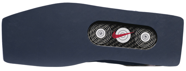
Nike Simadi (Greek for “Target”)
Sport: Shooting
The success of a world-championship marksman depends on balance and rock-solid stability. In a sport where athletes have to be as steady as possible, often pulling the trigger of a gun between heartbeats, the slightest movement can be devastating. The unshakable foundation of this kind of extreme body control relies on stable footwear, which is why designers met with US gold medalist athletes to develop the ultimate shooting shoe, the Nike Simadi.
Available in a mid version for rifle shooting and a low model for pistol shooting, the key innovation in this footwear is the outsole. Designed to provide the most stable platform possible for a shooter, the Nike Simadi is built on a carbon fiber plate that is both lightweight and stiff, allowing the most comfort possible in a shooting shoe. To prevent foot slippage, a high-traction rubber compound is integrated into the outsole, providing unmatched grip on the hardwood floors of the range. The stiff, synthetic upper—with a molded heel cup and midfoot panel—helps keep the athlete’s foot firmly in place inside the shoe.
The Nike Simadi Mid rifle shoe has been constructed with as much ankle support as possible, helping to immobilize the kinetic chain of the lower leg and lock down the shooter’s stance. The square toe of the Nike Simadi Mid was designed to accommodate and stabilize the toe-to-floor contact point of the foot in laying and kneeling positions. In the rifle shoe only, the carbon plate in the sole has been truncated to allow slight flex for floor positions.
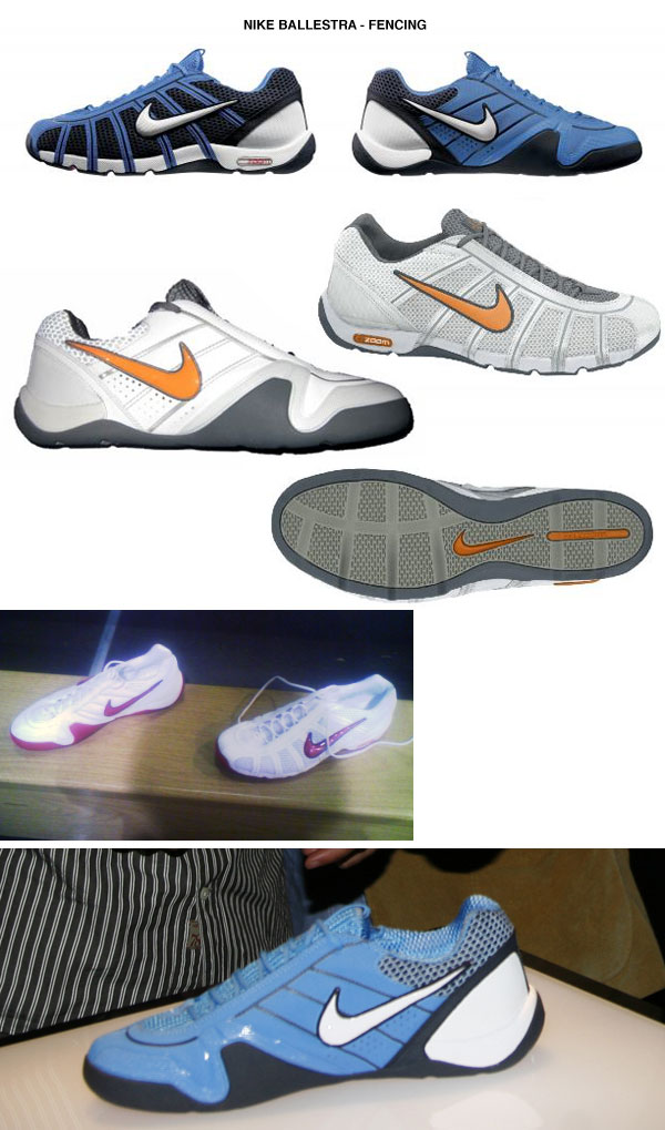
Nike Akribis (Greek for “Accurate”)
Nike Dunkesto (Team USA Only)
Sport: Archery
When the process began to create an innovative archery shoe for Beijing, the first step was to seek athlete insight. Based on feedback from the world’s top archers, the goal was to design footwear that helped the athlete execute precise use of a bow and arrow. To do so, athletes would require footwear that was lightweight, stable and comfortable. As with any sport that demands steadiness for perfect aim, an archer’s stance is the foundation for a well-placed shot. Building from Nike’s heritage of turf traction and stability footwear, a modified football cleat was used as the basis for the Nike Akribis archery shoe. With a nubby Astrograbber outsole that can penetrate and grip either grass or synthetic turf and a contoured footbed that elevates the heel to an athletic shooting position, the Nike Akribis provides comfort and sure footing on any surface, giving Nike athletes a better chance to perform their best in Beijing.
.:notcot:. 13.04.08 17:33 .:
design:.

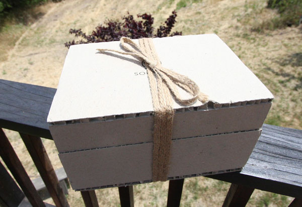
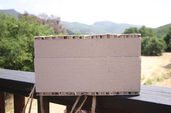
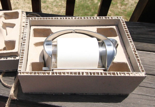
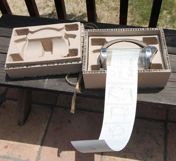
 On more packages to play with upon returning to LA… Here is the Sorapot unboxing that i’ve waited 3 years to do (i first read about it over on Cool Hunting in 2005)! Joey Roth was actually my first NOTCOT reader i ever met, and i’m ecstatic to finally see his masterpiece in my hands (and not on a computer screen!). So amidst all this u-haul unloading, unpacking and playing 3D tetris with boxes… here’s a quick unboxing of this beautiful new teapot. So industrial, yet elegant… and i even have

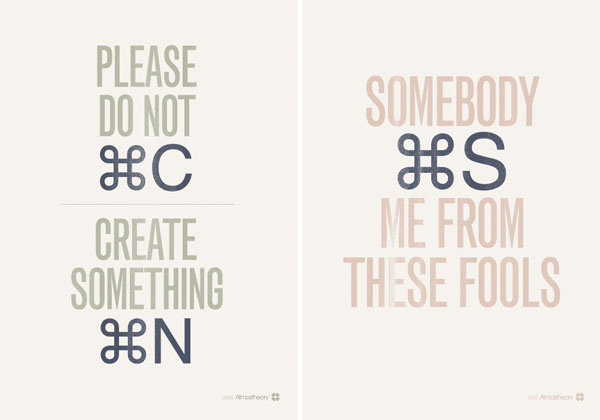 I giggled when i first saw these “Command” posters on
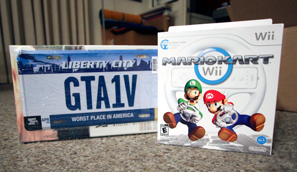 This is definitely the week of driving. The sites have been insanely quiet today because i have spent over 8 hours cruising down the 101 (the historic El Camino Real - slowly passing many of the california missions) - at no more than 60 mph behind a uhaul towing a car that i spent all day/night packing yesterday… and yesterday between packing (moving the NOTCOT norcal office back to socal - so dan and i are both back in LA for good now), i was also a bit slow yesterday (and sunday and monday) because in between packing i couldn’t stop playing
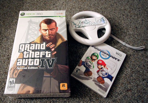
 Click the images to find out more! Wow, busy week/weekend across the NOTCOT sites… and the Daring Bakers have struck again, this month they have taken on the adorable


 NOTCOT Note: Interviews! We don’t have many of them on NOTCOT so far, but
 For those days when you just really want to get a Glock 9mm with Tactical Light on your flight,
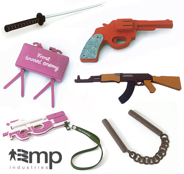
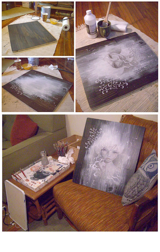
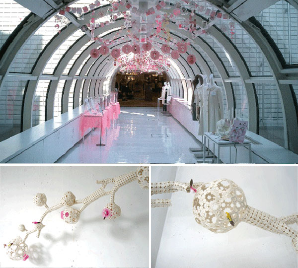
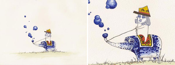
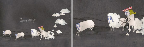
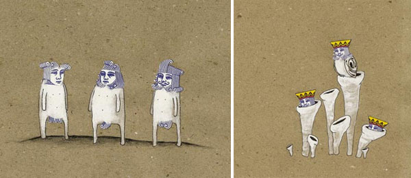
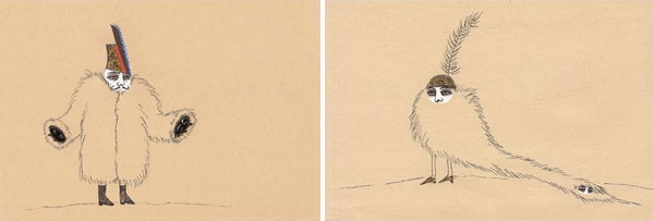
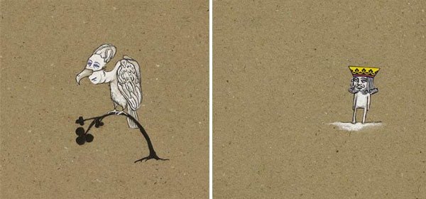
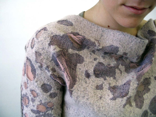
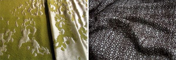
 I’ve been meaning to post about the incredible work of


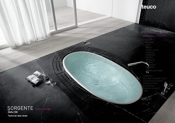
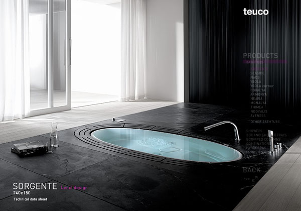
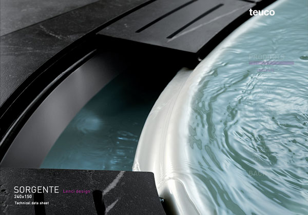
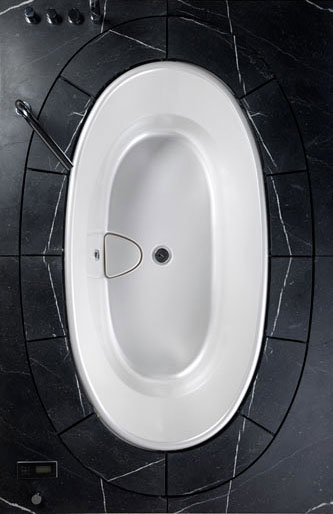
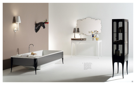
 I need to build a house/room around a bathtub one of these days… and i’m madly lusting after this
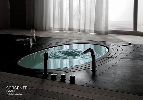


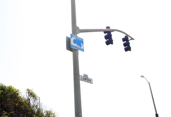
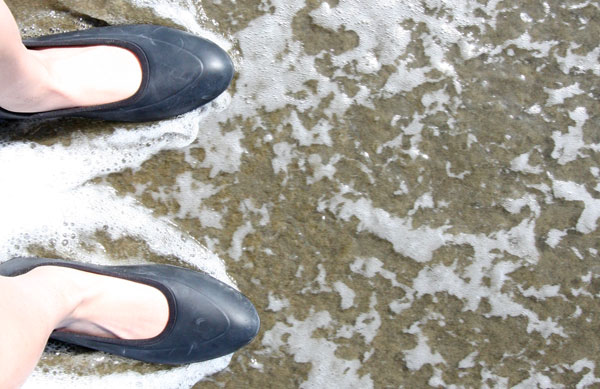
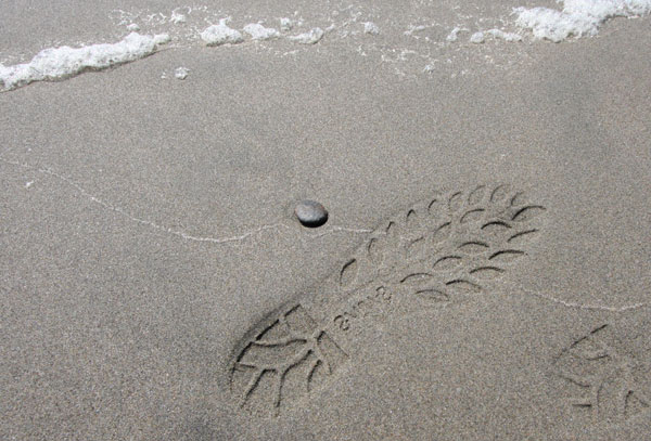
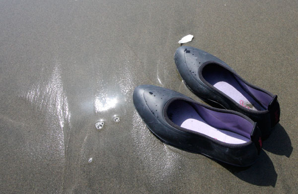
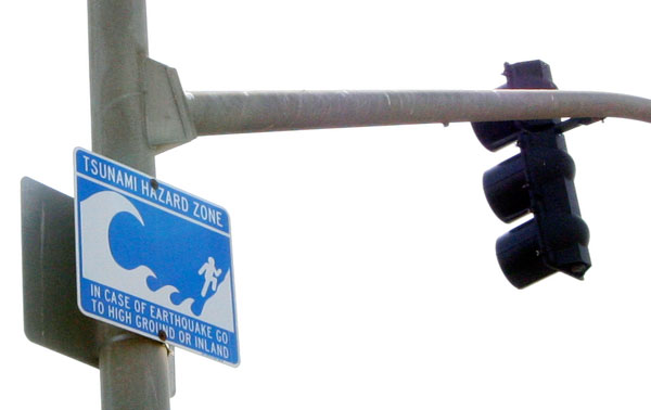 Tsunami Hazard Sign - While at the beach
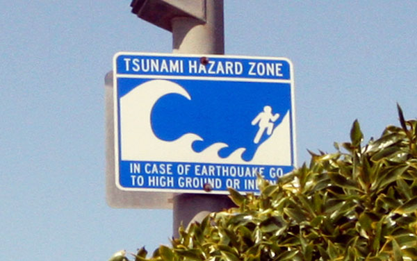
 I
I 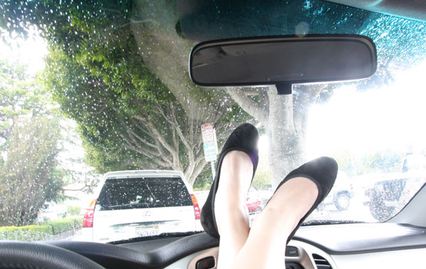
 On a continued giddy morning, after a crazy long day running up and down norcal… while i avoided all things Web 2.0, i couldn’t say no to playing with our

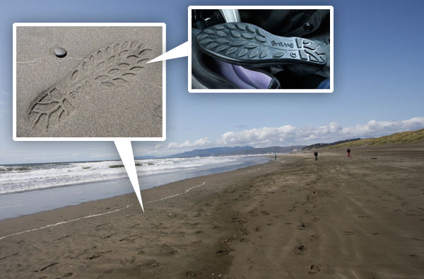
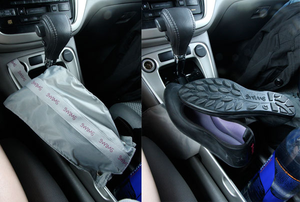
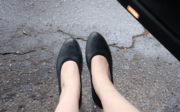
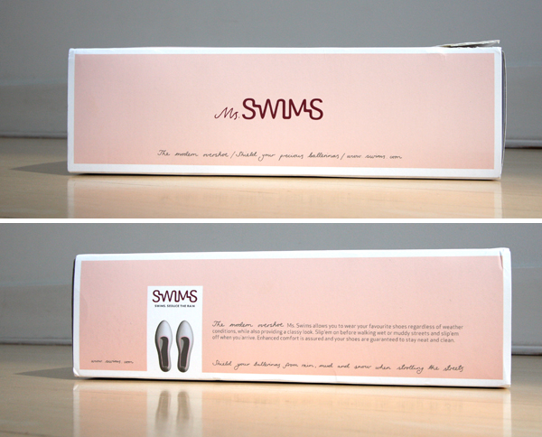
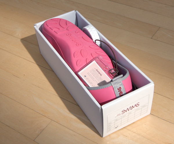
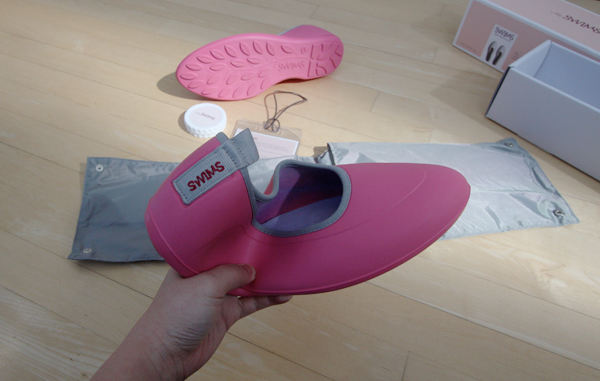
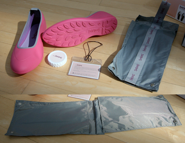
 HAPPY EARTH DAY! Sadly the weather got a bit drearier here where i’m hiding in norcal… BUT the good news is, i’m actually hoping it rains - since i just got a pair of black


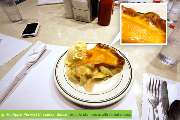
 Click the images to find out more! Hey everyone, sorry i got quiet this weekend. To be completely honest with you, i’m just having a bit of a hard time with things right now, and its been a rough last few weeks particularly, and overall the last few months have really been catching up with me it seems… trying to officially take a vacation this week… but unlike most sites that go on vacation, shopping/hunting/browsing/sharing/posting inspiring things IS what makes me happy, so posts will probably pick up after i get some brunch today, whereas emails (especially the bitchy ones) will probably have even slower responses than normal, meetings/conference calls probably won’t be happening (other than the really fun pre-planned ones)… essentially anything that “feels” like “work” i’m not available for this week! Check back May 1st if you’re looking for that stuff, where hopefully i’ll get myself relaxed and ready to do the whole “business” thing again. And for those who clearly can’t seem to understand this - i just need a break, so feel free to resume the painful/not fun stuff May 1st.

 NOTCOT Note: Here’s another treat from Anna of
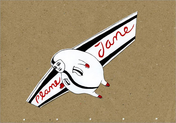
 Fresh from the inbox,
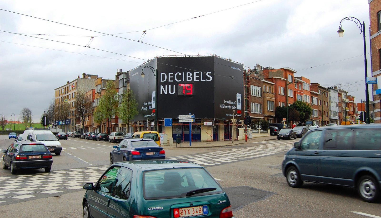
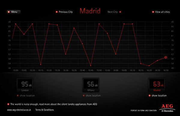
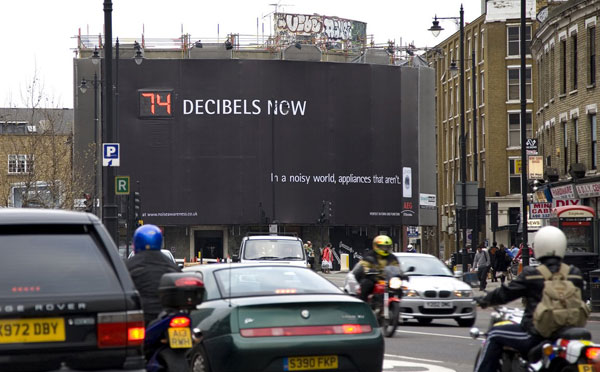 Ever wonder how loud your world is? Or in contrast, ever notice how nice peace and quiet is? Love this new global billboard campaign by


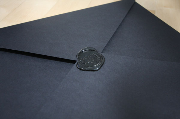
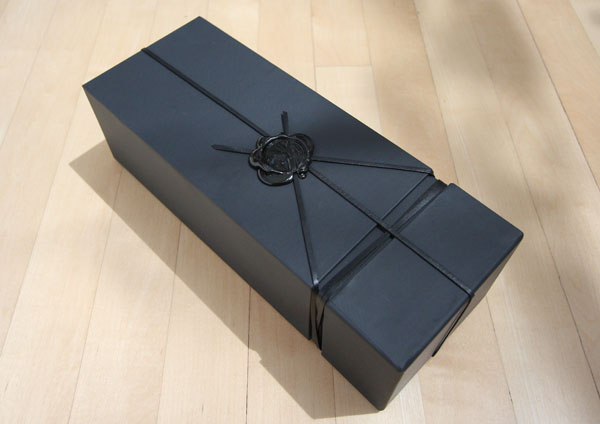
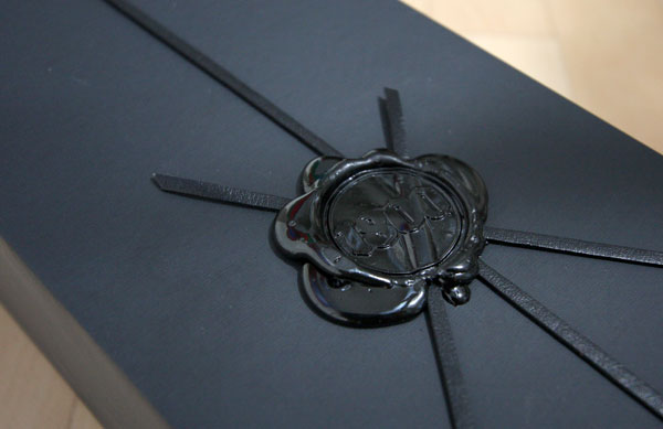
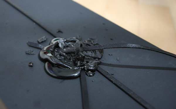
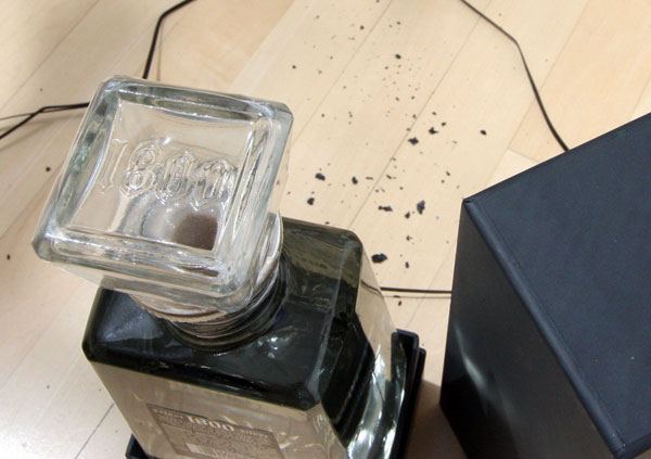
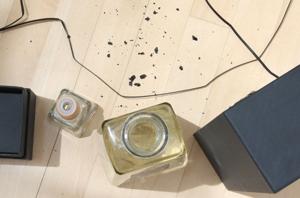
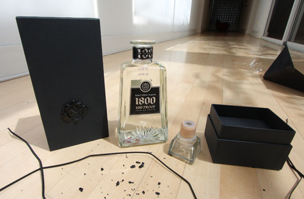
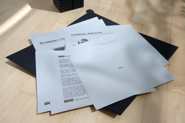
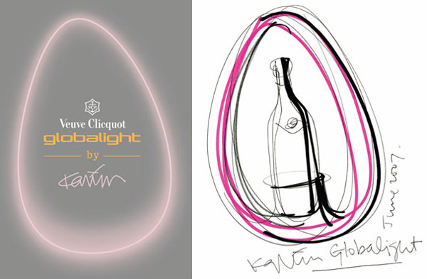
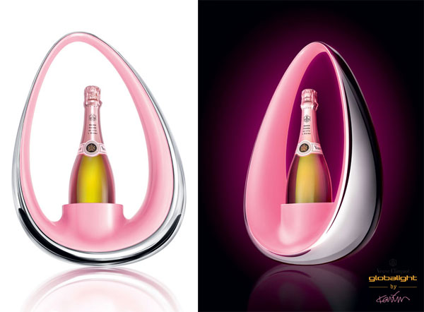
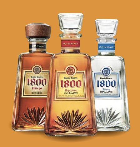
 Mmmm matte black box, tied up in leather cord, sealed with a big glossy wax seal… along with an enticing black envelope sealed with a matching wax seal, containing silver sheets of paper… it was far too fun to bust open this latest press release to land on my doorstep this morning and discover this beautiful bottle of the freshly launched “100 proof, 100 percent agave, super-premium tequila”,
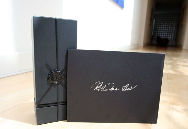

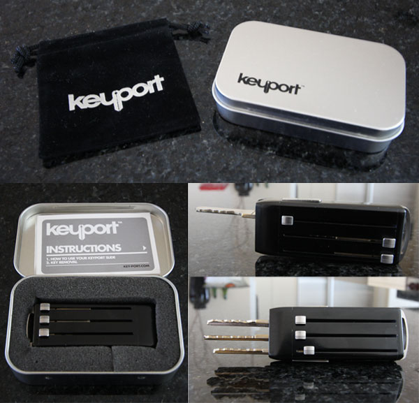
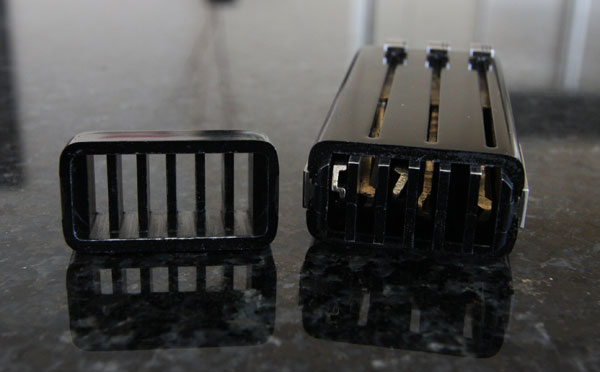
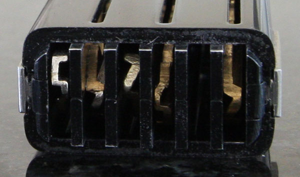
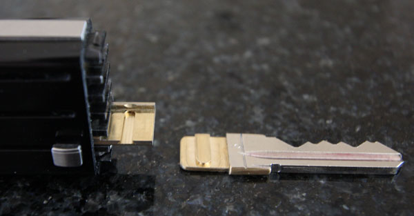
 Browsing
 Here’s that press announcement i’ve been dying to share with you….

 Warning, i have this tendency to do late night visual research binges - (binge and post?) - which result in rather large collaged image files - and tonight between


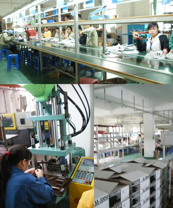
 There has been much talk of NOTCOT TV… actually scratch that… by *talk* i mean *pressure*. And we’re definitely interested, but keep in mine we’re 2 people running 4 sites, with help from a tiny handful of part timers who help when they can. If you asked me what i’d be doing now, three years ago, this wouldn’t have even been in my realm of possibilities! BUT, that being said, i’ve been buzzing with ideas, just not the time/resources to pull it off quite yet… and when i saw the new

 Swedish,


 I’m having one of those Mondays that already feels like a thursday… the week can’t end fast enough, yet its just begun. Also, its the week where i kick myself for not being in Milan for design week, not that i should have been there this year, seeing as i’m slightly over swamped with obligations at the moment anyhow. Good news for you, is part of that is due to a pile of really cool stuff i’m dying to post (the fun part of my
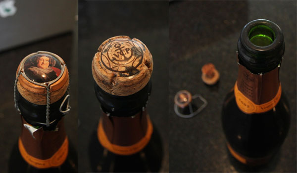
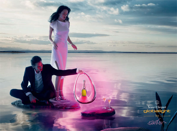
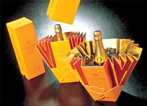
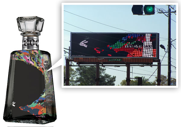
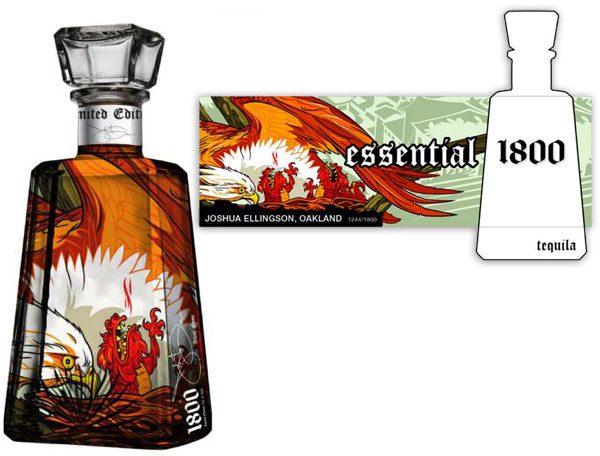
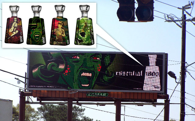 Prepare to see Tequila in a whole new light… especially if you live in SF, Chicago, Detroit, or Atlanta, where the first set of


 What more could we need to kick off a Monday in the making besides waldo hidden in the real world waiting for google maps, designer foosball, books transformed into sculpture, dragon bras, fun dresses and coats, martinis, cupcakes, carbonara, and more? Well here’s a selection of things that grabbed me from the last week, and after the jump take a look at the 25 most popular posts from across the NOTCOT Network. Happy Monday! (and as always, click the images to find out more!)


 Nike has designed a whole line of Olympic Footwear… one for every sport in the Beijing 2008 Olympics. And besides the usuals like track and field, basketball, etc… what fascinates me are their designs for things like Gymnastics, Wushu, Kayaking, Wind Surfing, Taekwondo, Equestrian, and Fencing. These were launched at the incredible 2 day press event:
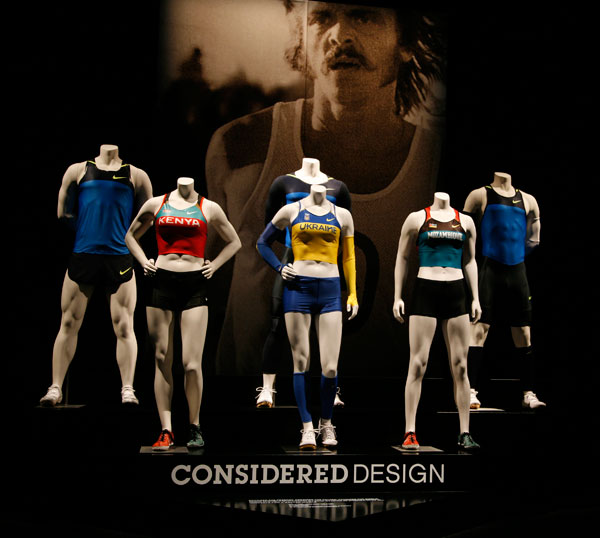


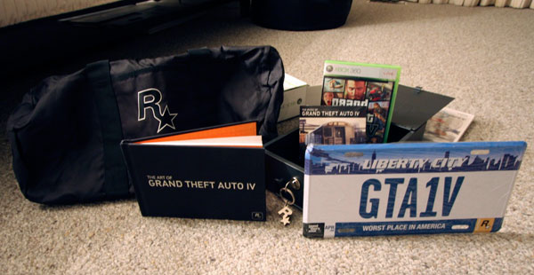
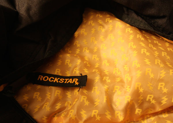
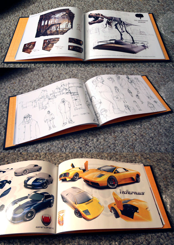
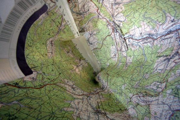
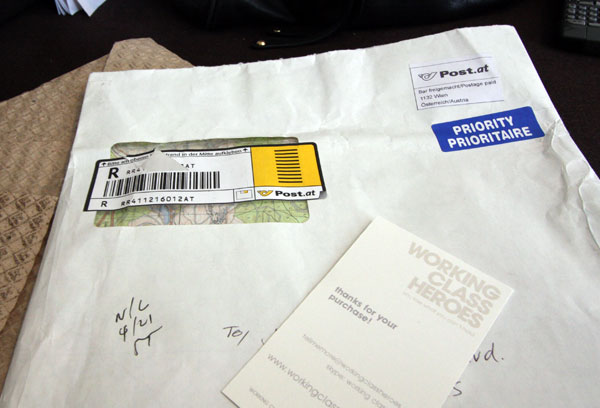
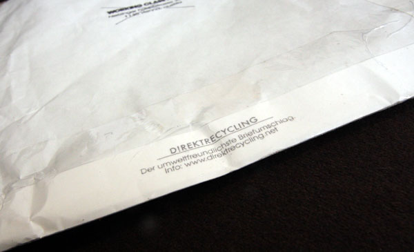
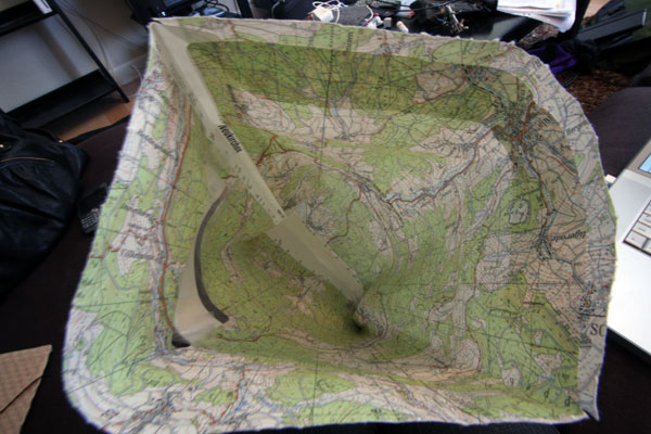
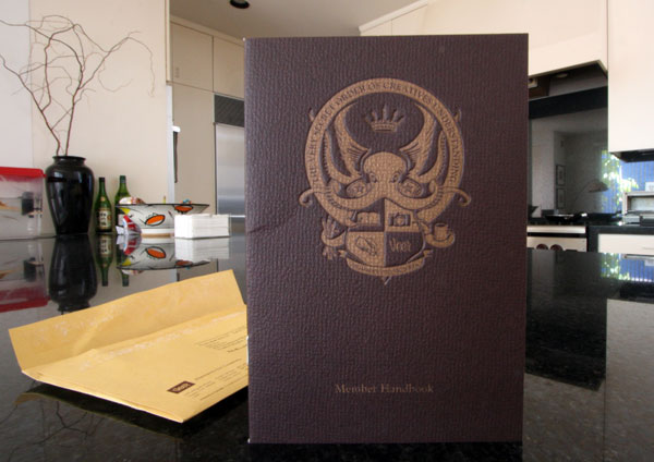
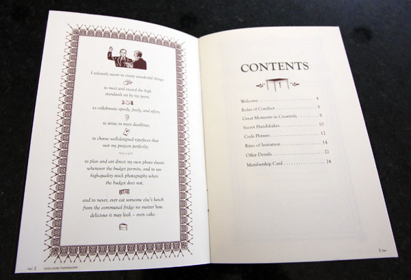
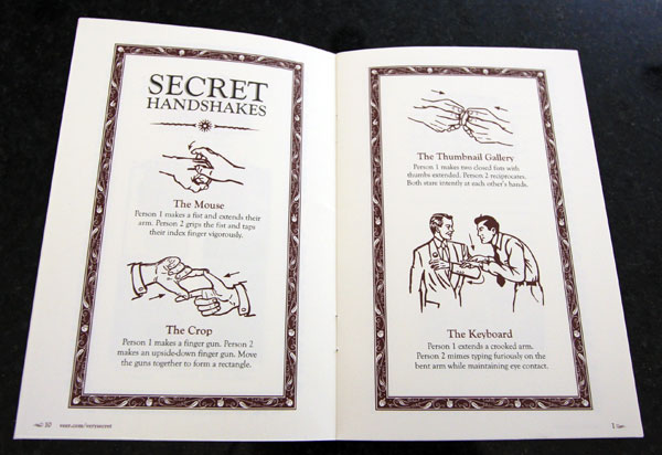
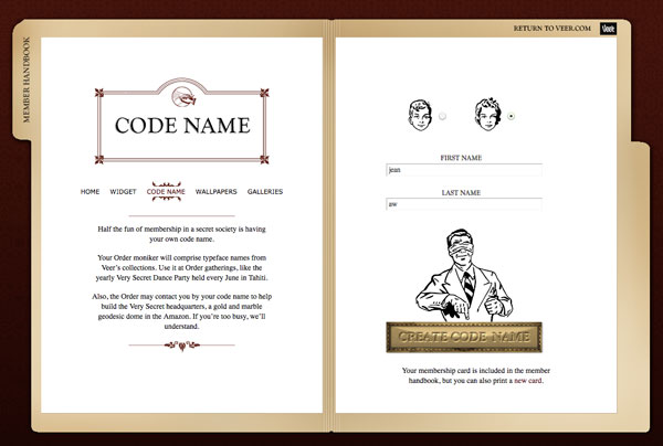
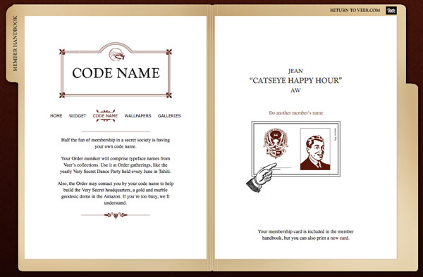
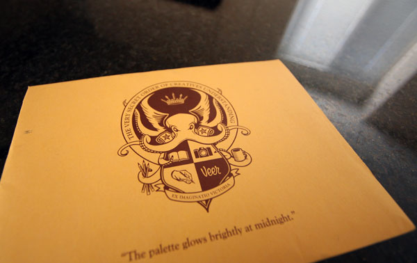 I got this mysterious envelope today, and it contained the membership booklet of
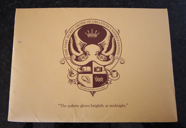


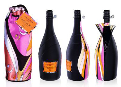
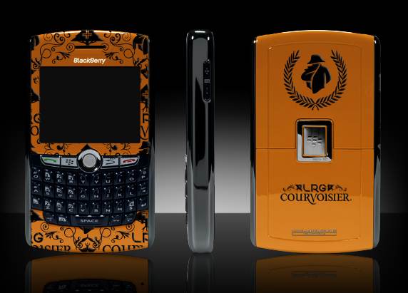
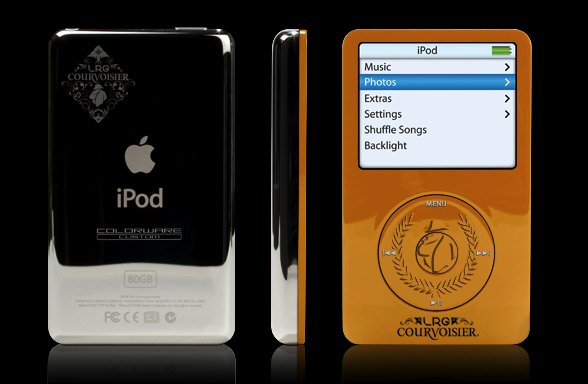
 On collabs i didn’t see coming…
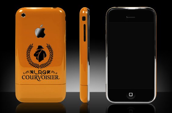

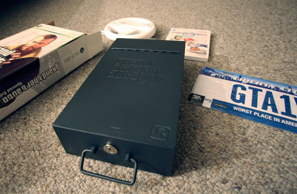
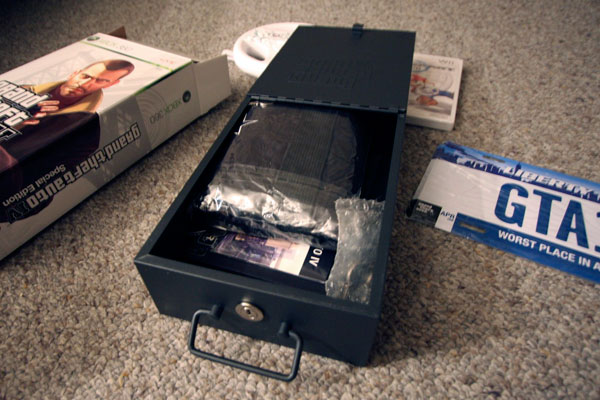
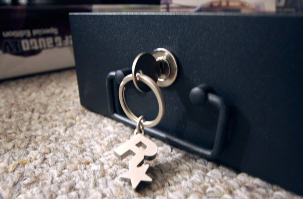
 WiiWare!!! Coming in June ~

 How very surreal tonight has been. After much hmmming and hawwwwing… i ended up at one of those LA massive clubs (


 Back in


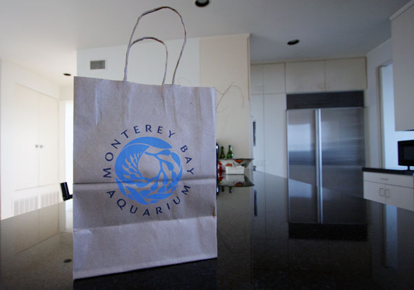
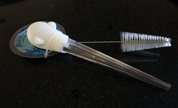
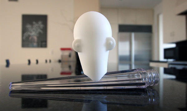
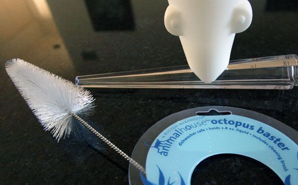
 Impulse buy while at the Monterey Bay Aquarium… a little aquatic indulgence for my kitchen… not that i NEEDED a baster, although i dont have one that amuses me quite like this one. Boston Warehouse AnimalHouse Octopus Baster - over
 ARGH, does anyone else still get the

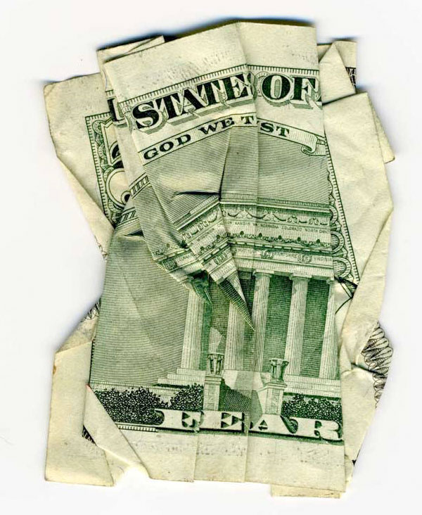
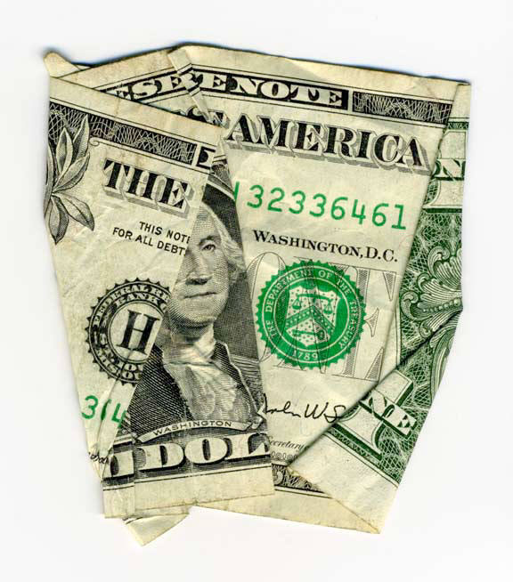
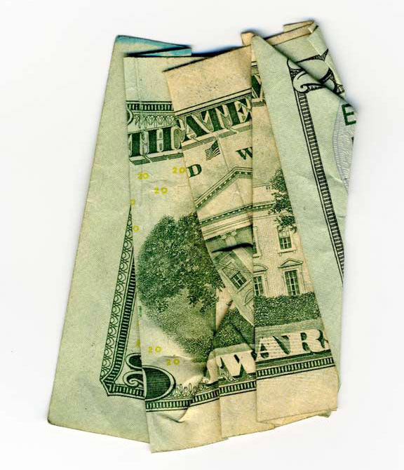
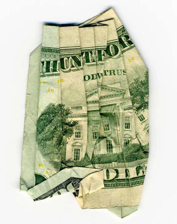
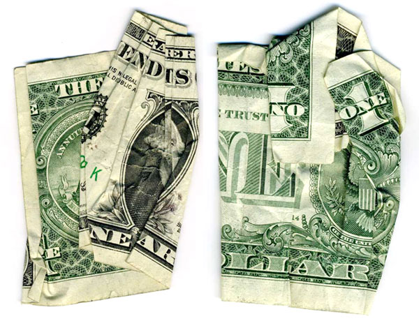 I bet you’re having one of those “i wish i had thought of that first” moments… yes we all have $$$ bills and scanners, have probably played with origami or silly money folding tricks in our childhood… but
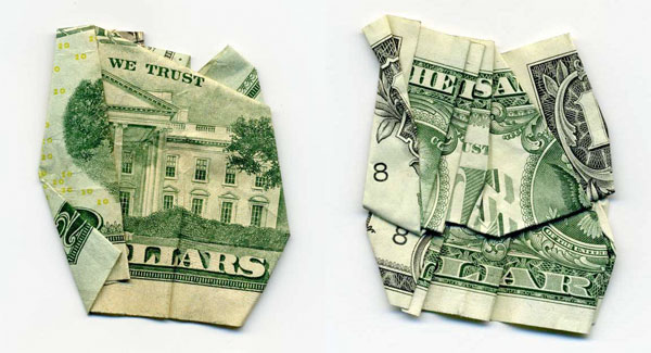


 NOTCOT Note: Here’s another post from Anna of the lovely
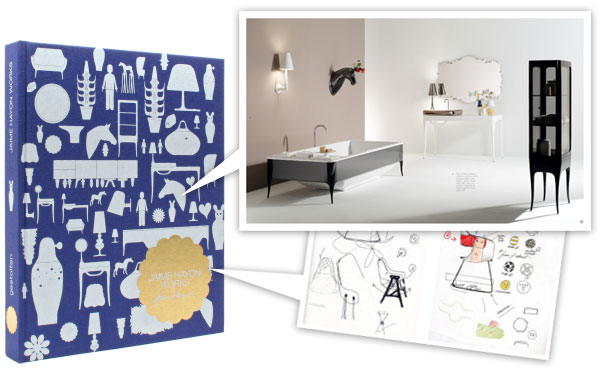
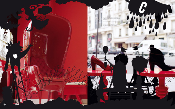
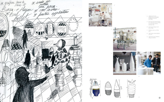
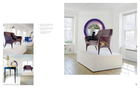
 Look left. Look right. I’m excited to announce that we are showcasing the works of
  Click the images to find out more! And as always - TasteSpotting and NotCouture roundups after the jump! Here are the most popular 25 posts over at

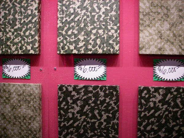
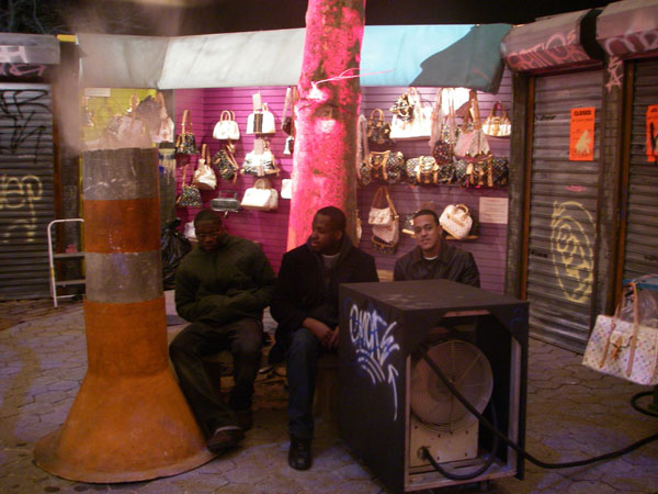
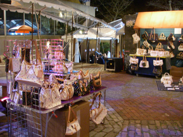
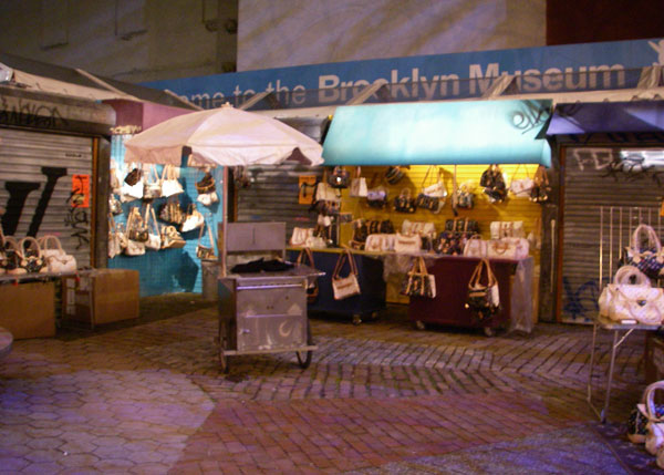
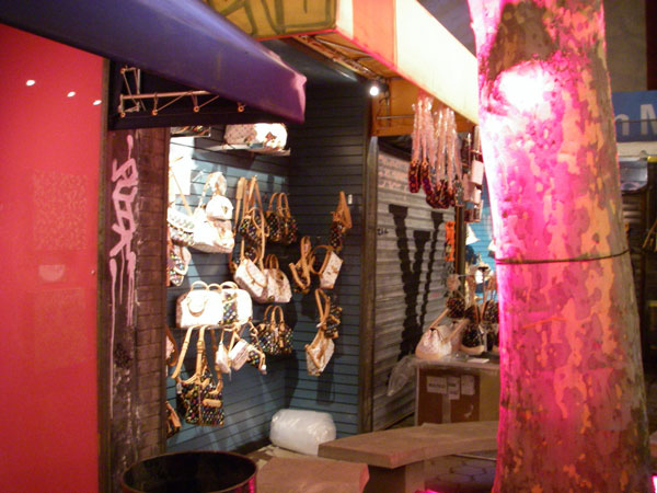
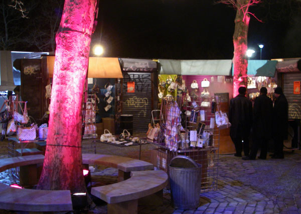
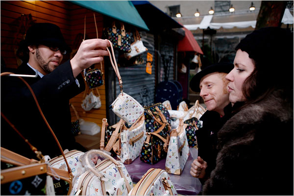
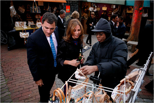
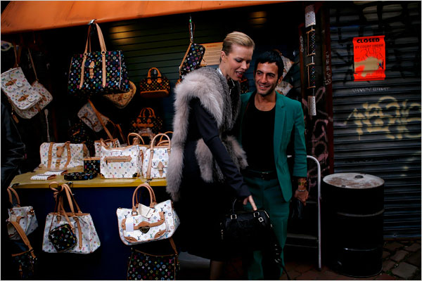
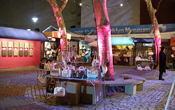 Louis Vuitton is really fighting back against counterfeiting these days. Did you hear about how the
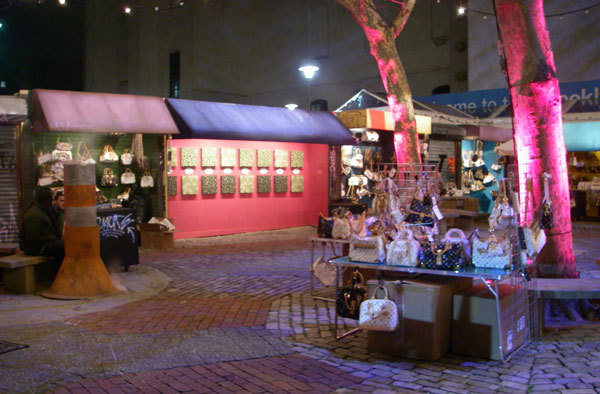
 So my mother sends me an email linking
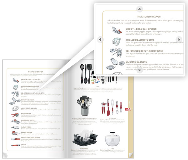

 NOTCOT Note: Here’s another post from Anna of the lovely
 NOTCOT Note: Here is another post continuing on Justine’s (aka


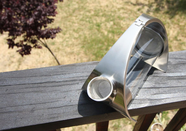
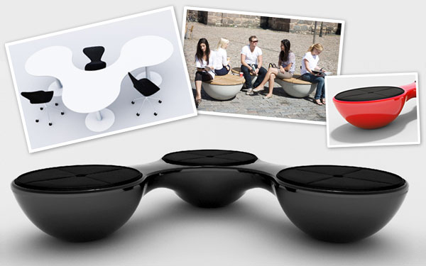
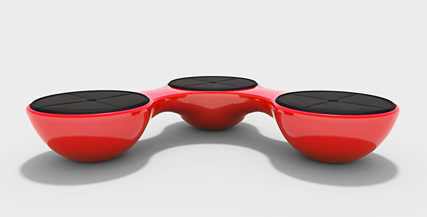
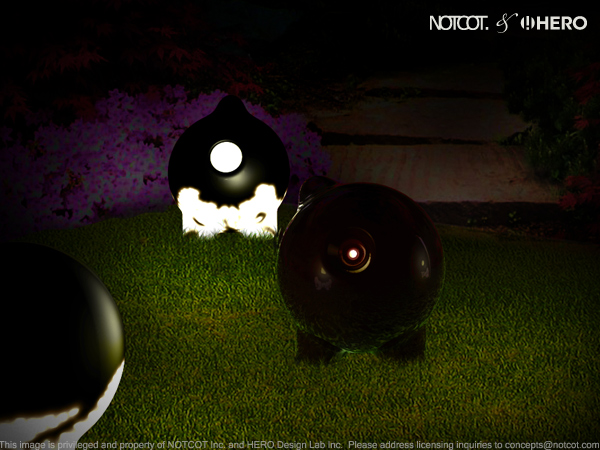
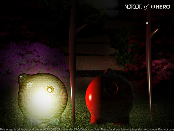
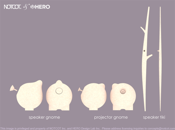
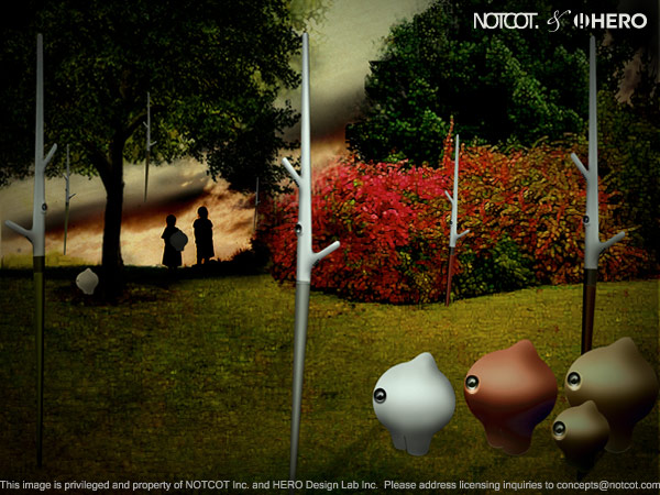
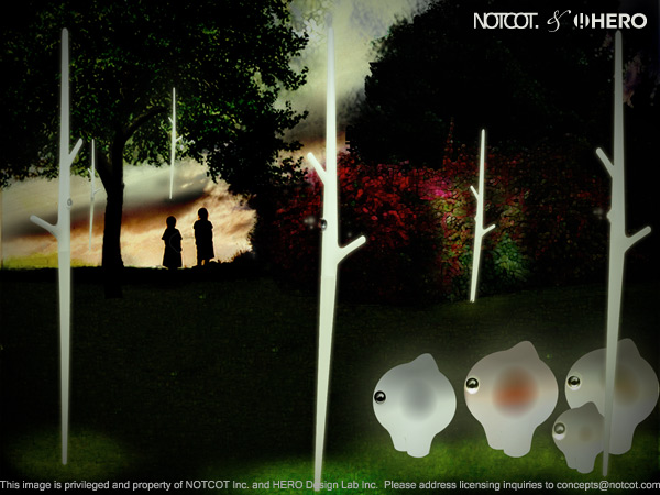
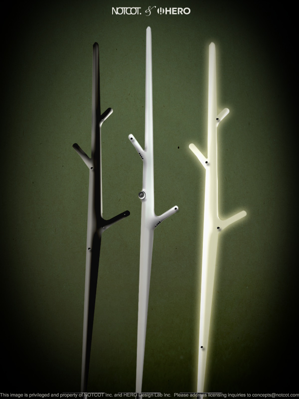
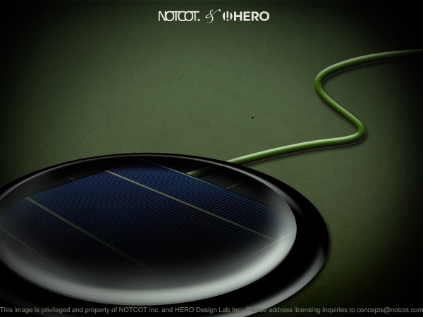
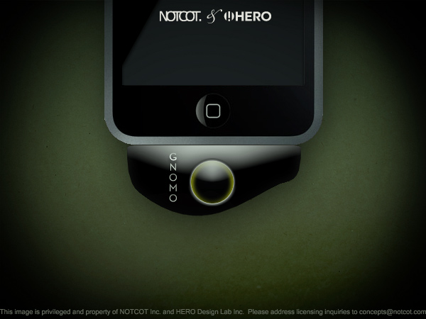
 NOTConcept 002: Outdoor Sound System - [
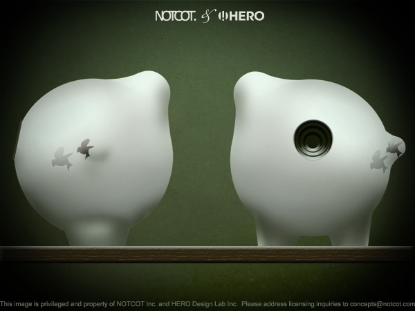
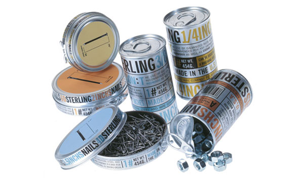
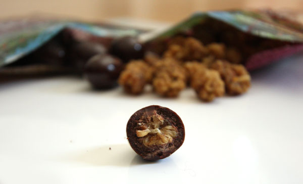
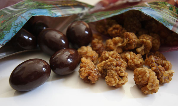
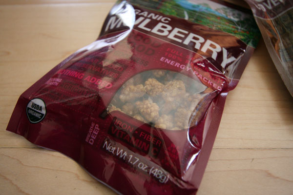
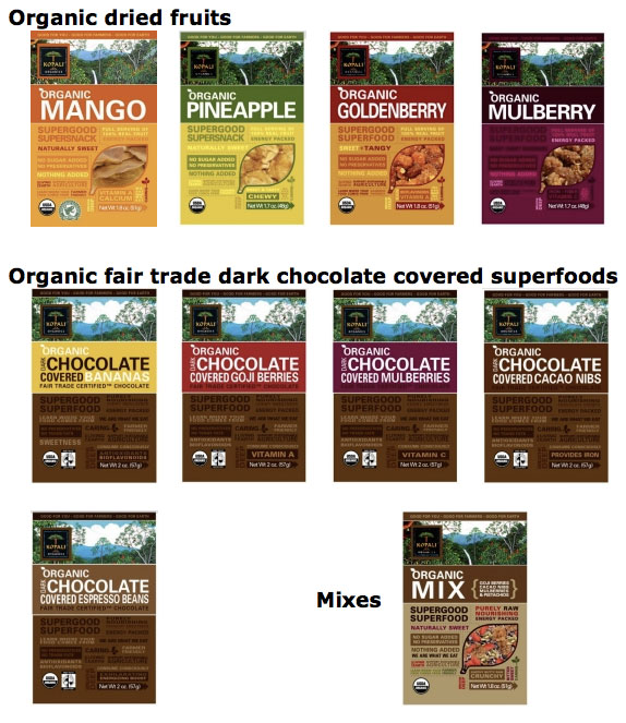
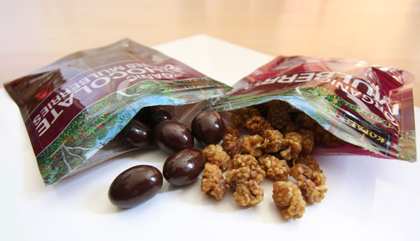 On random buying based on pretty graphic design/typography/packaging… i couldn’t resist snagging two packs of the
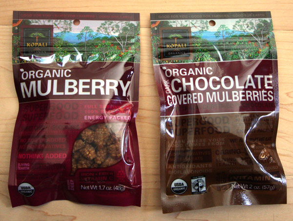
 Would it be terribly bad of me to go to Rome just to see