
007: Quantum of Solace- 11.14.08
 Just got back from the midnight showing of Quantum of Solace… and as a total bond junkie… i still stand by my opinion that the last one was one of the worst… and this one… well, it was off to a good start! Decent intro graphics ~ like the color palette and sandy look ~ awesome techy glass wall and table touch UIs (details like having him spell out “G R Double E N” over the phone, and as he says “double” a W shows up and changes to EE) ~ the aston martin DBS chase scene in the intro ~ tom ford did an incredible job dressing him… The prada dress she wears through the desert is awesome… but seriously, no gadgets? at all? Painfully annoying semi background integrated text telling us when we were in russia, etc? (wtf was up with some of those fonts?) Range Rover was one thing, but Ford? The fight scenes were so badly chopped up, you couldn’t follow what was going on… And could sony’s product placement have been more blatant? I think the sony phones and terrible microPC must have been his only “gadgets”… and the villains weren’t nearly amusingly villainous enough either! Ok ok, anyhow, i think i just needed to vent! BUT… seeing it was a nice excuse for me to post more of Justine’s pictures (she seriously sent me TONS from her National Geographic night out in London).
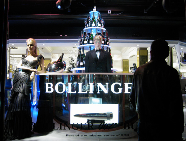
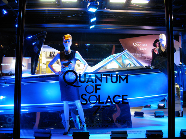
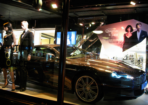
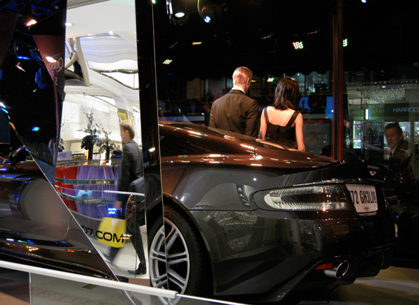
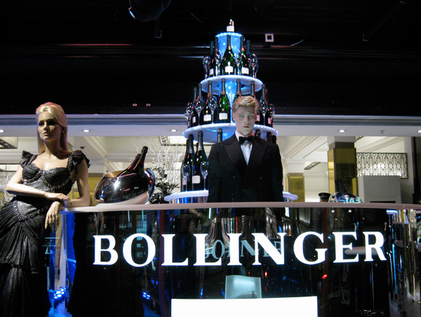
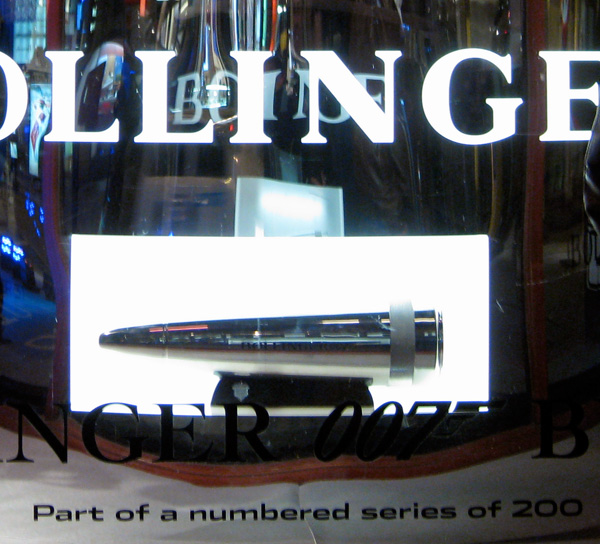
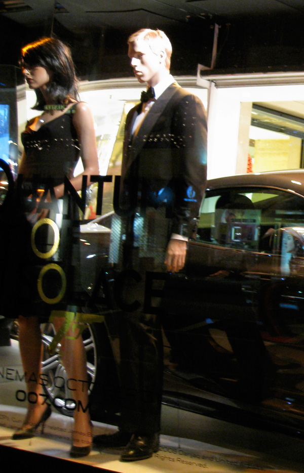
Here are some quick snap shots of the fun Harrod’s Brompton store windows as they closed up the Bollinger champagne bar… as well as the Aston Martin DBS, the Sunseeker speedboat, Tom Ford suit and black Prada dress worn by Daniel Craig and Olga Kurylenko and the latest Omega. Front and center of the bar you can also see the limited-edition Champagne cooler in the shape of a Walther PPK bullet that was featured on Liqurious. Perhaps better than the gadgetry in the film is the motion activated display at Harrods, where upon walking by you trigger clips from the film to play… Anyhow, check out more pics and info on the next page!
From the Harrod’s Site:
From 25th October 2008
To celebrate the long awaited release of the latest Bond film, Quantum of Solace, we’re showcasing an unmissable array of 007 icons at Harrods.
Visit our Knightsbridge store until January 2009 to view the very same Sunseeker speedboat (exhibited until 22nd November 2008) and Aston Martin DBS driven by Bond in Quantum of Solace, on display in our Brompton Road windows. The Aston Martin DBS is one of only five used in the film worldwide.
Plus, get an up-close peek at the Tom Ford suit and black Prada dress worn by Daniel Craig and Olga Kurylenko, modelled as part of this unique window display. A limited number of replica versions of these garments are on sale exclusively at Harrods.
You can also take a bite of Bond’s style with a globally acclaimed Omega watch. Visit our Fine Jewellery Room, ground floor for further information.
To watch the new film in optimum audio and visual glory, check out the latest home entertainment technology in our Sony department, third floor.
When you’ve finished perusing these exciting Bond collections, you can share in 007’s favourite off-duty indulgence - a glass of fine Bollinger Champagne. View the bottles on display in our specially built Bollinger Champagne Bar. Located for a limited time only in Harrods’ front windows, the Bollinger Bar inspires a toast to the return of Britain’s favourite spy.
Those who favour a soft refreshment can also purchase the new limited-edition glass Coke Zero bottle with a special Bond design, available exclusively from Harrods’ Food Halls, ground floor.
If this action packed line-up isn’t enough to leave you thoroughly shaken and stirred, you can also enjoy clips from Quantum of Solace playing in a compelling motion-sensitive exhibit in our Brompton Road windows.


I am to Bond what those chubby light saber kids are to Star Wars. I mean me and my friends donned full suits to this thing and it was terrible! It was so bad we had to come back and watch some classic Goldeneye to remember what a story line was and get the terrible bad movie taste off our brains. SOLACE=FAIL
----- JFK 21.11.08 00:52