*NOTCOT in
me - 05.12.19 -

UPDATE Oct 2019 - Our little NOTbaby is 4 months old now! For those who have asked, I’ve put together a NOTbaby List of products that have worked out well for us from Pregnancy to Baby (and will keep updating as we progress!) - It’s an Amazon affiliate storefront, because we’ve been using Amazon Prime a lot for the convenience during exhaustion! The tiny % of affiliate revenue that comes from any shopping through the NOTbaby List will go towards diapers and more baby goods!
Ooh it has been a while - nearly a year and a half of resisting internet brain dumps and oversharing. So i figured, today is as good a day as any to give things a try and see how it still feels… after all, i feel like there’s a basketball in my belly and typing seems better than waddling about. In a nutshell, NOTCOT.org is still where i’ve been sharing random inspiration daily (and it too has had some changes), Shawn and i are still a pair of creative junkies (though we’ve been channeling our creative energies towards secret projects!) and we’ve since gotten married and have a baby boy on the way (he could pop out any day now? or maybe a month from now?)… and the biggest shift has ultimately been taking (giving myself?) time away from oversharing on the internet after a decade and a half or so to finding the headspace to reassess where i’m at and what i want next!
All in all, i’m now 36 weeks pregnant with a belly that looks like it engulfed a basketball, and from what i hear… going through labor and raising a newborn will produce some fantastic chemicals that may make one crazy enough to consider going through this whole pregnancy process AGAIN… so before that happens, it seemed like a good time to round up some thoughts, products, and other silliness before i forget it all!
TO PAGE 2 of "Mother’s Day 2019: pre-baby stuff"! ----->
*NOTCOT in
me - 12.31.17 -
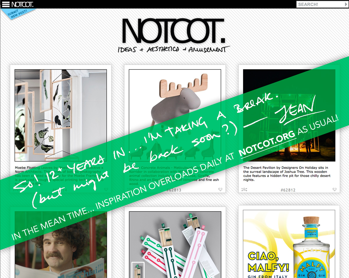
HEAD OVER TO NOTCOT.ORG FOR INSPIRATION OVERLOADS UPDATED DAILY! (As usual…)
First posted in Sept, but then i got excited for a little burst again… but trying again for the new year? If you want to talk about what’s next, have a fun project to work together on (design, real estate, etc.)… ping me! And the same disclaimer stands, i’m sure as soon as i try to do this, i’m going to stumble across something that blows my mind and i have to tell you?
Hi there. Let’s make this official - i’m taking a break from the bloggy part of NOTCOT! (Insert deep sigh of relief?) It’s been 12 and a bit years, and life has taken so many twists and turns and it’s been a roller coaster ride around the world and internet - so, THANK YOU to all of you who joined the ride! Until the last year or so, everything that i found and loved i shared here… my brain has been a design junkie for 3 decades!
As someone that craves newness like no other… it was inevitable that i’d need to keep shaking things up in my life, and lately that has turned to other projects and endeavors that are less internet-shareable (for the moment.)
SO… i’ll be back. Possibly tomorrow. Possibly 298 days from now. Your guess is as good as mine? But first things first, i’m officially saying i’m on a break from blogging. Let’s see where that leads.
If you’re curious what i’m up to, or want to collaborate or brainstorm or make amazing things together - let’s talk? I’m still happily doing the NOTlabs things and the real estate thing and… well… quite a few other things too!
And again… HEAD OVER TO NOTCOT.ORG FOR INSPIRATION OVERLOADS UPDATED DAILY! (It’s business as usual over there! and to be honest, it’s really hard to break the daily habit of sharing things that inspire me!)
2018 is finally here!!! Happy New Year ~ may 2018 be all we hope it will be and more!
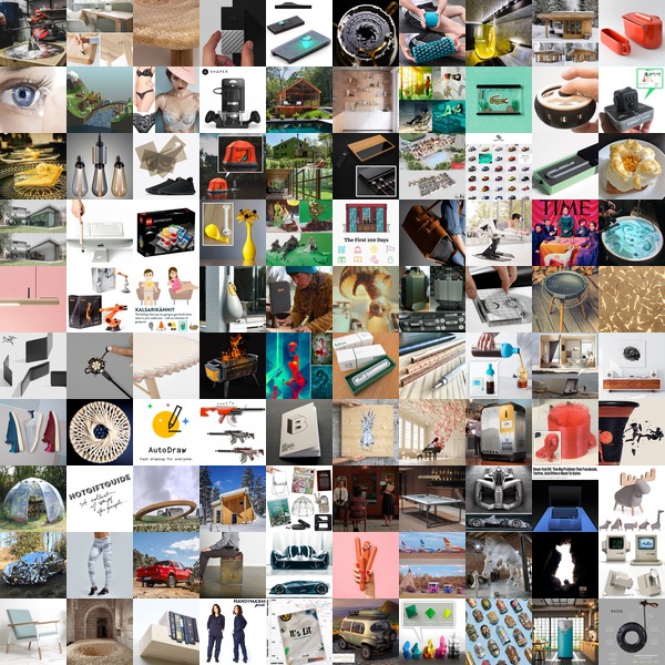
Here are the top 100 from 2017 on NOTCOT.org ~ click the squares to find out more!
*NOTCOT in
design - 12.18.17 -
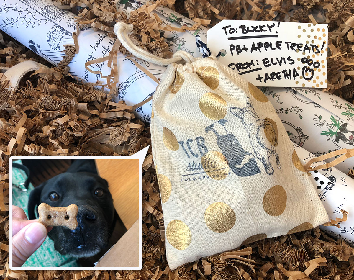
When a mysterious package arrives with adorable dog illustration tape and Bucky rushes to it (and won’t leave it alone) - you know it’s something good! We just received the cutest surprise from TCB Studio (which stands for Taking Care of Business Elvis & Aretha style) is the brainchild of Charmaine Choi in collaboration with illustrator Annie J Lim. From instagram, it looks like Charmaine has been busy silk screening all the goodies with her adorable pups (Elvis & Aretha!) in their adorable Cold Spring, NY home! Take a peek at all the goodies from wrapping paper and print, to tote bag and notebooks… and the pb+apple treats bucky sniffed right out on the next page…
TO PAGE 2 of "TCB Studio Howliday"! ----->
*NOTCOT in
design - 12.15.17 -
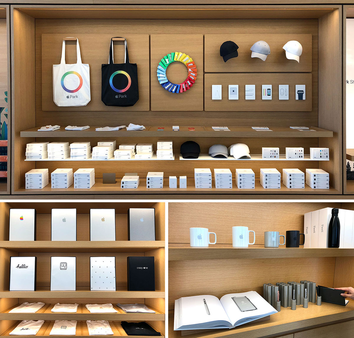
If you find yourself in or near Cupertino, and either are or know an Apple fanatic… it’s worth popping into BOTH the new Apple Park Visitors Store and the One Infinite Loop Store for gifts and offline exclusive goods… from t-shirts and totes, to hats, baby onesies, japanese hasami porcelain mugs, memory cards, postcards, iphone matching metal pens, swell water bottles, notebooks and more. And of course they are all beautifully packaged and perfectly gift ready. For whatever reason, the two stores have very different goods, so it’s worth seeing both - while Apple Park was an amazing space to go see, Infinite Loop had better products. (And keep in mind, products seem to rotate, so stopping by when in the area might be worth it?) Take a look at what we found there this week on the next page!
TO PAGE 2 of "Apple Store Offline Exclusives "! ----->
*NOTCOT in
design - 12.10.17 -
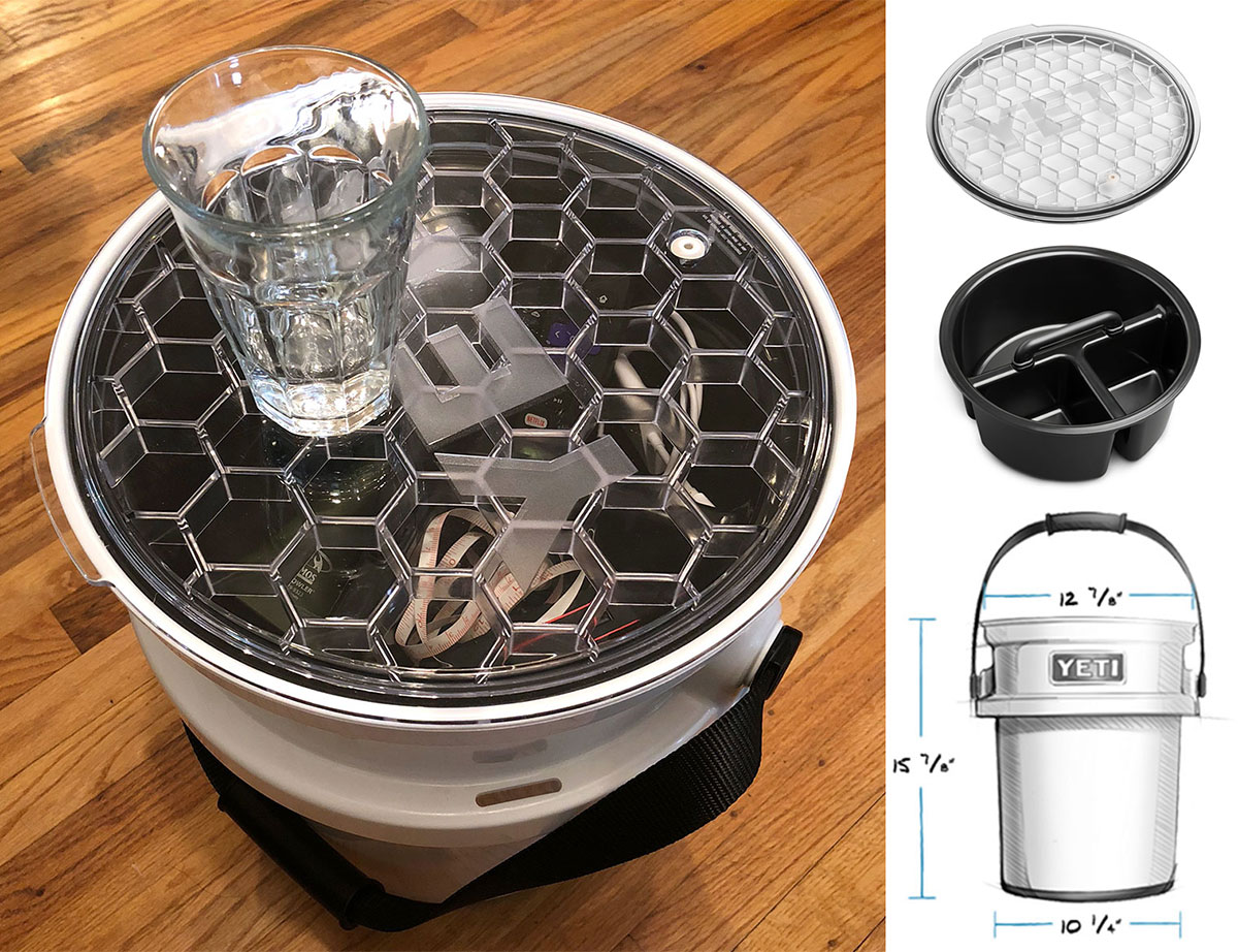
On surprising birthday presents, just received the YETI Loadout Bucket complete with caddy and lid and i must say… who knew i could be SO excited about a BUCKET?!?!?! Like all things YETI, all items feel over designed (physically + graphically) in a fantastic way. Non slip, food safe, super strong, comfy handle… every detail has been carefully thought through. Even amazing little details like the super strong lid that basically looks like a giant version of what you’d find on their Rambler tumblers (but with super hexs!)… and the caddy has a handle that drops down so you can put the lid on! And while you can use the bucket for everything you can think of (and they have quite the list of ideas too - be it for fishing, hunting, camping, brewing and beyond…) it’s also functionally solid enough i’m currently using it as a stool/storage/side table in the living room. Even the packaging of the accessories is impressively over designed! Take a look at all the details on the next page.
TO PAGE 2 of "Unboxing: YETI Loadout Bucket"! ----->
*NOTCOT in
design - 12.05.17 -
*NOTCOT in
design - 11.30.17 -
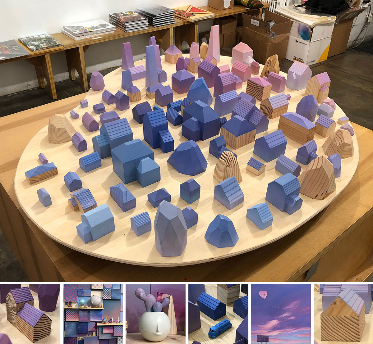
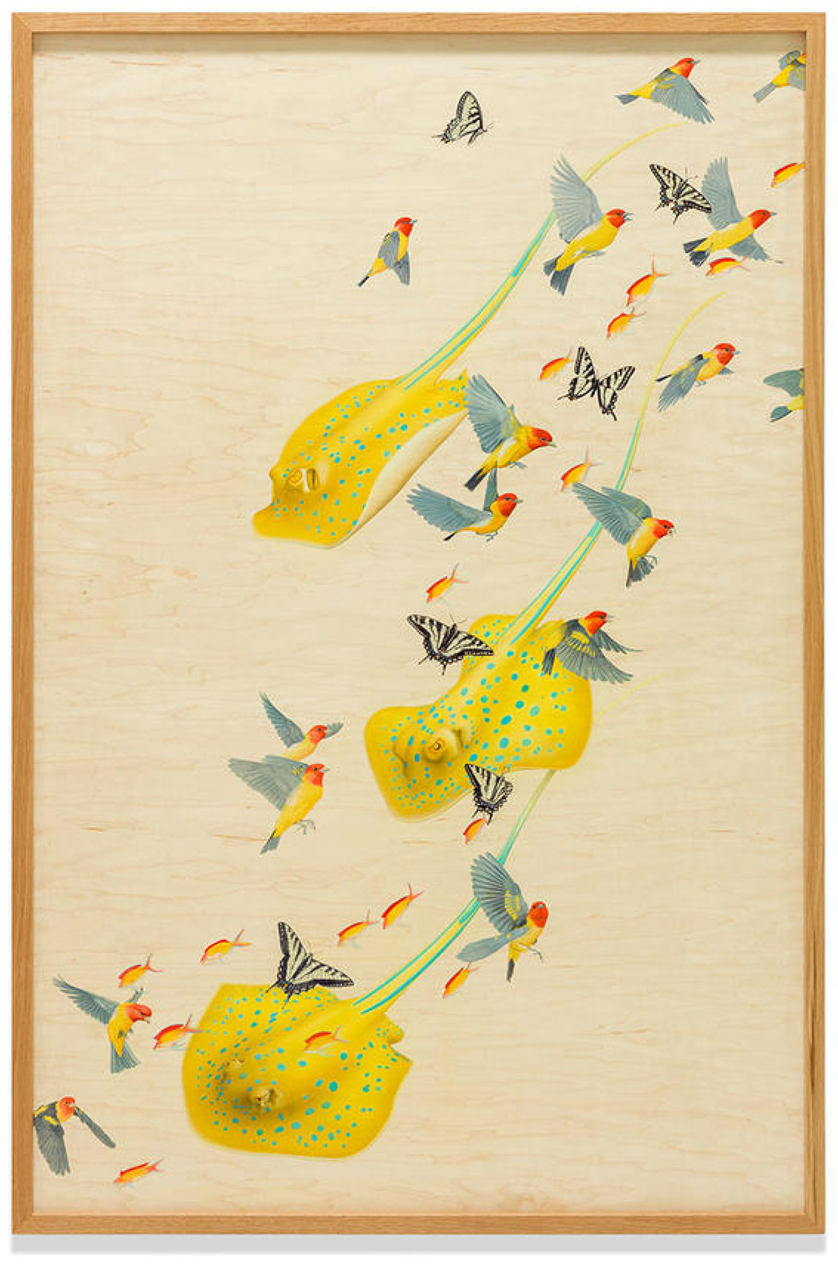
It’s been a little while since i’ve seen pictures of a gallery show floating around the feeds and thought - omg i need to see that! Well Yoskay Yamamoto’s Homebound show at GR2 did just that, and we luckily happened to wander by after dinner on the closing day of the show! The Sunset Village with Lavender Moon installation steals the show. (Even though previous photos made me expect to walk into a room FILLED with MUCH larger little houses!!! Which would still be an incredible exhibition that i would definitely HAVE to see.) Beyond the gorgeous palette, there are so many delicate and precise details that pull you in - from the shingles on the roof to the grain in the wood… i couldn’t stop staring, and even had to remind myself to snap a few pictures so i could remember it forever. Take a look on the next page!
p.s. I’m not sure if it’s the residential real estate projects we’ve been working on lately, or just thinking about single family homes and researching so many aspects of them daily… but definitely feeling extra drawn to the mix of art + houses! Now i’m itching to make minis of our actual houses… or paint one inspired by these!
TO PAGE 2 of "Homebound by Yoskay Yamamoto"! ----->
*NOTCOT in
design - 11.09.17 -
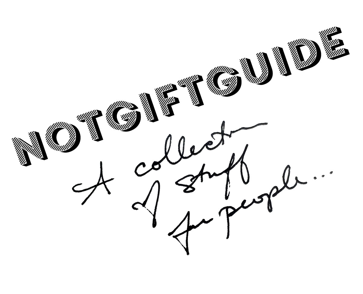
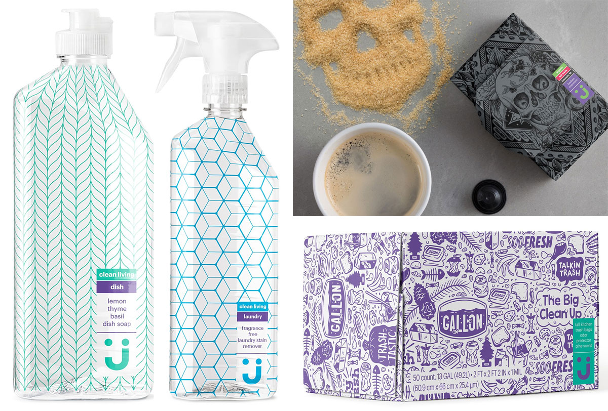
NOTCOT Collection Of Stuff For People!!! Things we love, things we want, and things we’ve either bought or nearly bought for friends. There’s a little random awesomeness for everyone on our lists here…
Gift guides often get so formal with the categories and over-simplification of your recipient’s interests… or they push things people want you to buy so hard. This is more just a list of awesome stuff we like that you COULD give someone - or buy for yourself. The only criteria? We like it.
Explore the collection on the next page!
Also… for EVEN MORE random ideas - i’m slowly adding stuff we have/love to this NOTCOT AMAZON SHOP ( Where yes, we make pennies on the dollar off things you buy, but we’re sharing because we’re addicted to the instant gratification of Prime and really use it, not for your pennies. Though every penny helps my Prime addiction?)
TO PAGE 2 of "NOTGIFTGUIDE 2017"! ----->
*NOTCOT in
design - 11.06.17 -
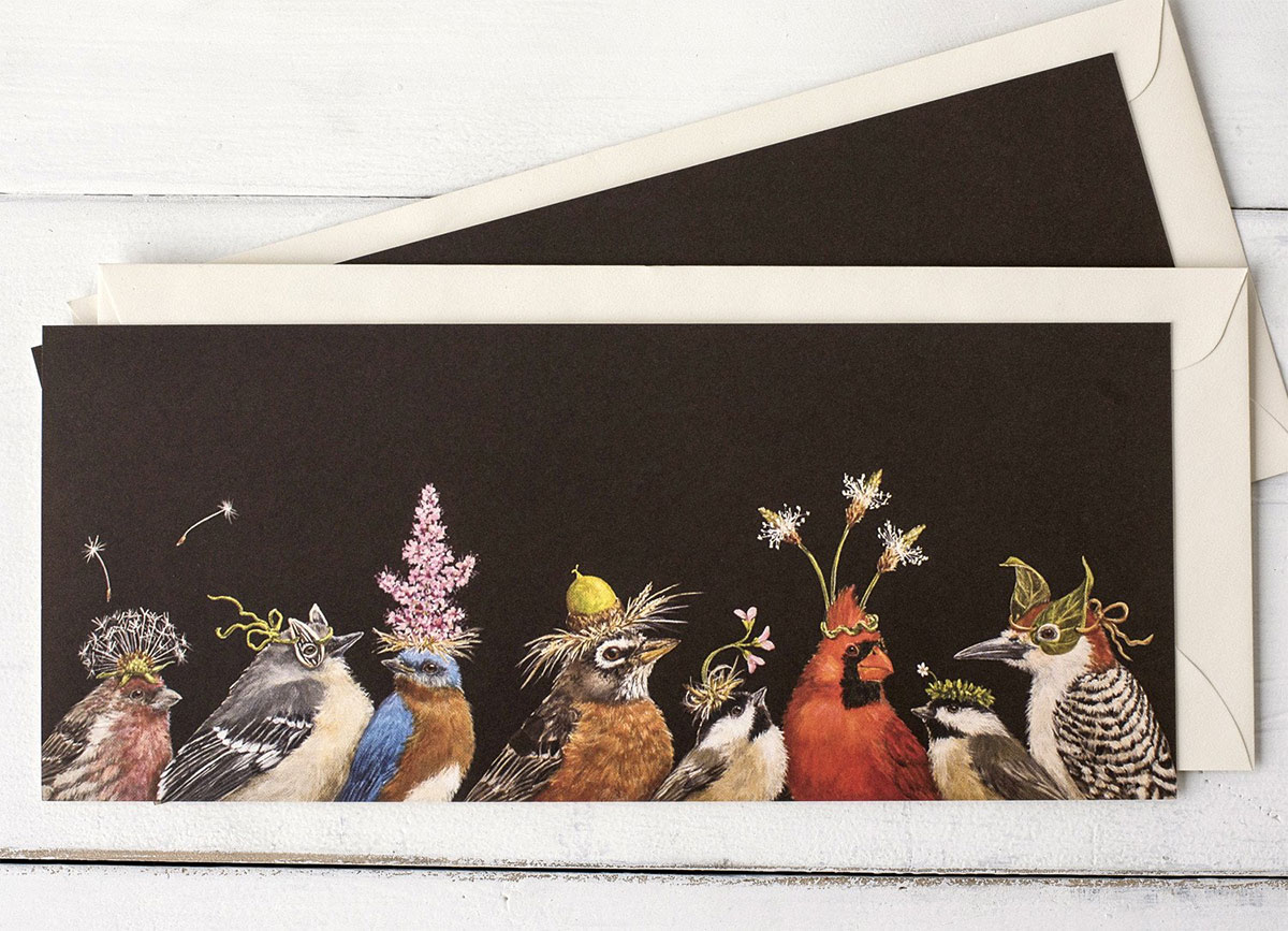
How can you not smile when you see a bunch of realistic little birds with party hats made out of flowers and leaves on their heads? We received one of Vicki Sawyer’s playfully illustrated bird party cards a while back, and i only just dove into the rest of her work! It turns out she has quite the line of cards, placemats, place cards, and even a coloring book with Nashville based, Hester & Cook, and she is actually based right in Franklin, TN! In addition to birds, you’ll find lots of other creatures ~ from dogs to sheep to pigs and more, also, of course, with fun hats and accessories. Additionally, her artwork has been licensed on other products as well, from embroidery kits to mugs and more. She has also created three party bird filled books which can be ordered in print or digital forms.
But first, take a look at some of my favorite Hester & Cook by Vicki Sawyer picks on the next page!
TO PAGE 2 of "Vicki Sawyer’s Bird Parties"! ----->
*NOTCOT in
food+drink - 11.05.17 -
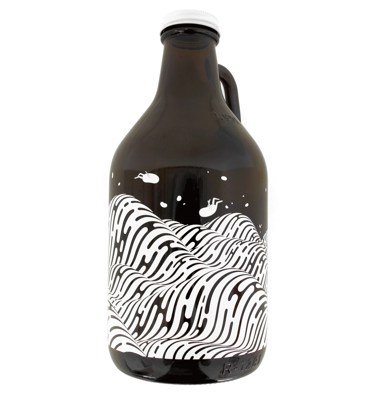
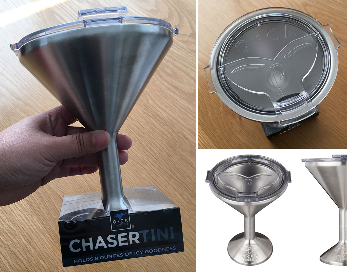 What do you get someone who has everything… loves fishing, the great outdoors, and an ice cold martini? The ORCA Chasertini! It’s essentially a martini glass meets super insulted travel cup meets… medieval chalice?
Absurd, right? Ridiculous even? Well, even crazier, i’m totally impressed by it! We just got one for my dad, and while it was meant as a fun, silly gift, it’s proven far more functional than we thought! It really does keep your drink cold longer, and with a lid, it’s totally an adult sippy cup of sorts. For the animal lovers, their whale tail (with fishing hook detail) keeps the top closed, and can be flipped open to drink. The base is non slip, and the size is LARGE. It can hold 8oz of liquid and keep it icy cold, or super hot, depending on what you’re using it for. They are also designed in Nashville, TN!
See all the details on the next page! (And on a side note, the more i research, they more curious i am about trying out one of their coolers next! Perhaps YETI replacement time?)
TO PAGE 2 of "ORCA Chasertini "! ----->
*NOTCOT in
design - 10.25.17 -
*NOTCOT in
design - 10.24.17 -
*NOTCOT in
home+decor - 10.23.17 -

Tray Tables! Tables where the top is a removable tray. SO simple. SO basic. And you can really just take a tray you already have and love and give it some legs and call it a tray table. Lately i found myself loving some basic, minimal IKEA ones, and it sent me down a path researching some other clean, simple versions as well… so naturally, i couldn’t help making a post to share what i found (and keep track of some of the ones i liked!) Check them out on the next page!
TO PAGE 2 of "Tray Tables "! ----->
*NOTCOT in
design - 10.16.17 -
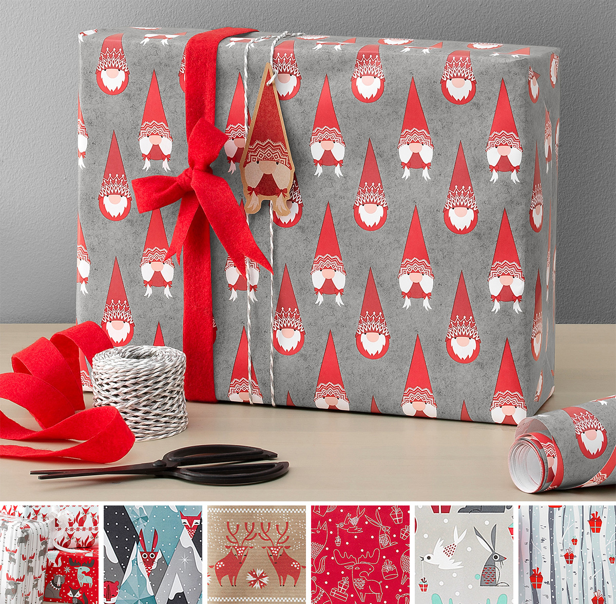
On adorably cute, happy, festive things (even though it’s mid October and feels WAY too early for xmas) - just came across the holiday displays at IKEA, and the IKEA Vinter 2017 collection of gift wrap made me smile! The playfully hairy gnome/elf/santa guys are too funny and the wintry woodland creatures are just so cute! From the popping eyes of the rabbits to the wiggly antlered moose and the serene deer and bears and more… Take a peek at my favorites on the next page!
TO PAGE 2 of "IKEA Vinter 2017 Gift Wrapping"! ----->