
Lesser Evil- 03.04.06
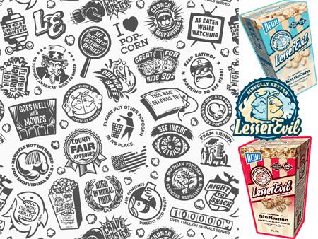 Ever wonder what it would be like if graphic designers made food? Well here you go. The packaging and marketing of this crazy Lesser Evil Popcorn (found it at Whole Foods today) is brilliant, and extremely well thought out (down to the logo faces lining up on the tabs when you open the box). But best of all is really this pattern of graphics they designed which is on the foil/plastic wrap in the box, as well as a desktop wallpaper available on the site. The kettle corn wasn’t bad, but not spectacular, but its definitely worth checking out for the fab packaging. Perhaps i will need to try the cinammon, peanut butter/choc, choc, and bbq flavors as well. My favorite graphics - the Shark saying “High in Crunchability”, the “High in Moral Fiber”, the “Kernels not intended for individual sale” with barcode, the “American Popcorn Growers Association” logo is priceless, and the “Aim contents directly into mouth”… not to mention the best logo ever.


I haven’t tried this but I plan to. Apparently the Cinnamon flavor is the best. Interesting note - did you know that this is Jim Cramer’s, of Mad Money, product?
----- David 12.05.06 14:55