
Saks Mixes it Up- 12.24.06

Pentagram takes Saks Fifth Avenue’s branding to a new level - nearly a googol of possible logo iterations and STILL have people know its Saks? That’s the type of proposal that most designers would run, hide, and cry about.
Waking up and seeing the post at 30gms that pointed me to Michael Bierut’s Pentagram post has had me giddy all morning… the black and white, the mathematical shuffle, the balls to slice up a clients logo till nearly unrecognizable and still so perfect… i LOVE the boxes and and imagery it creates, and it scales endlessly. “A new identity designed by Pentagram for iconic New York retailer Saks Fifth Avenue launches on January 2, 2007. Partner Michael Bierut describes the process behind the development of an identity with more variations than there are electrons in the known universe.” The post (case study) itself is so beautifully written, it will leave you with more branding understanding than most intro courses.
![]()
There really is something so gutsy and brilliant to be able to combine such a throwback to their original cursive driven logo… while still creating something so versatile, “spottable from across a busy street”, and somehow forward looking and emanating endlessly possibility.
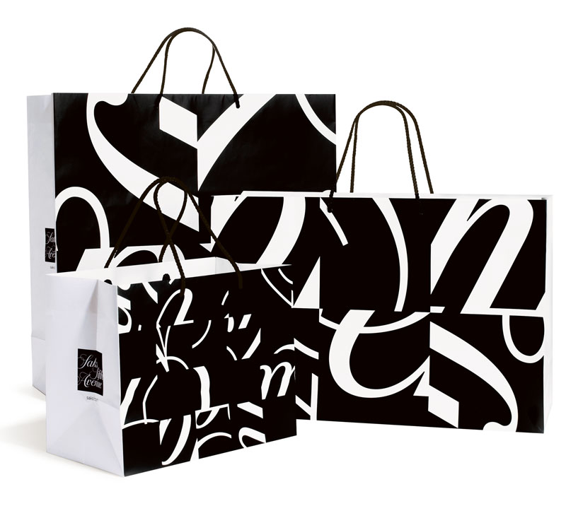
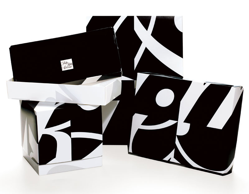
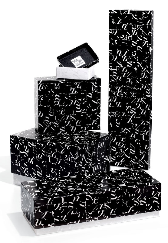
“Most importantly, there are over forty different packages in the program, from jewelry boxes to hat boxes, and four sizes of shopping bags. In the new program, no two of these are alike, yet they all go together.”
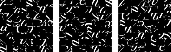
And the math minor that nearly went major in me loves this paragraph… “The 64 tiles can then be shuffled and rotated to form an almost infinite number of variations. We say almost infinite, but obviously there’s a fixed number of possibilities. Curious about what that might be, we consulted a friend who’s a graduate student in theoretical physics at Yale. He calculated that the number of possible configurations is in fact 98,137,610,226,945,526,221,323,127,451,938,506,431,029,
735,326,490,840,972,261,848,186,538,906,070,058,088,365,083,852,800,000,000,000. He helpfully pointed out that this is nearly 100 googols (a googol is a 1 with 100 zeros after it), and many times the number of electrons in the known universe.”


Looks like Saks finally got it right. This logo is just the end result of the last five years of a ship with no rudder. It’s painful to watch a bastion of retailing sink like the Titanic. They were once the best, they knew who they were, knew who their customer was and delivered a product that was the envy of their competitors and the dream destination of every supplier.
The new logo actually tells a graphic tale of the currrent state of this iconic institution. 64 squares, each one a portion of the what the company once was all going in a different direction, making no sense together and rendering the former great company unrecognizable.
----- Anonymous 06.01.07 11:16