*notcot in design , 08:22

Quotes from Hulk4598- 07.06.09

quote1.jpg 
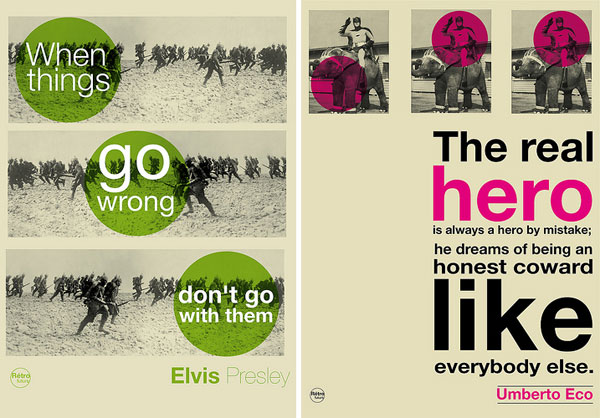
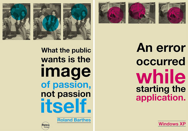
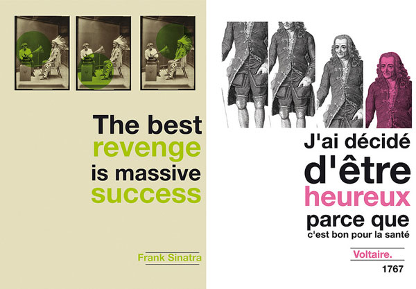
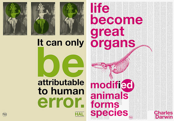
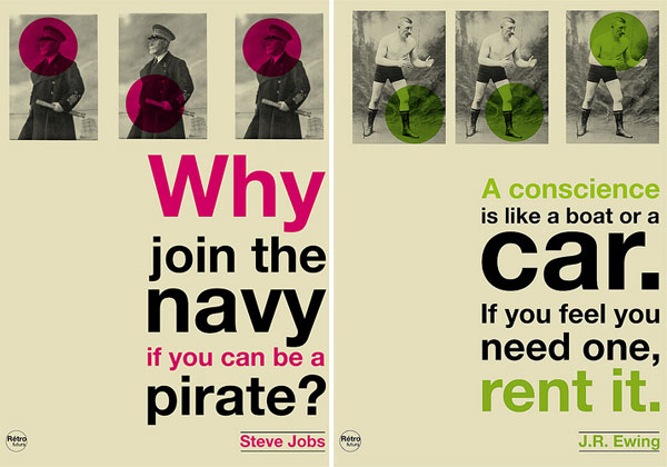
Last night ended up going through all of flickrer Hulk4598’s quotations, and while i’m still a bit mixed on the circle thing ~ his pictures are hilarious, and quotes… quite awesome. So here are a few of my favorites on the next page to kick off your Monday.


quote2.jpg

quote3.jpg

quote4.jpg

quote5.jpg

Tags:

12 Notes

There is perceptibly a lot to identify about this. I assume you made some good points in features also. Wow, that’s a time saver! Thanks!

----- Natasha Bedingfield 30.11.10 18:03

Even if he was, are first year design students not allowed? Jeez.

----- Eleanor Reagh 24.07.09 00:57

-THE SLAPSTER

that bio clears a lot up. sorry if i offended anyone…i suppose my design program’s made me a bit of a snob sometimes. he doesn’t even study design 0_o oops.

----- Kelley 11.07.09 19:13

love the quotes. don’t get why the circles… but they certainly did catch my attention!

Ben
http://www.vidafine.com

----- Ben 08.07.09 23:44

hey fuck you! i liked them, it has nice concept and aesthetics

----- aliennumberone 08.07.09 21:10

@Kelley: Read his bio on Flickr, it may clear up some things. And I found most of these clever & amusing, everybody’s a critic these days!

----- The Slapster 08.07.09 17:26

I like the colors, and the quotes are amusing, but the design seems to fall short of the ideas.

----- Zoe 08.07.09 10:00

Kelley ~ really? you’re not sure why i posted it? I told you in the post that i posted it b/c the quotes were quite awesome. =)

----- jean/NOTCOT 08.07.09 04:39

eh he seems like a first year design student

a.) he doesn’t need to repeat the image 3 times. it’s a little desktop publisher-y
b.) the circle communicate nothing, they’re just fluff elements.
c.) and like tom mclean up there said: the type is kind of boring.

not really sure why you posted this notcot…

----- Kelley 07.07.09 23:28

very interesting. perhaps the dots are a reference to john baldessari. or maybe they’re just dots.

----- thuy 07.07.09 13:36

I like the concept, the colours and illustrations but the typography leaves a lot to be desired.

----- Tom McLean 06.07.09 10:38

Great!

----- Denis 06.07.09 08:45


Copyright NOTCOT INC 2005-2019 - Privacy Policy - Work In Progress! Please be nice!