
A World Mapped by (Facebook) Friends- 12.14.10
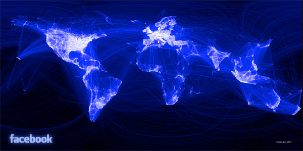
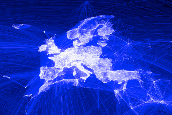
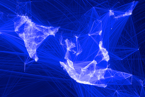
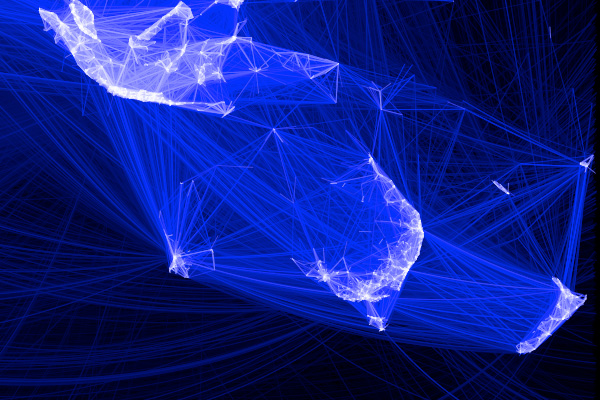
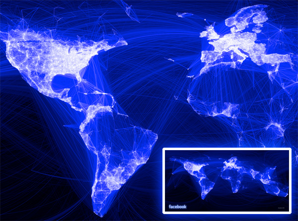 Facebook data infrastructure engineering team intern, Paul Butler, has made a beautiful infographic mapping friendships through plotting their coordinates and connections… and what lit up looks a lot like the Earth At Night!
Butler’s goal? “One that piqued my curiosity was the locality of friendship. I was interested in seeing how geography and political borders affected where people lived relative to their friends. I wanted a visualization that would show which cities had a lot of friendships between them.” And how did he do it? “I began by taking a sample of about ten million pairs of friends from Apache Hive, our data warehouse. I combined that data with each user’s current city and summed the number of friends between each pair of cities. Then I merged the data with the longitude and latitude of each city.”
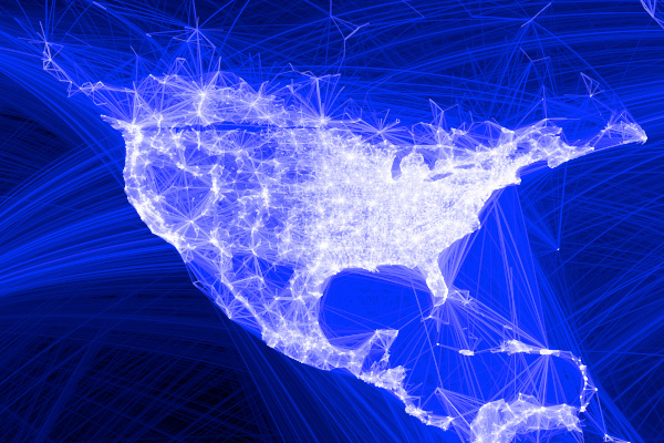
See close ups, as well as comparisons between his infographic and the Earth at Night on the next page…
 View paul’s high res pic here
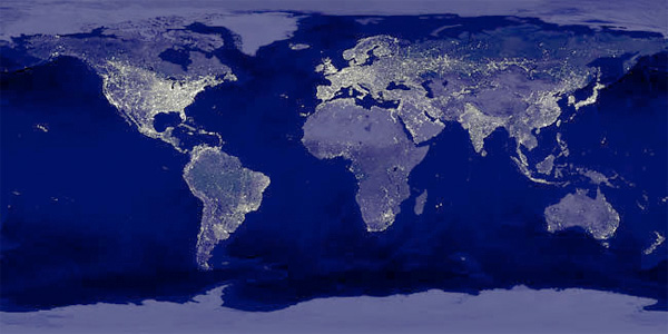 Earth At Night! The classic NASA pic from 2000 - Credit: C. Mayhew & R. Simmon (NASA/GSFC), NOAA/ NGDC, DMSP Digital Archive
Isn’t it incredible seeing how similar they are? Pretty much everywhere where people are, is fully lit up by facebook accounts…


Ah, nevermind that comment, I should look a bit further next time.
----- Matt Hoving 15.12.10 14:07