
Symbaloo- 08.02.07
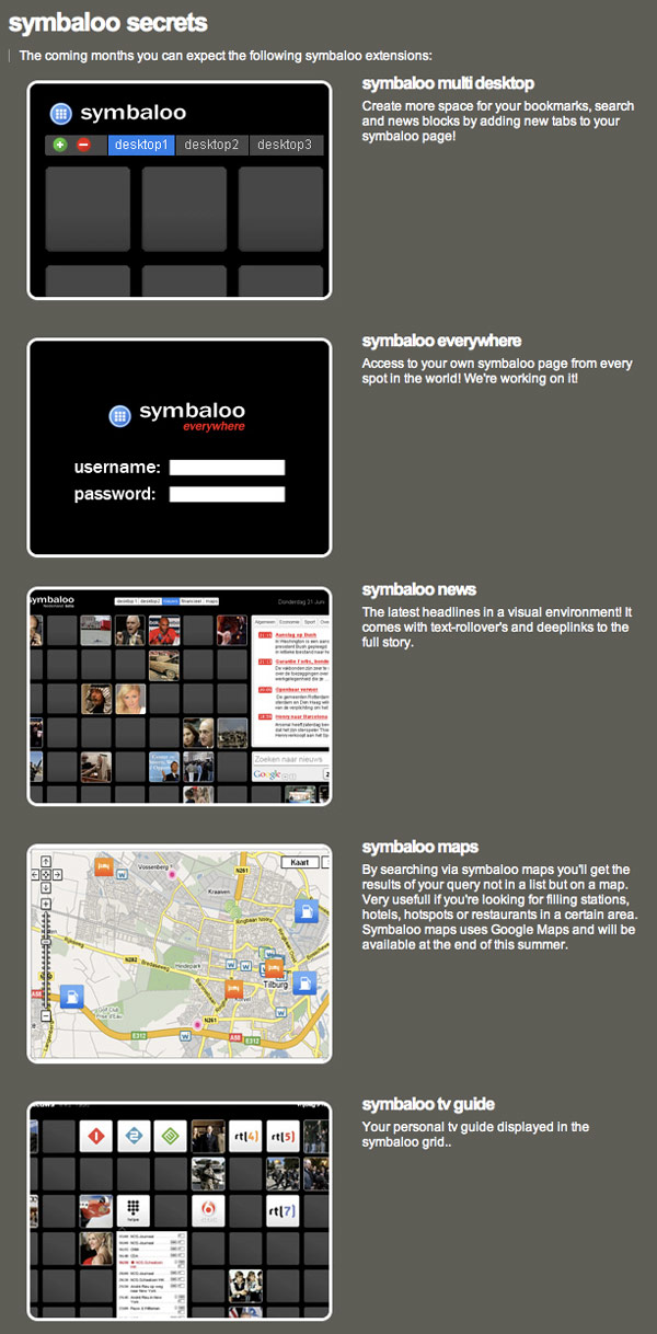
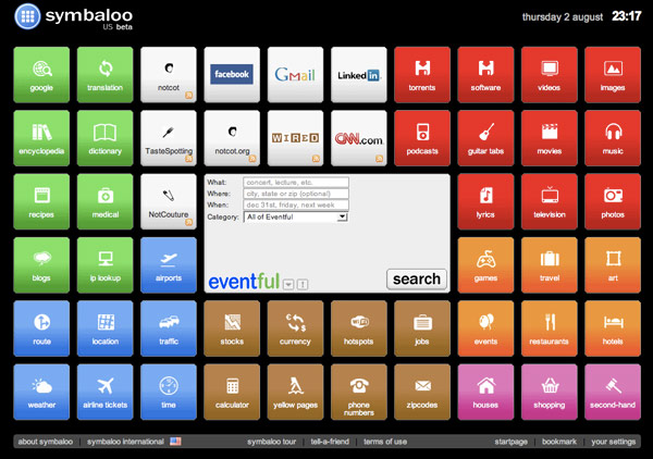 Symbaloo just popped up on NOTCOT.org thanks to John Hawkins, and it was kind of visually interesting, and worth a note for its user experience. First impression, overly web 2.0, and oh so bubbly… reminds me of a homepage version of that Optimus Keyboard… meets the periodic table? Another overly mashed pile of widgets, RSS feeds, searches, etc… but i like the icons (they remind me a lot of the PSP, PS3 navigation icons). And the way you can drag things to the trash in the middle. Also that you can customize the size of the grid you’d like, either based on standard browser sizes, or you can manually add/subtract them. Dan (my other half on all things UX) completely disagrees with my even posting this ~ but although i couldn’t imagine actually using this, i’m intrigued… particularly by what is in their Secrets/Work in Progress section (more after the jump)… like news images showing in the squares: “The latest headlines in a visual environment! It comes with text-rollover’s and deeplinks to the full story.” and also their tv guide integration and map searches with their icons on the maps. So nothing terribly new, but some interesting ways to visualize? I’m posting this one in the name of research on grid views and visual views of news/data… kind of like Yahoo’s OMG - i love how theirs have quick news pop up over the image, and leaves a check mark over ones you’ve read.
Funny how squares as image thumbnails are in isn’t it?


Great site!
----- booblik 05.08.07 12:03