
Highland Park Single Malt Scotch- 02.11.09
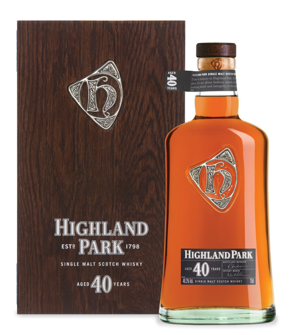
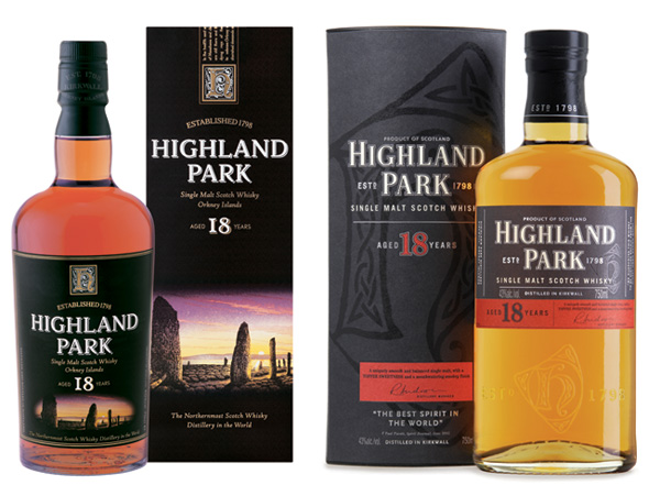
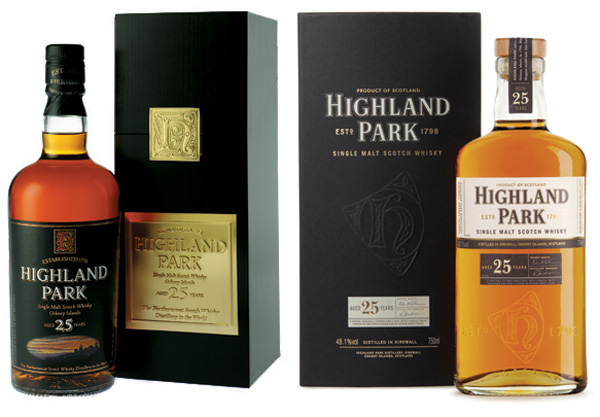
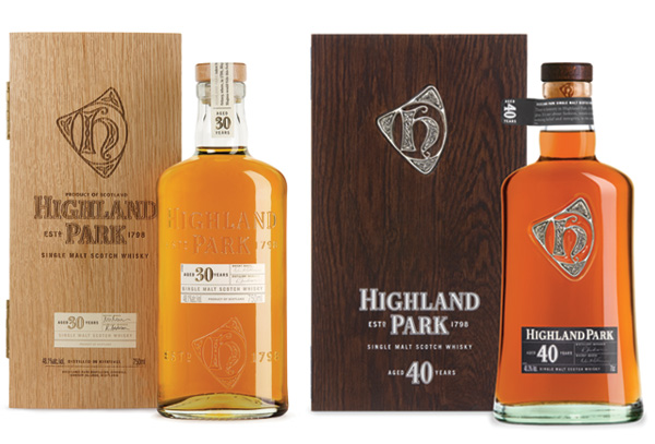 I have a soft spot for Scotch ~ especially when the packaging grabs me… Although the packaging redesign for Highland Park Single Malt Sotch Whisky happened in 2006, i was still curious enough to poke at their PR to show me the old bottles for comparison ~ and there’s just something about the cleanliness of the design of the 30 and 40 year bottles and their wood boxes i’m loving. Don’t the slight curvatures of the 40 year bottle remind you of the Ri(1) bottle? Well, only shorter and stouter, and with a much cooler label and silver “H” emblem ~ which apparently dates back to the Orkney’s 12th-century Viking ancestry. Even the 30 year bottle is so clean, i love the transparent look with only the small paper labels covering the gorgeous color of the scotch in the glass bottle… As you’ll see below, the packaging of the 18 and 25 year bottles are similar but have much larger labels, although on a similarly shaped bottle ~ they are however packaged in fun gloss black on matte black boxes! And you can see how they compare to their predecessors… Also noteworthy, it’s nice to see a brand site dedicate a section to the thought that went into the redesign of the packaging! See close ups and more on the next page!

About the brief and the Silver Amulet from the Highland Park Website:
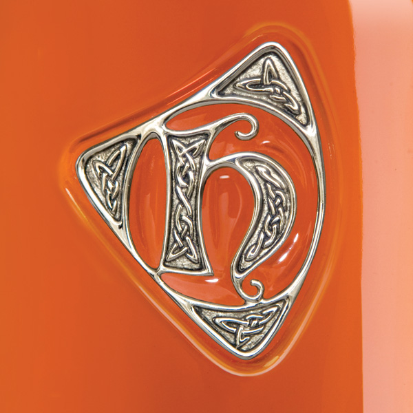
The Amulette
Andy Bowman, the award-winning designer at the head of Mountain Creative Design, was tasked with re-branding Highland Park; the brief was to reinforce the brand values and to focus on integrity. Having worked with Highland Park before, Andy was already a fan.
“I have very fond memories of my first stint on Highland Park; in the summer of 1995, I was asked to paint a series of watercolours that would feature in a book celebrating Orcadian poetry entitled Orkney Stories. Having been deeply in love with the Scottish Islands and their culture for some time, it was no great inconvenience to find myself wandering the rugged and beautiful landscape in search of inspiration.
By coincidence, 10 years later we were asked to revisit the brand; the branding that had served Highland Park so well for many years clearly hadn’t originated from Orkney which has a culture of Celts, Picts and Vikings. I had a fairly good idea of what we were trying to create but my knowledge of Viking art was minimal. Sitting alone in the Eunson Room at the distillery with only my diary for company, I started to sketch; five minutes later the first draft of the amulette was finished. I felt that overall it looked like a modern shape but its centre was rooted in something that definitely wasn’t modern. I struggled to justify it at first but it felt right; a perfect mix of Celtic and Scandinavian influences.
From the brief, it was clear we needed assurances that the Viking influence was well-founded. I flew to Oslo in December 2005 and, after studying in the museums of Norway, Sweden and Denmark, I felt vindicated.
In my research I learned of the many similarities between the Celtic, Gael, Pictish and Viking art styles; I was most influenced by the Urnes style; the soft, graceful curves and sophisticated line shapes belie its 1,000-year-old tradition. The style is essentially Norwegian, the homeland of the Vikings settlers that arrived in Orkney at around the same time. Most Viking - and much of Celtic - jewellery was created in silver and that was the overriding reason to change from the old golden “h”. The knotwork that features in the Amulette is common to Norway and Scotland as is the lettering style employed to create the “h” in Highland Park. The design was then taken to the renowned Orkney jeweller, Ortak, to be created in pure silver.”
The bottle and label
Pearlfisher are an independent design partnership, with offices in London and New York, which wins awards for creative excellence and commercial effectiveness. Their brief was to create package design in keeping with Highland Park’s positioning as the world’s most respected single malt.
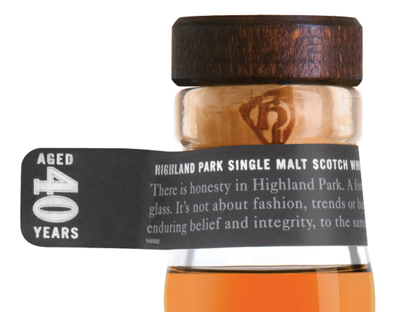
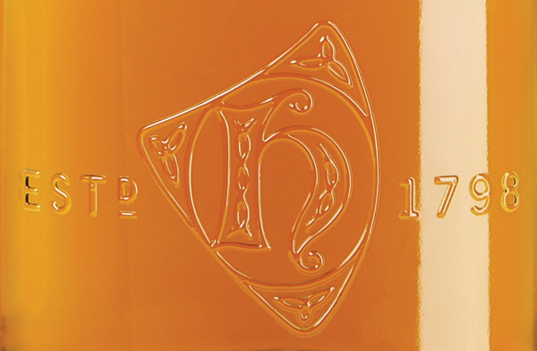
Hidden layers of depth like the subtle embossing of the “h”, the varnished “h” on the label and the larger, chunkier type on the back feel good in the hand and fit well with the brand’s rich mythology. The logo is a more refined version of the signage on the gates, in keeping the brand’s heritage. “Estd 1798” is also taken directly from the gates, creating an instant connection to the brand for anyone who has visited or seen pictures of the distillery.
Writing “Product of Scotland” above the logo assists in anchoring Highland Park. Historically, addresses were often used on whisky advertisements and outer labels.
Centred layouts with a dividing rule were popular in malt whisky advertising. The information would then be separated out into different areas; in this instance it’s the age and the tasting notes. The back of the outer packaging displays this technique to great effect.
The embossed “h” creates a further layer of subtlety and intrigue; the new Orcadian styling is a clearer cue to Highland Park being a product of Orkney. In this instance, it is flanked by “Estd 1798” using the same style as appears on the bottle graphics and on the distillery gates.
The use of the Distillery Manager’s signature on Highland Park 12 to 18 year old adds further credibility to the label and recalls the days when most bottles of whisky were hand-signed. The same rationale applies to the use of the signatures of the Distillery Manager and Whisky Maker on Highland Park 25 and 30 year old.
The brand colour is slate grey rather than black and is used more sparingly. Although it is clearly connected to the earlier design, it adds depth and warmth thus reflecting the complexity of the taste profile.
Sans serif typefaces were often used in posters and add a utilitarian slant to the brand’s authenticity.Less important information would run vertically on the sides as a note and often recounted a story connected to the brand; on the younger variants of Highland Park it relates to the brand’s conception. We have also used quotes from a vintage ad campaign attributed to James Grant’s distillery.
In the 18th and 19th centuries design rules tended to be far less uniform than now. For example, text was not justified nor did it necessarily run the full length of the pack. With the new packaging we brought Highland Park’s authenticity to the fore while making it accessible and relevant to today’s sophisticated consumer


I visited the Highland Park distillery when traveling the Orkneys. The finished the tour with a tasting, which was awesome. This stuff is the real deal.
----- Caroline 17.02.09 07:11