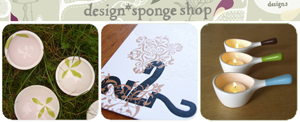
The long awaited DesignSponge SHOP has now arrived! Grace’s dream project is now a reality, and you’d be silly not to go check it out ~ with limited edition exclusives by some of her favorite designers (I’m a huge fan of the work of Karin Eriksson, so loving these salt, pepper, olive sets) ~ and 10% of all ad revenue going towards charity (artists will take home 100% of profits, d*s takes NONE). Additionally, every piece you see in the D*S Shop was designed exclusively for the shop in a limited-edition run and will sell for no more than $100 (before shipping). I think it’s a brilliant and noble idea ~ and to see this all go from designs in the real world - to design blogs - and then giving back by offering design to the real world… makes me happy. Congrats, Grace!
[Also, riveting interview with Grace of d*s over at the ThisNext blog]
*NOTCOT in
design - 10.02.06 -

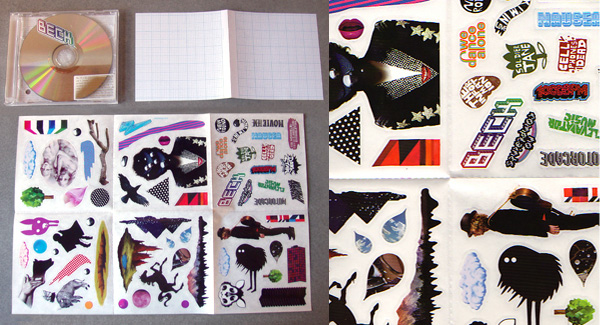
Gone is the day of the fancy designer cd cover, here are the days of customization… and design emulating the mixed tape/cd look of DIY covers? The new Beck album “The Information” comes out tomorrow, and over at Design Observer, Dmitri Siegel shares with us the playful customizable nature of the cover art… it is blank, and you get stickers. Not any stickers, but stickers from some of the best artists around (yay Genvieve Gaukler) Cover art for The Information by Beck. Art direction and design by Matt Maitland/Gerard Saint at Big City Active with Beck. Sticker art by: Jody Barton, Beck, Juliette Cezar, Estell & Simon, David Foldvari, Genevieve Gauckler, Michael Gillette, Jasper Goodall, Mercedes Helnwein, Han Lee, Matt Maitland, Ari Michelson, Parra, Melanie Pullen, Gay Rie[***]aleksey Shirokov, Will Sweeney, Kam Tang, Adam Tullie, Kensei Yabuno, Vania Zouravliov, 2006.
From the Amazon description for Beck “The Information” , “The artwork for The Information is either non-existent or infinite, depending on one’s point of view. Each copy will come in a blank package with one of four collectible sticker sheets specially designed by European and American artists and representative of the unique Beck aesthetic.” ….. Seeing Beck perform on Saturday! Anyone else going to be at the LA Weekly Detour?

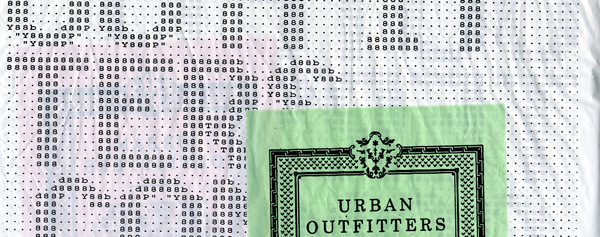
Anyone else notice the Ascii art on the Urban Outfitters bags? Mostly 8’s with some d’s, b’s, T’s and Y’s thrown in to help shape out the letters… but the ascii art lover in me came back out when i noticed this… here’s a quick scan of it (bigger below) ~ will try to remember to add a picture of the full bag if there’s interest.
TO PAGE 2 of "URBN Ascii"! ----->
*NOTCOT in
tech - 10.01.06 -

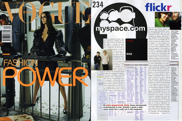
I indulged myself with the massive issue of Vogue Italia in hopes of escaping my web 2.0, social networking, california based craziness that has been quickly taking over my life… after doing some serious NOTCOT house cleaning till 8am (read: fixed .org atom feed, cleaned up all .com rss/atom, fixed .com search, added features to .org, finished emails, and a ton more)… all i wanted was a little break from the web. Just some good old fashioned, relatively shallow product/fashion obsession and drooling over accessorizing as an art form.
So imagine my surprise when in the midst of Vogue Italia, i find myself reading about how “Il web sta cambiando… Gli user-generated sites stanno decisamente rivoluzionando la rete.” and see giant myspace, flickr, and craigslist facing me. TOM made it into VOGUE. Maybe its not the web thats changing, but Vogue sta cambiando. Also this is by far one of my favorite Vogue covers to date, the image of that model at the gun range… those pumps amidst the shells… and LOVE the font… and how that orange picks up on the glasses of the guy in the next stall, and the target on the ground. Closeups below… token Diesel Sweeties to make you giggle too.
TO PAGE 2 of "Vogue Italia Sept."! ----->
*NOTCOT in
playful wearable - 09.30.06 -

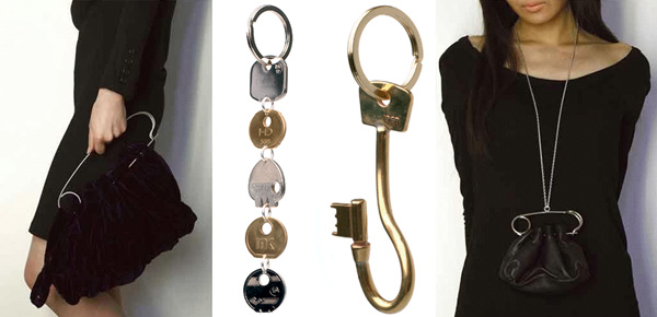
Borba Margo, it’s a British line. Had a bit of trouble finding much info, so feel free to enlighten me. Noticed their “Break Up” keyring over at Colette, and since there was no explanation of the name, my imagination ran wild and noticing i had the keys from some ex’s apts and my old apts on my keychain for some reason, felt like theirs was symbolic of a break-up where the heads of those keys strung together represent pasts not to revisit. From what little i know of the brand… Colette gives us this: Borba and Margo produce objects that in their own words “cherish human desires and fantasies revealing something essentially magical.” So while googling them… also came across their collection at Rendez-vous Paris, and the Large Safety Pin purse and necklace/purse were quite fun as well.

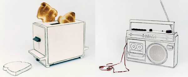
While those miniatures below intrigue me, Cynthia Greig’s more recent “Representations” series mesmerize me and mess with my head far more… “Focusing on the representation of ordinary things, I draw directly onto 3-dimensional objects (which I have painted over in white paint) to create visual hybrids that appear to vacillate between drawing and photography, black-and-white and color, signifier and signified. My photographs intend to draw attention to how we see.” And that, they certainly do… below are the more which i simply can’t stop staring at… its as if you’re living in a 2 dimensional 3D world… and i love that the phone line is cut… not sure why, but its quite amusing today. (Great title for the series as well.)
TO PAGE 2 of "Representations"! ----->

“Life-Size” by Cynthia Greig really messes with your sense of scale. (And if you saw the new CSI last night, doesn’t this remind you of that insanely detailed mini murder replica?) In her statement about the work, i love this excerpt “I am fascinated by the fact that almost anything (from sunglasses and cameras to hypodermic needles and condoms) can be found in miniature. I’m equally intrigued by the desire to collect such tiny replicas of objects from our own material world. As a smaller scale surrogate of the original, the miniature seems to imply the existence of some kind of alternative universe where we (as larger bodies) are like gods, omnipotent and in control.”
It’s fascinating to me how detailed the pieces she made are, and how she manages to recontextualize the everyday by having people interact with them as they would the originals… and that she picks everyday objects like condoms, pills, hypodermic needles, pipes, cameras and more… More of my favorites below.
TO PAGE 2 of "Senses of Scale"! ----->
*NOTCOT in
design - 09.29.06 -

I am realizing i really have a thing for when science and design meet ~ i now look forward to SEED as much as i do Wallpaper. So when just saw their pullout “Thank a Science Teacher Postcard Campaign” had to scan them in to show you the playful designy sciency crests they made. Fun stuff, click image to see larger.

More big brand mashups - this time we have the high end Versace meets Lamborghini, to give us the Murcielago LP640 Versace Edition. While the white seats may be utterly impractical ~ i must admit i’m loving the mod black and white feel they have going on. Paris Auto Show got all the good sporty releases this year! via Sybarites, who has quite a few high res pics.
*NOTCOT in
me - 09.28.06 -

Thursday again already! This week seemed to be ring week at .org, and we saw some very interesting and bizarre posts. Also welcomed quite a few new contributors who have been sharing some incredible design finds from around the globe with us. So go poke around .org, there is never a lack of creative inspiration.
(l-r, 1462, 1484, 1496, 1497, 1418)

Most sinister sports car i’ve laid eyes on… it’s those swarovski looking false eyelashes on the headlights look isn’t it? and those wolverine claws coming out of the trunk that does it? You know, imagine you’re watching transformers or some animated feature, you would see this and KNOW it was either the villian, or the vehicle of the villain… the very deviously genius villain. So here we have the freshly announced in Paris, 2008 Audi R8. Gorgeously evil. Wicked fast. Fun images and schematics below. Watch videos of it in action at Left Lane News.
TO PAGE 2 of "2008 Audi R8"! ----->

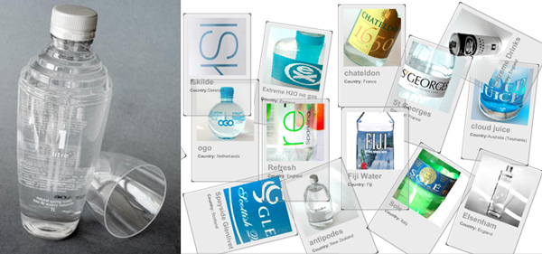
On water…. Water packaging is hot these days. Why? I’m not quite sure ~ we’ve always had fancy water. But now fancy water packaging is taking the form of what looks like flasks (Fred and SEI) and even Martini Shakers? So in the theme of oO’s water list on ThisNext, and Sean even ripped off his list and added more normal and less designy waters to his ThisNext list… So i had to highlight Wawali, “12 waters, 9 countries, one source”, which has the best of the gorgeous water i’ve been seeing around… and a fun .org like interface (well polaroid-y look) via CoolHunter.
*NOTCOT in
design - 09.27.06 -

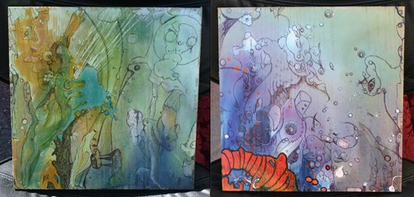
Checked out the Abbot Kinney Street Fair down in Venice Beach last weekend, and amongst your usual bazzar type vendors, found this gem of an artist, Ariel Olguin, who’s work is definitely worth sharing. Larger images of some of my favorites below, including the mural and pieces hanging in Trim (an edgy hair salon that was filled with pirates, art, and booze as well as people getting their hair done that day ~ great mix, no?). But beyond the mind blowing street/liquid feeling art and hats, Ariel’s story is one of those classic rags to riches, American dream style tales…
“I was born in 1979 in the mountain town of Balcarse, Argentina. I came to the United States in 2000 for vacation in Miami and never left. I was working as an elevator operator and realized how much people appreciated my work. I sold my art to the passengers on the lift. With the last 250 dollars that I had in my pockets I made my way across the states to California. Thanks to some dude, I was able to live in a mobile home in the Home Depot parking lot. In the beginning I was drawing some shit just for kicks, to pass the time. Somehow I ended up with a pretty decent internship at an advertising agency as an illustrator, in the creative department. It was at this time I realized I needed to get out and show my work.” Wow? Go see more below.
TO PAGE 2 of "Ariel Olguin"! ----->

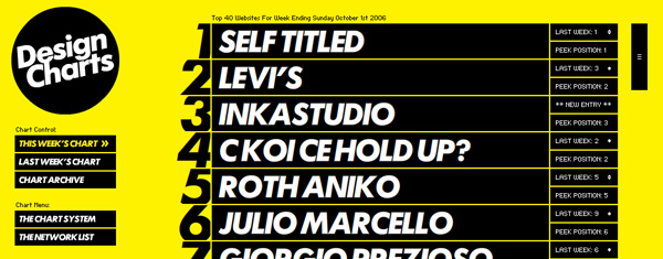
Like the Billboards only for design? Or thats their idea anyhow… ironically, the interaction on their site pains me greatly, i roll my mouse around and the site bounces up and down and gah! too much. But the idea is cool, a nice way to see who the Top 40 Design Sites are for the week as judged by merely 3 sites… Designaside, Dope Awards, Website Design Awards. And felt it was worth a mention, since sometimes even in the bounciest of sites we might be able to find some worthwhile pages to browse? Design Charts [via UnBeige]

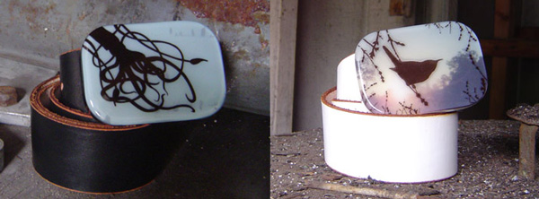
Brooks Salzwedel makes some gorgeous resin belt buckles (remember the smoggy cityscape?)… well just going through NOTCOT archives, i checked out the site again and noticed these two nature themed ones ~ loving the sunrise/set behind the bird, and the squid… the layering of the resin creates such mesmerizing depth in the buckle.
