*NOTCOT in
nature - 02.20.08 -
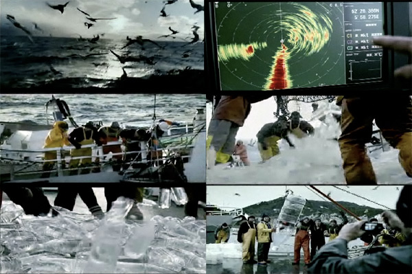
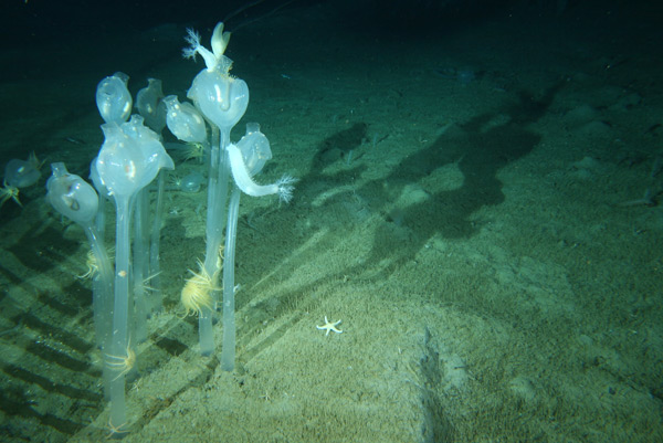 Inspiration comes not only in all shapes and sizes, but from literally anywhere… and all of us at NOTCOT have a particular fascination with the inspiration from nature (ok some more than others, since Justine picks nature over design with her phd studies!)… So when we heard about the new deep sea species found in Antarctica, and then found these high res images and video of them, we swooned. And realized we HAD to post them. Here’s what we found out from the Australian Antarctic Division: “The return of the last of three Antarctic marine science research vessels marks the culmination of one of Australia’s most ambitious International Polar Year projects, a census of life in the icy Southern Ocean known as the Collaborative East Antarctic Marine Census (CEAMARC). Australia’s Aurora Australis and collaborating vessels L’Astrolabe (France) and Umitaka Maru (Japan) have returned from the Southern Ocean, their decks overflowing with a vast array of ocean life including a number of previously unknown species collected from the cold waters near the East Antarctic land mass.” Some of the shapes and curves of these are just incredible… don’t those tunicates look like glassy hearts? Lots of imagery after the jump!
TO PAGE 2 of "Aurora Australis’ New Species in Antarctica"! ----->
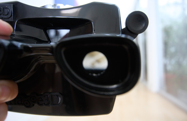 It’s here! My Arkitip issue #0044 just showed up! And i’m in love with this glossy black viewmaster that came with the issue… so much that i even have pics of it for you as if you were looking through it! (See after the jump for the woody mac within)… Since i was a bit excited, here’s a quick reverse unboxing in images for you after the jump!
TO PAGE 2 of "Arkitip Highmath No. 0044"! ----->
*NOTCOT in
food+drink - 02.19.08 -
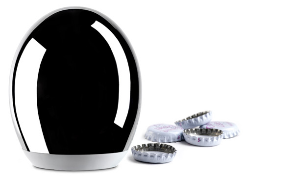 In the Alessi 2008 Spring/Summer collection is the new Pop-Up Bottle Opener. This beautiful piece is designed by Giovanni Alessi Anghini, great-grandson of Giovanni Alessi, founder of the company. It should also be no surprise that Giovanni Jr. has put in his time at Stefano Giovannoni’s Milan studio, and is now coming into his own. Apparently this mirror polished stainless steel bulb of a bottle opener has a magnet within that holds onto the cap once you push down to open a bottle. See an image of it on a bottle after the jump!
p.s. does this remind anyone else of J Schatz’s egg bird feeders, lamps, etc?
TO PAGE 2 of "Alessi Pop-Up"! ----->
*NOTCOT in
tech - 02.18.08 -
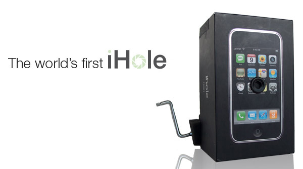 iHole… yes, someone has gone and done it - made use of that gorgeous iPhone box and turned it into a camera! Scot Hampton announced “the world’s first iHole™; the revolutionary analog photographic device constructed from the recycled packaging of digital technology.” (i wonder if he really trademarked that?) on his blog Feb 13th… see more of the fun pics after the jump. He suddenly has me overflowing with silly homemade cameras from recycled packaging ideas… like a collection of portraits of products as taken by their packaging?
TO PAGE 2 of "iHole of Scot Hampton"! ----->
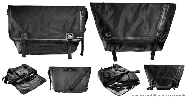 Flipping through the 2008 Incase catalog, these new Nylon Messenger Bags jumped out at me, and upon reading the details (see the catalog pages after the jump) i had to post it out of curiosity and intrigue. In two sizes (medium and large), both have a sleek yet textured look, weather resistant nylon and waterproofed lining, exterior weatherproof pocket and headphone port, topographic print lining, and i like how the edge goes up and around the clips… as well as a mysterious “plush faux-fur lining” (i wonder what that looks/feels like) to protect your goods. In the large model, there is even a removable notebook sleeve, removable hipsack (fanny pack?), interior bike pump tie down, and an “abrasion resistant skateboard attachment with molded skate bumpers”. See more details and images after the jump!
It isn’t easy finding a good subtle, rugged, stylish, black messenger bag. I’ve got quite the stash of them (from chrome to ordning & reda to random leather ones to timbuk2 to patagonia…), but it’s been a while one has even really caught my attention.
TO PAGE 2 of "Incase Messenger Bags"! ----->
*NOTCOT in
me - 02.17.08 -
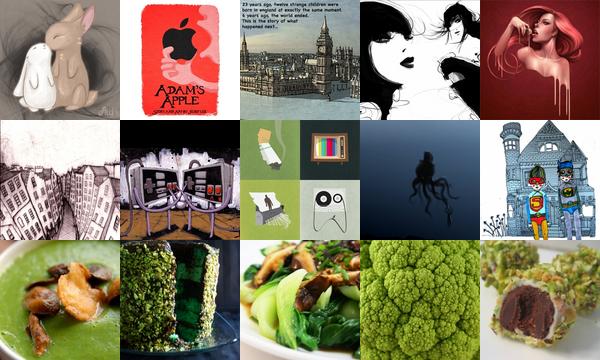 Click the pics to find out more! Here we have another roundup of roundups ~ a full on best of last week showcasing 24 of the most popular from all of our sites below… and above we have lots of fun art, and a row of green themed foods. Why? Its just what inspired me as i flipped through a few pages this sunday! Oh, and if you haven’t checked out Adam’s Apple, that’s a must! Brilliant illustrations coupled with quite the unexpectedly twisted creation tale.
RANDOMIZER! Also new, we’ve been working on/tweaking this new feature, and its getting there ~ new buttons are up on all the sites now (see the cute little push pinned polaroid stacks?). I begged dan to make me this one for a while, because with nearly 10,000 posts on NOTCOT.org and TasteSpotting, there is so much incredible stuff, its hard to keep track of everything, so when you just feel like something random and inspiring, perhaps a blast from the past or even something you might have missed… just click the stack! Personally i’ve lost hours browsing randomly.
TO PAGE 2 of "Weekend Roundup!"! ----->
*NOTCOT in
design - 02.16.08 -
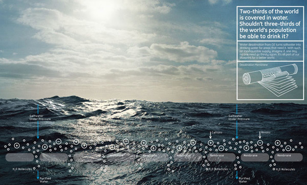 Beautiful print ad campaign for GE’s Ecomagination… view the full set of the Blueprint Series after the jump. They are “all part of our blueprint for a better world”, covering water, solar power, home, wind power, and cleaner coal. What i like in particular with this campaign are the infographics overlayed on beautiful scenic national geographic-esque shots… with clear bold statements, they let you simultaneously appreciate the natural settings, why thinking about how to execute the diagrams. “Two-thirds of the world is covered in water. Shouldn’t three-thirds of the world’s population be able to drink it?” Yes.
TO PAGE 2 of "GE Ecomagination Blueprint Ads"! ----->
*NOTCOT in
design - 02.15.08 -
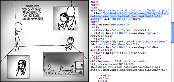 Not to geek out on you, but just had to point out how perfect XKCD’s use of title is in #383 ‘Helping’. And also another reason why people really should check out content in its original/intended form (as well as on RSS readers, splogs, etc!). And oh how i wish someone would make a magical ‘make everything better button’… perhaps shaped like a Staples’ EASY button? And i suppose this will make me rollover pictures to see the title text more often now?
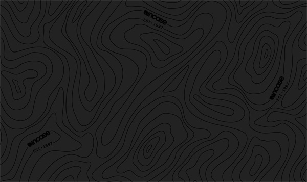 And since i gushed so much about the Incase topo print being used throughout the press kit in a gorgeous gloss on matte… i just discovered their blog, which has the background and some wallpapers. “This unique pattern along with the integration of the Incase logo is a graphic component of the Incase identity representing the concept of travel. The Topo pattern also resembles an abstracted wood grain that compliments the Incase leaf logo.” Also, i just noticed they already got their Arkitip #0044 HIGHMATH with the black viewmaster (see their pics)… mine should be here any day now!
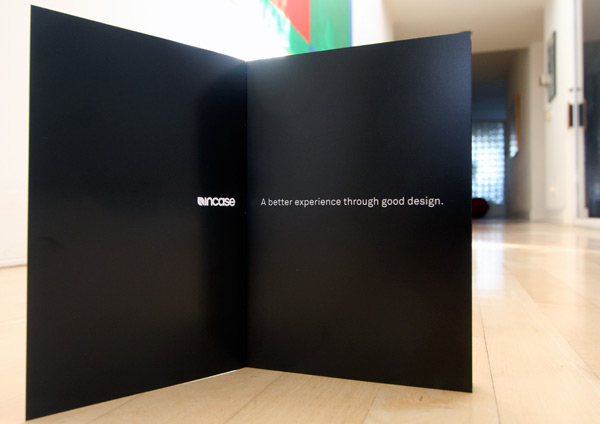 Incase: A better experience through good design. The UPS and FedEx guys always seem to make my day. Today it was the delivery of the Incase press kit that has my love of packaging design gushing. With a tagline like “a better experience through good design”, you would think it would be hard to live up to… but apparently not, from the time i sliced the tape open on the box they continued to surprise me with impressively high quality new products for 2008, incredible attention to detail in the catalog/boxes/design, extremely efficient use of space, and ultimately the whole press kit experience was like a designer’s babuska doll of surprises. So come unbox it with me in the photos after the jump! And more to come on the incredible macbook pro hardshell case soon…
TO PAGE 2 of "Incase Press Kit"! ----->
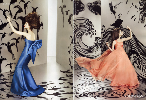 Flipping through the Feb 2008 Vanity Fair, i couldn’t resist tearing out this Spring Nordstrom ad… much like the Prada and James Jean campaign for spring, Nordstrom has teamed up with Ruben Toledo who painted 20-by-30 foot walls to serve as a backdrop for the models which were shot by fashion photographer Ruven Afanador… in fact, Toledo even got to paint ON the models for the campaign. Lovely to see the contrast of the perfectly style colorful models in designer dresses and shoes popping off of the playful black and white paintings… see all of the scans after the jump, and you can even click them to see larger.
TO PAGE 2 of "Nordstrom + Ruben Toledo 2008"! ----->
*NOTCOT in
food+drink - 02.14.08 -
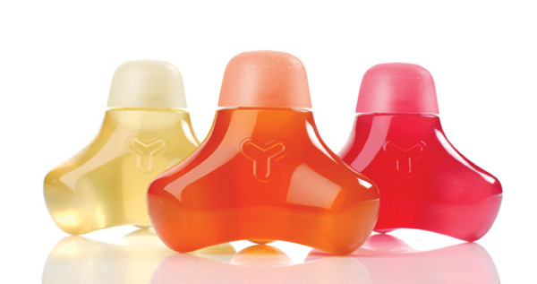 A new entry in the bottled water market, Y Water, comes fresh out of Venice Beach ~ has a playful bottle designed by Yves Behar ~ and can be built into crazy structures… oh, and they are also targeted at kids, and are organic, low calorie drinks chock full of vitamins and minerals! “Y Water’s attention-getting names—Muscle Water, Bone Water, Immune Water, and Brain Water—communicate the idea that the ingredients are the building blocks of healthier bodies.” And there’s the green angle too: bottles are 100% recyclable and 100% reusable as a creative developmental aid… And perhaps just as fun, are the crazy illustrations all over the Y Water site. See images of all after the jump!
TO PAGE 2 of "Y Water"! ----->
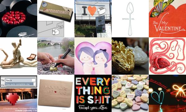 Click the pics to see more! Whether you love or hate Valentine’s Day, Romance, Love, Sex, Spooning, Chocolates and more… apparently NOTCOT.org has you covered this pseudo-holiday. Also Fabulist found a great little video of our favorite, Ze Frank, rambling on the occasion, which i have embedded below for your viewing pleasure. (Beware, he actually blinks!)
TO PAGE 2 of "Happy Valentine’s Day"! ----->
*NOTCOT in
wearable - 02.13.08 -
 Sorry, it’s been quiet… i tried to take the day off. Still ended up handling a few emails and calls via the pearl, but at least it was while running around discovering things… like Shu Uemura’s Art Of Hair. Shu Uemura is one of those lines i’ve loved for not only the gorgeous packaging design (have you looked at some of those lipstick and skincare products? The new clear lipstick cases were designed by architects!), but also for their skincare and makeup products. Admittedly i was skeptical about their branching out into haircare… until about an hour ago. I’ve been a Bumble & Bumble girl for the last decade or so - but the last few weeks i felt like something different - i tried other bumble products (also love their packaging/branding), various ‘organic’ brands, even some basic drugstore brands (which ended up being far too fruity and chemically for the most part), and was about to give up back to my usual, until i wandered into Shu Uemura today.
Apparently the “Art of Hair” line is not available for sale online, and can currently only be purchased in their retail boutiques (but you can also call and order from them)… the boxes with the gloss images of the bottles on a matte white are gorgeous, and the bottles themselves beautiful as well, so i was already ready to simply show the packaging of the new line here… but only if it was any good! Anyhow, i’m sure you know by now, i’m smitten, and silly enough, can’t stop running my fingers through my hair. Smells amazingly fresh, feels ridiculously clean, AND comes in pretty bottles. See the unboxings after the jump, as well as a few other fun goodies i picked up… and a statement from the designers of the packaging, campaign, and branding of the line.
UPDATE: Check out this beautiful flash site for the ‘Art of Hair’… check out the Ceremonies in particular, they sound like pure bliss… and more updates being added at the bottom of the post as i obsessively research more.
TO PAGE 2 of "Shu Uemura Art Of Hair"! ----->
 Inspiration comes not only in all shapes and sizes, but from literally anywhere… and all of us at NOTCOT have a particular fascination with the inspiration from nature (ok some more than others, since Justine picks nature over design with her phd studies!)… So when we heard about the new deep sea species found in Antarctica, and then found these high res images and video of them, we swooned. And realized we HAD to post them. Here’s what we found out from the Australian Antarctic Division: “The return of the last of three Antarctic marine science research vessels marks the culmination of one of Australia’s most ambitious International Polar Year projects, a census of life in the icy Southern Ocean known as the Collaborative East Antarctic Marine Census (CEAMARC). Australia’s Aurora Australis and collaborating vessels L’Astrolabe (France) and Umitaka Maru (Japan) have returned from the Southern Ocean, their decks overflowing with a vast array of ocean life including a number of previously unknown species collected from the cold waters near the East Antarctic land mass.” Some of the shapes and curves of these are just incredible… don’t those tunicates look like glassy hearts? Lots of imagery after the jump!
 It’s here! My
  In the Alessi 2008 Spring/Summer collection is the new
 Flipping through the 2008
  Click the pics to find out more! Here we have another roundup of roundups ~ a full on best of last week showcasing 24 of the most popular from all of our sites below… and above we have lots of fun art, and a row of green themed foods. Why? Its just what inspired me as i flipped through a few pages this sunday! Oh, and if you haven’t checked out
  Also part of the
  Beautiful print ad campaign for
  Not to geek out on you, but just had to point out how perfect
  And since i
 Flipping through the Feb 2008 Vanity Fair, i couldn’t resist tearing out this Spring Nordstrom ad… much like the
  A new entry in the bottled water market,
  Click the pics to see more! Whether you love or hate Valentine’s Day, Romance, Love, Sex, Spooning, Chocolates and more… apparently
  Sorry, it’s been quiet… i tried to take the day off. Still ended up handling a few emails and calls via the pearl, but at least it was while running around discovering things… like