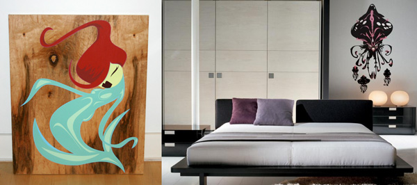
New Tags launched on the sides of NOTCOT! This time we are sponsored by Pop Cling, which brings the art of local artists into your home in the form of high quality adhesive prints. This Costa Mesa, CA based company supports great local artists like Madsteez and Ben Collison to name a few. While this trend of moving away from traditional wallpaper and framed art has evolved into vinyl sticker graphics and magnetic wallpaper to let you fully customize your spaces ~ it fascinates me that Pop Cling has taken it to the next level by creating full art pieces to can simply stick wherever you please. One of my favorite pieces is Ben Collison’s Flower Girl, which they sent me to try out ~ review below! So, explore the tags! And see some of the different pieces they have, and some creative places to stick them up ~ all pieces are printed in limited runs and come with numbered certificates of authenticity.
TO PAGE 2 of "Pop Cling Tags"! ----->
*NOTCOT in
wearable - 09.18.06 -

I received some shirts from Headline Shirts, and first impression was WOW it is SO SOFT… and proceeded to make everyone around feel them. (Honestly i have a hard time believing these really are american apparel, but apparently they put it through some secret softening washes, and they magically get transformed into shirts you’d live out of)… then comes the laughter at how brilliant their poignant shirt designs are. [Seen above is the “Operation: Lets Bomb Some Shit” with a map of Some Shit below].
Based in the Mission (yes, the one in SF) ~ this line was started in ‘04 by Chris Gorog and creative, Jake Ginsky. What started as a Stanford B-school project quickly grew into a high quality entrepreneurial adventure ~ filling a void in the over-saturated tshirt industry providing provocative designs (both visually and intellectually) based on current news stories as a means for informed consumers to express their social and political viewpoints. Where many have tried to poke at this niche, few have done it nearly as well - the quality of the shirts as well as the designs (on multiple levels) impressed me more then i expected. Not to mention, how brilliant is their “tag”, which is printed inside the collar? Double Scotch icon - love it. See more shirts below!
TO PAGE 2 of "Headline Shirts Review"! ----->
*NOTCOT in
design - 09.17.06 -

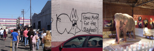
While i hate to further indulge this media circus that has been Banksy’s Barely Legal… i couldn’t resist going back today to see what a front page LA Times image (with article on front of the California section) & expected animal rights controversy yesterday turned the show into… The result? A line longer than one would have expected at the opening to Space Mountain… one of the most bizarre mixed crowds pouring into a small downtown LA street/alley. An overheated fire hazard where you are elbow to elbow looking at “art” while being yelled at to keep circulating so others too can see the art. And saddest of all? No more pink elephant… just a slightly pinkish hued one… And the security (hardcore woman with beret and all) was trained to search my purse for a SHARPIE - not weapons….. So kudos to Banksy, for using LA to do what it’s best at. It was certainly one hell of a weekend. [New updated images in the Gallery… extensive discussion on BoingBoing… and tons of youtubes of the pink elephant.]

Dropped by the GOOD Magazine LA Launch Saturday night - and it was an interesting scene - the Bacardi and Pom were flowing (as well as Fiji Water and Pom Teas) - took place at St. Vibiana’s downtown (a historic converted cathedral) - had some really sweet flat packed looking benches/tables with trays of 1” buttons, plants, magazines ~ and an interesting mix of dj’s and live bands throughout the night…
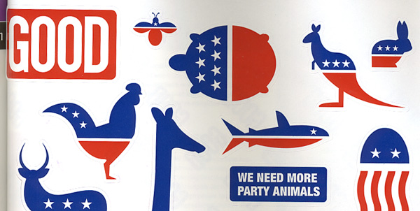
For those who haven’t heard, Good Magazine is 26 year old Ben Goldhirsh’s newest venture, fueled by 12 under 25’s looking to change the world by creating their own media voice. [Check out the LATimes article] From a design standpoint - their layouts are really fun and worth taking a look at ~ lots of WIRED-esque information visualization (although i must admit, some of it slightly over the top for readability), great photography spreads, and love the typography (clean & strong). One of my favorite aspects of the premier issue? MORE PARTY ANIMAL stickers. (full scan below).
TO PAGE 2 of "GOOD Party"! ----->
*NOTCOT in
design - 09.16.06 -

Wallpaper turns the big 1-0. I may only be 23, but i do remember them from back in the day. I also love that together with Phaidon they’ve finally released some vibrant pocket sized travel guides, and will definitely pick some up for the next adventure. So just a quick shout out to them - they’ve been inspiring and influencing my love of all things gorgeously ingenious for a whole decade now.
*NOTCOT in
design - 09.15.06 -

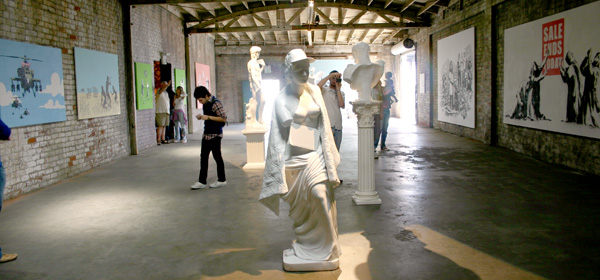
Of the pieces shown at Barely Legal, this set grabbed me the most. Statues just pull you more in person, vs the paintings… and really just watching PEOPLE at this show is worth going back for. Check out the images below (aka cropped and sorted for your viewing pleasure) - or you can also view my larger unedited set in the Gallery.
TO PAGE 2 of "Banksy Statues"! ----->
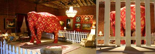
 First things first - no one can ignore a Pink Elephant in LA. Or probably anywhere for that matter. Especially behind a white picket fence, on a rug, being tossed pretzels… the question of everyone who sees the pics from the internet is always “is it real?” well proof of how real it is is below in pictures.
Checked out the Banksy Barely Legal show a few hours ago, and it IS as fun as all the hype… while most of the pieces you may have been seeing online for a while - still fun to check out, and it really is all about the elephant. I know this will be all over every site (if not already) ~ but took so many pics, feel free to take a look at my perspective.
TO PAGE 2 of "Banksy in LA"! ----->
*NOTCOT in
me - 09.14.06 -

This week’s roundup selected by Shade Elaine… Been a busy week! She says, “All work and no play makes Jack a dull boy.” Us, Notcot kids, have been working so much lately so here are some things I’d rather be playing with instead.
(l-r, 1334, 1325, 1309,1311, 1292)
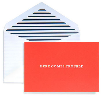
 This card says it all, and while Kate Spade calls it a baby announcement, i think this is truly the card for all occasions. I can see using it for everything - what correspondence isn’t worthy of such a first impression? For obvious reasons i’m biased to the b+w striped envelope interior… then that vibrant hue of red to grab your attention combined with the simplicity of the lettering with such a bold message… HERE COMES TROUBLE [i’m thinking these are good business/calling card inspiration.]

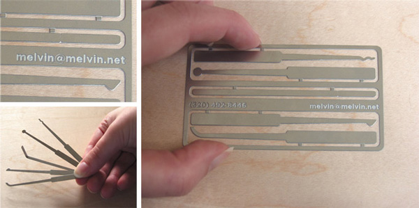
Possibly the most brilliant business card i have seen to date. [Thanks Craig!]… and apparently they are functional picks… Would love to get my hands on one to see how the tension wrench works (bending it yourself and all). Designed by Jeni Mattson.
*NOTCOT in
playful - 09.13.06 -

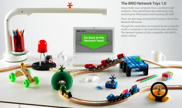
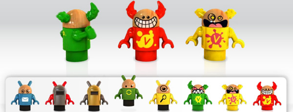
So while in the post below i focus on how fun the interface and animation interactivity is - this post was worthy because the toys themselves are so fascinating to me. Our old toys are growing and evolving with the times (remember monopoly started the credit/debit card edition?)… So here with brio, we have EMO, where when placed with some mail on his box, makes noises? - Lazie’s CD Burner, where you push buttons to activate laser lights and jet engines - the Attacker + Viruses, a crazy offroad vehicle - Bernie’s Flashing Diode, when you pass under it, it flashes. Dex’s Search Pod has the magnifying glass and flashlight… See? Woody toys, taken to a whole new level, i WANT these for my desk, they are a) adorably amusing b) strangely techy yet woody… BRIO NETWORK 1.0! oh, and don’t miss the video!

If anyone were to rip off the OS X Dock (and improve it!)- it’s apparently BRIO - yes the toy company. And their new Network 1.0 line of toys. More to come in the next post about how brilliant they are. Check out the animation in each section - this is one site worthy of having you explore every bit of it.
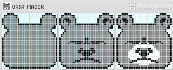
Remember paint by numbers? Do kids even have that anymore? Well apparently for the DS Icon kids (and adults and not so creatively inclined) for icon making - you have paint by pixel! And this grumpy bear is just… so grumpy and pixely. DS Icons. [via wonderland]
*NOTCOT in
design - 09.12.06 -

Love the design, great simplicity/colors/fonts - and it plays like an old school video game (or at least it sounds like it) as it finds and creates these product clusters for you while pulling out from amazon. I know people love how simple google’s main page is - but seriously, this one pulls off that simplicity even better. Amaznode (colin posted this to .org and i have been mesmerized since i woke up)
