*NOTCOT in
design - 05.20.05 -
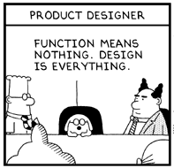 Half of my problem with the “world”. My biggest pet peeve in the world is with regards to the world of design and usability/HCI/engineering/programming/etc. This is the first part… Creatives: it needs to be FUNCTIONAL. Usability/manufacturers: there is NO REASON for it to be ugly. I think i may have ranted a bit at UCSD cogsci HCI kids (i say kids, but i think they were all my age or older… and i was chatting about my design school experiences to an HCI class)… i keep getting the feeling some of them are too excited about making it usable, and forget that aesthetic is crucial too. Balance, people, balance. And nice find Core77 with this great dilbert epitomizing half my plight.
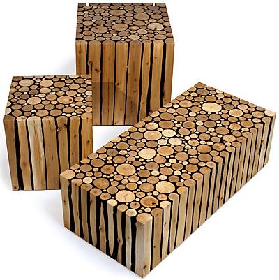 Brent Comber’s Alder is visually orgasmic. And i haven’t even seen the real thing yet. Its been everywhere, (yes yes between E3 and ICFF every blog/mag is pretty swamped with gaming and design). But the image. WOW. So cool.
 Not only being my definition for “design” versus art… We-Make-Money-Not-Art is the site of all sites. It is the biggest inspiration i had through my year of Interaction design Masters, and the singular site that turned me on to reading blogs in the first place (no offense other sites i still love to read). This post should have come a long time ago, but feelin’ nostalgic tonight… Regine has seriously the best collection/archive of interactive/tech projects out there i have found anywhere (and i have spent quite some time doing a TON of research in the field). If she printed an annual each year, i might have to subscribe, just b/c it would be a great reference to have for anyone in the industry.
So just incase (and i’m sure there are very few) there are readers who don’t read We-Make-Money-Not-Art daily. Get to it.
 I feel like i have been Shaolin Shroomed. Really. Anyhow, sorry for the delays/skips in posting this week, i guess most people have started to notice i’m a bit sporatic in the posts. Maybe that’s what makes me different from some of the sites that save up so they have stuff for everyday, you get it when i find it, and am super excited about it. Not much fun any other way. [feel free to differ and tell me, i can pretend to stock up maybe =P ]
Anyhow, braveland had these new awesome designs, and this one felt like the travelling that has kicked my ass from San Diego to Los Angeles to Philly to Hartford and now i’ve just arrived to New Haven (Yale Graduation). So yes, TIRED. But a few cool things that i think may possibly be cool simply b/c i was in such a dazed state, but in case, check them out (i might add pics later)…
ZIP-LINQs!!! Super fun retractable cables of all sorts, light weight, fun to play with, and uber-functional. I picked up a USB for my digicam/ext hd. can’t stop playing with it. so mesmerizing.
ZIP-KORDs!!! Much like the linqs but different. Slightly. I got the sony ericsson charger. Couldn’t resist, saves so much tangled messes.
FOM! TRAVEL FOM! … You know those brookstone started “FOM” pillows that are in lycra and all little foamy pellet lightness inside? Amazingly comforting to smoosh? Well i guess my travels have been too international the last few years, i have failed to notice the brookstones in every airport? (or is this new?) but there are travel FOM, from mini pillows, mini cylindar pillows, those around the neck things, even eye pillows (and furry ones, and animal prints too, yikes!) I was tempted. Maybe on the way back, my neck is killing me. [p.s. and apparently they are so new the whole line isn’t even online yet? and they come in nice travel packaging, and with little airplane keychains on them. reasonable at 20$]
*NOTCOT in
design - 05.18.05 -

Well, I’m sure you’re all overwhelmed by the plethora of E3 articles this week, but trust me, THIS ONE has got to be the best. Maybe I’m naive, but I always thought that video game voices were just tweaked normal voices. I was glad to find out that I was wrong! Check out this article from the SF Chronicle and meet (and hear) the voice of Mario!
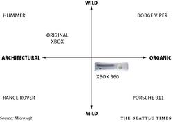 XBOX 360: The Design Breakdown… great article by Seattle Times, found on Joystiq. Here are a few quotes to get you going [but you need to read this one yourself…]
The executives talked about vehicles as a point of comparison. A Hummer had the same wild, architectural sense as the Xbox. On the mild, organic end was the Porsche 911, which had a well-evolved and distilled feel. That’s the look the group eventually settled on. Apple Computer’s iPod is mild, executives said. Mild will still look fresh five years from now. Wild and aggressive will seem dated.
When people there were asked what company might have made the console, they guessed Sony or Apple. That thrilled Microsoft executives.
Ok those were my favorite quotes. Now go read. Go.
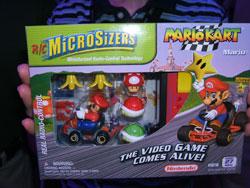 For ShadeElaine and the many a night we spent playing far too much mariokart So cute. It’s E3 week, and the gaming maddness is engulfing even the least interested non-gamers… from the XBOX, PS3, GameBoy mini… too much out there. This one’s from Gizmodo.
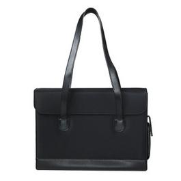 Classy, Simple, Sleek, minimalistically girly with a tinge of professionalism? and 24.99$ from target. This is a big deal… for me to be posting target, at the mention of this my friend just said “you? buy a bag from target?”… so yea i’m a bit of an anal bag elitist. See, at least i’m honest. And when it comes to laptop bags, i’m even worse, and spending range in the past has been pretty high, until i have resorted more to nice sleeves in sweet messenger bags (currently toting and old school brown worn leather JCrew number).
Anyhow back to the point, this bag looks pretty great, and hangs well over the shoulder. I’m debating whether to purchase it… PROS: Looks great, and i dont have a good for looking professional walking into a meeting bag. [it also comes in a great shade of red/green/white on black polka dots] It is also has a cross patterned quilting interior that seems sufficiently padded all around… nice leather accents/base/straps/cell phone holder on the side. CONS: um, where does the charger go? cables? ipod? clutch wallet? sketchbook?
So that’s my debate. To buy or not to buy? Always seems to be the question on this site? And after Target’s big move on the prescription bottle redesign, taking on big designers, and their great design for the masses ads… i suppose i’m not so surprised at this great little find.
*NOTCOT in
design - 05.16.05 -
 Who will fall in love with Shanghai beauties like this? Please refrain from picking your teeth in public. Hahahahaha. Ok, just go click for more and read the full post already, i know you’re dying to see the other two.
Found in Luerzer’s, this campaign was created by the Shanghai Agency Leo Burnett… it falls in the “Social and Environment” category of the advertising/poster bi-monthly. I can’t stop laughing. Brilliant.
Scary… the client is “Shanghai Adbay - Public Ettiquette”, with the ad copy/description as follows:
“Who will fall in love with such beauty of Shanghai?” Part of a civil educational campaign initiated by the Shanghai City Government, was to remind her citizens to carry themselves properly in public.
While i agree that public ettiquette is beneficial to society in a way… where are the male equivalents to these ads? What about the revolting men trying to win the women? Crafty readers ought to take a stab at it?
TO PAGE 2 of "Who will fall in love with…"! ----->
 Shadow and Light collection These are funky/sleak, and the anti-bling. Think about it, you’re basically wearing a shadow or a former self, it’s the anti-jewelery. And i love the playful designs in shiny black pastic. Alex and Chloe is an LA based design label which encompasses that anti-bling indie/80’s rocker icon lover within. The overhwleming look of a mound of these on your neck, still hangs so flatly it’s rather understated. [note: these also come in gold, but i’m not as big a fan of those]
They were featured in MetroPop, which noted “…about this kind of loud fashion — it just doesn’t care, and feels comfortable not caring.” It’s certainly not about taking yourself too seriously, but still shows your flair for creating a “look” of your own.
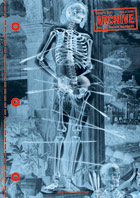 Sorry for the delays today, and due to a lot of questions lately… this is a quickie on me (well slightly). As for the delay, during a weekend of backpacking i was tech free, so no posts, but much contemplation of the meaning of life [and design].
1 - What am i?
2 - What is Notcot? [see after the jump]
3 - Design week? month? year? [see after the jump]
- …what you should be reading/watching…
1 - First things first, with regards to what i am (many have been asking, few have yet to be answered)… ideally i’m a conceptual designer/theorist focused on the roles/impact of technology on our interactions with environments… practically i am trained with a master’s in interaction/experience design + research experience/interest in HCI/Usability + BA in Interdisciplinary Computing in the Arts + a math minor + [with real world experience from graphic design - branding - web - idea marinating - marketing - automotive research - industrial design - business]…
TO PAGE 2 of "Notcot’s Note"! ----->
*NOTCOT in
design - 05.13.05 -
 GOOD entries needed. This is such a great idea for a contest… Literary audio clips offered for use to brilliant musician/samplers to mix, by the old school publishers Penguin. The clips range from Charlie and the Chocolate Factory, Dracula, the little kids boook Spot (the dog!), some James Bond novels, William Blake poems, Great Gatsby, Time Machine… and so much more.
There is so much potential in such a concept, now we just need to spread the word! To some brilliant intellectual musician types? [no offense to the few entries so far, but they aren’t as exciting as i had hoped… YET]
so how it works: make music. or just listen and rate them. By the end of July its all over. Penguin ReMIXed.
*NOTCOT in
playful - 05.12.05 -
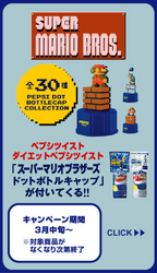
 Super Mario Pepsi Bottle Cap madness. What is up with this? Do they dance? I can’t tell. But it is definitely a strange trend in bottle cap decor? The images are pretty sweet (see below)… i wonder what the real ones look like? and there is free Super Mario TAPE as well (yes, like scotch or packing tape stuff)… found via Octopus Dropkick.

TO PAGE 2 of "Super Mario Kigurumania"! ----->
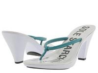
 I never expected a pair of shoes to express what i am feeling textually. I’m a girl Sole Searching. For shoes, and in life in general. But the shoes are so-so, i just think it’s an interesting idea that Kenneth Cole took their ad campaign so far… in a good way. Nothing like some good, bold, blunt statements in print. I’m a barbara kruger fan through and through, while a picture is worth 1000 words, a few more in text often add the desired irony/sarcasm/not-so-obvious. Shoewawa
 Chocolate, exotic brews, high tea in a divine little outdoor patio with great feng shui — minimalistic fountain, very green relaxed environment… Hidden on Abbot Kinney in Venice Beach, Jin Patisserie sounded good in the reviews (Angeleno, LA Times, Lucky, Daily Candy, NY Times to name a few…). It looked amazing in the pictures.
You HAVE to try it. Had high tea there today, tried to do lunch, but as i wandered through and saw the desserts and scones and chocolates, had to have sweets. Although open since Sept 2003, i have only now come to experience this secret spot of Kristy Choo, Singaporean native/air hostess turned dessert designer, in person. The highlight about afternoon tea is that you get a sampler of savories and sweets (highlight being the sweet being minis of many of the mouth watering desserts they offer). We also tried a pot of the RYOKUCHA MIDORI:
The tea drunk by the Samurai. Being low in theine and Rich in vitamins C and E, it is fortifying without over stimulating the nerves. An ideal tea for physical and intellectual exercise, it has a fine robust, fresh flavour.
I have been feeling rather physical and intellectually excercised today. But that might also be the scones and that chocolate pyramid dessert mini… Jin Patisserie
 Half of my problem with the “world”. My biggest pet peeve in the world is with regards to the world of design and usability/HCI/engineering/programming/etc. This is the first part… Creatives: it needs to be FUNCTIONAL. Usability/manufacturers: there is NO REASON for it to be ugly. I think i may have ranted a bit at UCSD cogsci HCI kids (i say kids, but i think they were all my age or older… and i was chatting about my design school experiences to an HCI class)… i keep getting the feeling some of them are too excited about making it usable, and forget that aesthetic is crucial too. Balance, people, balance. And nice find Core77 with this great dilbert epitomizing half my plight.


 Who will fall in love with Shanghai beauties like this? Please refrain from picking your teeth in public. Hahahahaha. Ok, just go click for more and read the full post already, i know you’re dying to see the other two.
 Sorry for the delays today, and due to a lot of questions lately… this is a quickie on me (well slightly). As for the delay, during a weekend of backpacking i was tech free, so no posts, but much contemplation of the meaning of life [and design].
