*rugenius -
06.14.11
, 00:13 -
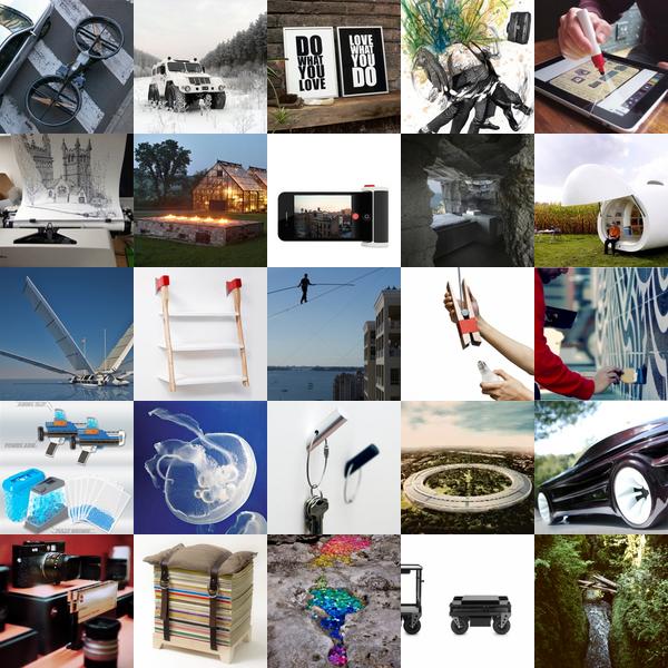
Get inspired with this stunning roundup from NOTCOT.org. This week we’ve seen yachts that turn into planes, hoverbikes, tightrope walkers and more. Find out more about each post by clicking on its individual image.
*notcot -
06.13.11
, 02:30 -
 It’s not often you see Letterpress mixed with Skateboard art… mixed with exotic hardwoods… mixed with ABCs… especially the ABC’s of offensive rap lyrics. Amazingly Scumco & Sons seems to have managed to merged all of that… and more. Crafted in their Pittsburgh studios, Scumco & Sons have launched this one of a kind 26 piece art series of decks. Nick Teodori grabbed my attention with them in person last weekend, and i must say they are even more stunning in person! His attention to detail is hard to miss. Layer upon layer of graphics, colors, woods, and meaning for you to decipher and interpret as you wish. Can you name all of the rap songs that inspired them? Can you name the beautiful exotic woods used? Can you imagine teaching kids the alphabets off of these? Which letter would you pick to adorn your wall? The Process: Standard 7 layer maple deck with an 8th layer of 0.06 mm furniture veneer, with prints made on a Vandercook Universal III then heat transferred. The lovely photos are courtesy of Demian Aspinwall, and making of coming soon… but first, check out all of the ABC’s on the next page as well as some close ups!
p.s.
While some have been sold ~ a few letters are still available from the collection… so hard trying to decide which one/s my wall needs.
--> to more images
*notcot -
06.12.11
, 01:50 -
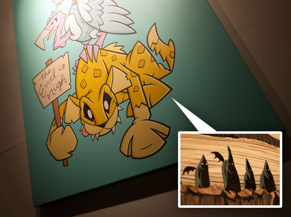 Went gallery hopping tonight ~ so fun to pop in to CoproGallery to check out the new Joe Ledbetter Innards show and Joe Vaux’s “My Brain Made Me Do it”. Fun, cheeky, creepy, and awesome ~ take a peek at some sweet details… and a few other goodies on the next page!
--> to more images
*rugenius -
06.07.11
, 00:27 -
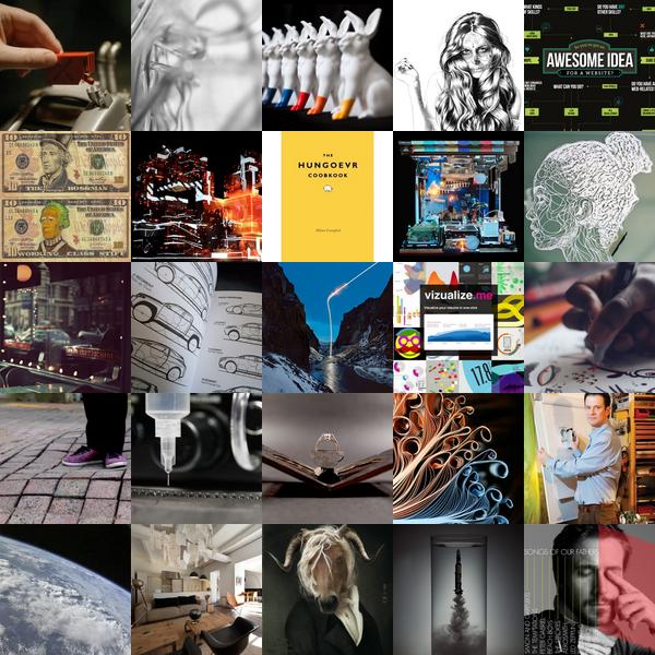
Catch up with a week’s worth of design inspiration from NOTCOT.org. This week’s picks include water droplet installations, bouncy floors, landing patterns, book sculptures and much much more. To find out more about each post, click on its individual image.
*rugenius -
05.31.11
, 00:45 -
A roundup of design inspiration from NOTCOT.org that takes you down the rabbit hole, through beautiful soundscapes and beyond. To find out more about each post, click on its individual image.
*notcot -
05.26.11
, 01:30 -
 Just in from the UK ~ Justine just checked out Clerkenwell Design Week!
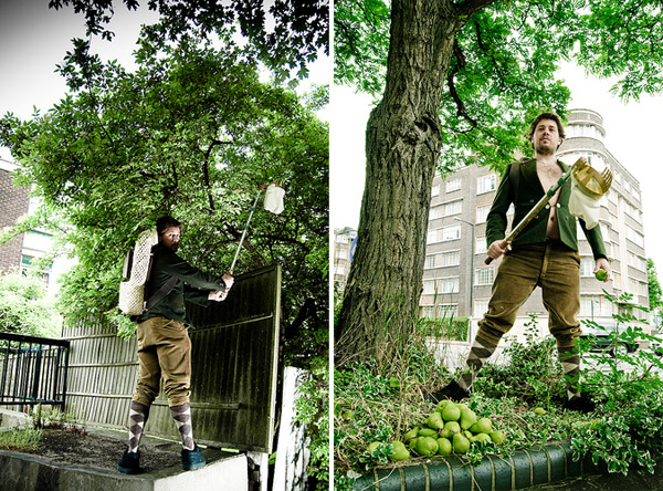
Love this project, FruitCity by Vahakn Design Studio. I discovered the project at Federal Office’s Political Objects exhibition at Clerkenwell Design Week, but found so much more about the project online!
The project is all about taking advantage of a shared community resource, fruit! There is a growing map and network of all the fruit trees in public spaces in London created by the FruitCity team. Who knew you could pick your own mulberries, figs, apples, pears and more!
In addition the map, the project includes three objects for urban fruit farmers: an extendable picking arm, a picking backpack and mobile cider press and a fantastic photos series to show them off.
Such a great community project! Angelenos should check out Fallen Fruit for LA fruit maps.
--> to more images
*notcot -
05.25.11
, 16:00 -
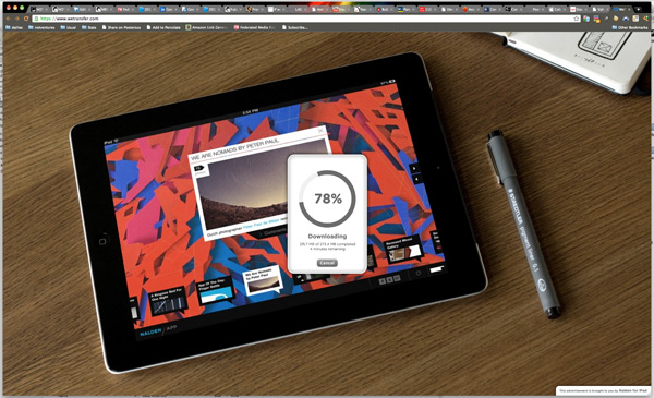 I have a mesmerizing user experience crush on WeTransfer right now. If i’m going to have to wait for ages to download files ~ it might as well be fun. There is an awesomely playful and elegant experience when i land on WeTransfer, and i actually love watching it download and excitedly await the next AD coming up… in full screen mode behind the little download progress card. It’s just gorgeous. A breath of fresh air versus the ones that have the pop ups and the speedier download if you sign up and pay, etc ones with creepy text ads trying to hide themselves as useful calls to action, and the actual download link is hidden looking like a tiny google adsense text link.
Deep breath ~ enter, WeTransfer. Dear PR people, designers, and anyone else who uses third party services to send me large files ~ there’s something magically happier about WeTransfer, i’m actually even MORE excited to see your file after going through the transfer process. And it’s just so pretty. and simple. ok, so i’m done gushing now, i just adore elegant, functional, beautiful user experiences! I even watched the ads go by AFTER the file finished downloading so i could take more screenshots to share with you guys on the next page!
p.s.
Thanks Nadine Johnson’s office for the HUGE file that took long enough for me to sit here and have my WeTransfer ad filled moment of zen.
--> to more images
*rugenius - , 15:26 -
 Just in from the UK ~ Justine just checked out Clerkenwell Design Week!
Nostalgia just hit ~ remember those pin art toys from the… 80s? Just lost a little time ending up on searching for the old ones! Found info on it on Wikipedia - random fun fact? “The pinscreen was popularized in the 1985 music video for the Midge Ure song “If I Was”, which included a giant body-sized version.” They are even still available on Amazon!
But i digress… this installation from Clerkenwell Design Week is “Be a Pin Up!” from Lulu Guinness, there she is with it above (pics from her blog). The giant frame of pins is situated in front of the iconic London landmark, St John’s Gate and lets the public create full body sized portraits using the 6,000 chromed capped aluminum pins. Here are a few pics of the images created by passerbys. Check out the pics on the next page!
--> to more images
*rugenius -
05.24.11
, 00:31 -
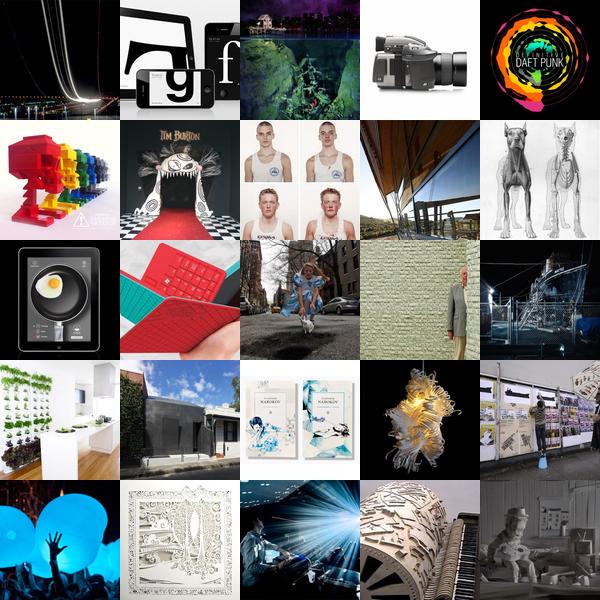
8-bit sculptures, tablet games for cats, surfboards with engines, this week’s roundup from NOTCOT.org has it all. To find out more about each post, click on its individual image.
*notcot -
05.20.11
, 22:40 -
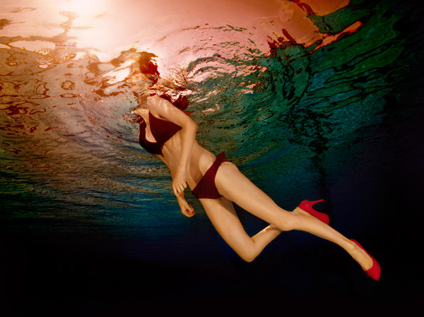 On shows that would be lovely to see in person ~ the master manipulator photographer, Jill Greenberg, has a NY show coming up ~ “Glass Ceiling” at ClampArt starting on June 16th. She “revisits her interest in feminist art for her new series (which was the focus of her senior thesis at the Rhode Island School of Design over twenty years ago). The photographs in this body of work picture female athletes and dancers underwater engaged in a variety of ambiguous and dynamic movements. The women wear colorful bathing suits and high heels in complimentary hues, forcing one to question how and why these models are immersed.” Even in times like today, so much, yet so little has changed. And it’s hard not to be reminded you’re a woman (which of course is a double edged sword… depending on how you wield it!) ~ and these pictures capture a feeling that i’m sure we’ve all come up against…. is she breaking through the glassy water tension? or is she just gasping for air? Take a peek at the stunning series on the next page…
--> to more images
*notcot -
05.19.11
, 22:05 -
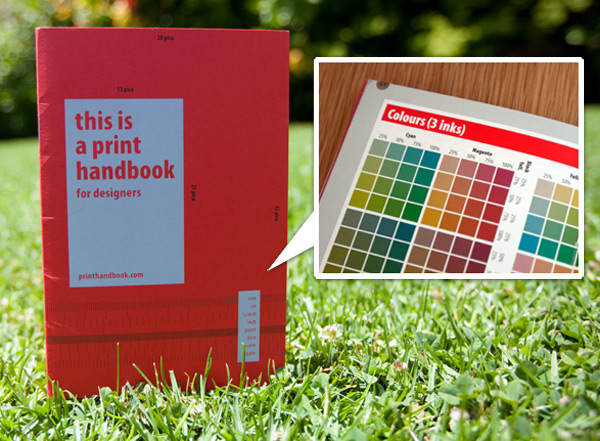 On fun little arrivals ~ it only makes sense that the Print Handbook is available in print! Even with an adorable website and a digital peek at the interior available online… it’s definitely a nice little resource for the bookshelf! Take a peek at more pages on the next page…
--> to more images
*rugenius - , 11:35 -
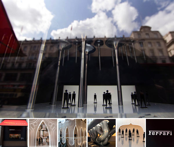 Ferrari parts, tiny abstract people, and architecture - how can you go wrong? Justine has found more window fun on London’s Regent Street. The display in the Ferrari store is my favorite of the Regent Street Windows Project, a collaboration between Regent Street retailers, the Royal Institute of British Architect’s, Elle and Regent Street.
The Ferrari display, “Cities of Tomorrow” showcase Ferrari-inspired urban environments of the future. The window designs are the work of Duggan Morris Architects in collaboration with Ferrari and Pipers. The displays are made of Ferrari memorabilia, original, unique and certified components from past and present of F1 and GT cars, which can be purchased from the Ferrari store. The Cities of Tomorrow windows will be on view at the Ferrari Store on Regent Street until Sunday 29 May 2011. Take a peek at the installations on the next page!
--> to more images
*rugenius -
05.18.11
, 09:30 -
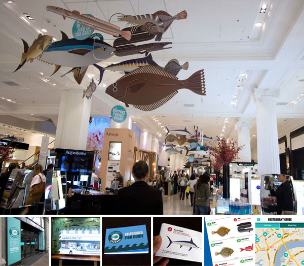 There’s more than just the Whale Rodeo! As promised, here are more highlights from Selfridges’ Project Ocean. In addition to the commitment to raise awareness and funds for conservation, Selfridges really carry the theme throughout the store, tying things together with their beautiful illustrations of fish by the very talented Sanna Annukka (check out her commercial portfolio here)! And yes, you may recognize that beautiful style from the Marimekko prints we love so much!
Annukka’s illustrations grace the doors and windows of the store, and can be found throughout the store in mobiles and on the walls (you might have spotted a few in our previous post). They are also the images that feature in Selfridges’ fish guide - the print, web, and app versions! Check out the beautiful illustrations in all their many manifestations on the next page!
--> to more images
*notcot -
05.17.11
, 16:06 -
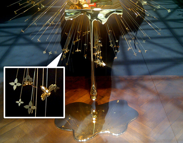 On random finds on my cell phone ~ Louis Vuitton had some memorable window designs down at South Coast Plaza. How can you not be drawn in by these dripping golden honey bursts ~ with golden bees and LV logo/icons all bursting out from it? Take a peek at more details on the next page ~ and if you have more pics or info, send it over!
--> to more images
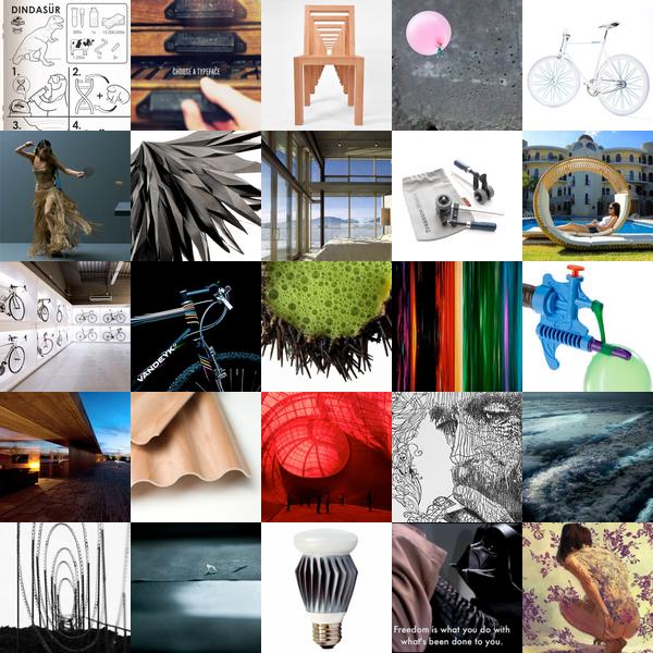
*rugenius - , 00:09 -
Linocuts, water balloon fillers and Star/Sartre Wars. It could only be your weekly NOTCOT.org roundup. To find out more about each post, click on its individual image.