*notcot -
10.17.07
, 18:26 -
 Saw this over as NOTCOT.org #6720 as posted by Daniela Sammartino and the image has been stuck in my head all day. I love these World Wildlife Federation ad campaigns that utilize the existing surroundings so well… remember the one where the shadow cast throughout the day on the billboard showed the ocean levels rising? Here we have a paper dispenser with south america cut out, and green foil to tint your view… clearly conveying that with every piece of paper you take, you’re taking away from the greenness of south america. How multisensory and engaging beyond a simple sticker/poster. By Saatchi & Saatchi, Copenhagen, Denmark.
My only other question ~ doesn’t the paper itself look green? Why the need for the green foil? (As it says over at I Believe in Advertising)
*notcot -
10.16.07
, 12:11 -
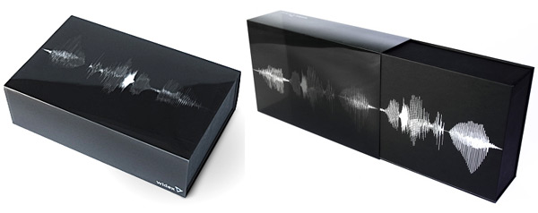 Wow. This packaging is the most brilliant way to package a hearing aid i’ve ever imagined. Feel free to jump ahead and view the video below of the seemingly simple packaging in action… and then come back to finish reading. Basically for those who can’t hear… how do you help them experience a sound before even getting to the hearing aid within? You show them a soundwave. In action. They have used the plastic sleeve around the box to create the illusion of an animated soundwave as you push the interior box out. Not to mention the simple black and white nature of the design is just classy. My only problem with this design? I can see it being far too fun to just slide the box in and out to watch the soundwave move, and thus it would take too long to get to the actual hearing aid. I love this. Design is by Copenhagen based design studio Goodmorning, for Widex “high definition hearing”.
--> to more images
*notcot -
10.14.07
, 21:06 -
 Click the images to see more! WOW. So that first pic is the Sony Bravia commercial for Egypt… they tossed more spools of thread down than i can count, and it is an incredible sight. While the bunnies were cool… watching that much thread come spinning down the side of pyramid just made my jaw drop… much like the bouncy balls and the paint! Anyhow, here are a few NOTCOT.org goodies to help you catch up/kick start the week. Happy Monday!
*ShadeElaine -
10.12.07
, 01:55 -

*Snicker* Yes, I love the cheeky title. Hand Job: A Catalog of Type by Michael Perry (published by Princeton Architectural Press) is full of unique and quirky hand-drawn typography. It makes me remember the days of junior high when I was trying so hard to establish my handwriting style, the years in high school when I embellished the letters on the notes I wrote to friends, and the random doodles that ended up on the margins of my lecture notes in college. Fifty-five typographers and graphic designers, including Geoff McFetridge and Deanne Cheuk, are featured in the book, and they are all listed in alphabetical order. Their names appear at the bottom of the pages which I found pretty handy for reference. Great to flip through for some quick inspiration, and I definitely want to start drawing words again to balance out the computer-based work I do! Some of my favorite pages from the book after the jump!
--> to more images
*Sub-Studio - , 01:46 -
 NOTCOT Note: Here’s another article from Anna Corpron of Sub-Studio!
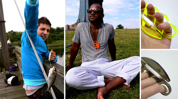
Living in New York, I don’t get to fish much, but Sean and I both grew up fishing with our dads and have a healthy appreciation for an idyllic day on a river or lake. I would love to have Christina Angliker’s Fishing Knuckles - basically a bum’s fishing kit that you can keep with you at all times. Not only a fishing rod, Fishing Knuckles is a protective device and a fashion statement. Though, it might be a bit more fashion than function - I’m not sure how you could reel in a fish without cutting your hand on the line. Christina recently graduated from Pratt and her website is definitely worth checking out - I appreciate that she includes so much of her process on the site. Also, her Peace Buttons shown below are a beautiful physical interpretation of a “wound”…
p.s. if these feel familiar, these were also seen as NOTCOT.org #1599 back in the day.
--> to more images
*notcot - , 01:23 -
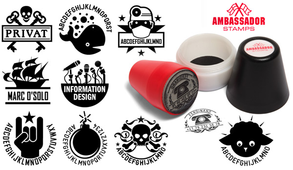 Wow. I think i just spent an hour looking at random vector logo cliparty designs for stamps, pillows, and buttons over at Ambassador Stamps that showed up in NOTCOT.ORG submissions from Jensche (it’s been fronted! But was so cool it needed a proper post as well). Basically these brilliant Swiss folks have been designing quite the playful selection of gorgeous graphics that you can choose for a stamp, throw pillow, or button… since 2002! There are basic graphics, and there are ones which you can customize with your slogan, company name, etc. And even cooler? You can fork over 89 euro, and give them your company name… and cross your fingers, close your eyes, and then see what you get in about 10 days. No refunds. But from the looks of the randomness they design that is SO fun, i’m extremely tempted. Best case scenario? You pay a mere 89 euro for the logo of your dreams? Looks like even Coudal has made one. [Beware: the UI is a bit messy ~ but the site is quite pretty.]
Ok, so enough about the really fun designs… now for the packaging and product, these aren’t just ANY stamps, they are uniquely shaped cone like stamps that are contained in screw capped ink pods of sorts (ink pad in the bottom). And they are packaged in specially designed cardboard boxes! (images of all that below). Sooooo tempting.
--> to more images
*notcot -
10.11.07
, 19:44 -
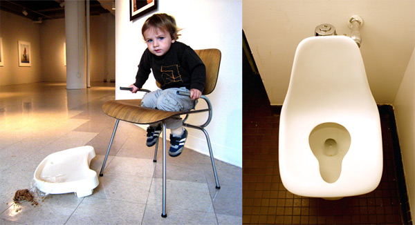 These Eames Hacks cracked me up as soon as i saw the images over at Core77. This project is by Department of Industrial Design at The University of the Arts, Philadelphia’s students: Jared Delorenzo, Tim Peet, Alexandra Temple Powell, Tom Reynolds, Alie Thomer, and Andrew McCandlish. “These two pieces, the Eames toilet chair and the Eames child seat, are about breaking the status surrounding high design objects. Through physically invasive alterations, these once iconic, elite, forms are liberated from their old, restrained image. The project is not a critique of the Eames, but rather a fulfillment of their original ideals.”
How appropriate for this Eames 100th Anniversary. Also loving the way they cut the high chair leg holes… and that toilet is hilarious. More below!
--> to more images
*notcot - , 09:28 -
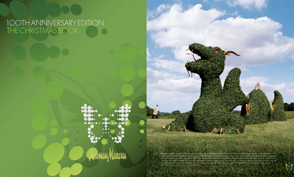 The extravagance of the Neiman Marcus Christmas Books are always an annual visual indulgence for me ~ majority of the pieces being laughably gaudy… and always a few that i covet (for my fantasy world)… it has become ritualistic page flipping, much like the annual IKEA catalogs. This year with their 100th Anniversary, it’s only MORE over the top ~ and as always, their fantasy gifts don’t disappoint ~ with everything from the $100,000 Touch Screen “Media Wall” to the Treetent hanging pod and a Swami “conversational robot”… But my favorite? The 100 ft long Dragon Topiary constructed from 15 indigenous plants… next year i’d need the moat to go with it… and then a castle? More pics below ~ and also of my *other* hopeful prediction of comebacks… the Steamer Trunk! I’ve been coveting an old style one to accommodate my trips where i throw my life in my car and take off for what can be anything from a few days to a few months… must have a way to stash it all nicely, like a pop up insta-closet. But check out the Steamer Trunk Bar below…
--> to more images
*notcot -
10.10.07
, 17:57 -
 Rodrigo Bruna just sent in some images from Reconstruccioniepce which is showing at the Museo Nacional de Bellas Artes Curated by Angélica Peréz Germain - October 5 – December 3, 2007. If he sounds familiar, you are probably remembering our previous coverage of his incredible Toast “painting”. Believe it or not, this too is made from toast! Here is his description of the piece:
“The first photography of a landscape was taken by Niepcé in 1826. The particularity and beauty of this image triggered my attention to work with it. In the middle of 2006 I initiated my research and creation project titled Reconstruccioniepce. Through spatial and objetual projects I developed a reflection of this image and the fragility of the reconstruction processes. The material chosen for these works was bread, and the action was toasting. It is not longer the sun which fixes the images, but the vehement fire that fixes the vestiges of a landscape on white slices of bread. This statement defines my system of work and the material and technical displacement I made of the photographic process. Reconstruccioniepce V arises from the destruction realized of a previous version of this work at the Museo de Artes Visuales of Santiago.
The remains of bread that were left from this action are selected and organized in a ornamental border that crosses two walls of the room, proposing a new version of this enigmatic landscape.”
--> to more images
*notcot - , 16:23 -
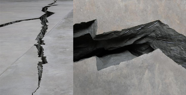 “Doris Salcedo’s Shibboleth is the first work to intervene directly in the fabric of the Turbine Hall. Rather than fill this iconic space with a conventional sculpture or installation, Salcedo has created a subterranean chasm that stretches the length of the Turbine Hall. The concrete walls of the crevice are ruptured by a steel mesh fence, creating a tension between these elements that resist yet depend on one another.” Love the images of this latest exhibit at the Tate Modern. Found this over at DesignBoom.
--> to more images
*notcot -
10.09.07
, 12:50 -
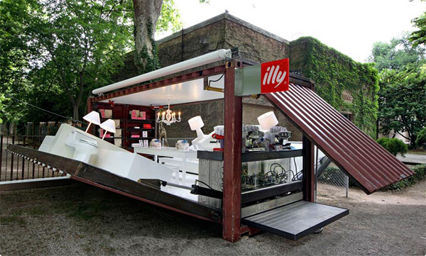 I just spotted this incredibly cool shipping container/Illy cafe titled the “Push Button House” on The Cool Hunter ~ and it brought back a flood of memories, of all the other fascinating uses of shipping containers that have come up on NOTCOT in the past (full pictorial reminiscing below of more than 10 breathtaking reincarnations) from instant server black boxes to bars to art galleries and more. But check out how this Illy one opens! And how much they pack in there? Shade Elaine and i are thinking this might be the way to have the perfect mobile studio, and we can drop down in random backyards of friends all over the world? Hehe. Ok anyhow, i digress.
“Holiday shoppers milling about the Time Warner Center in New York will have a fabulous chance to experience one of these soon. Between November 28 and December 29, 2007, they can rest, relax and sip a perfect cup of illy espresso in one of Kalkin’s creations, the temporary Push Button House cafe that the Trieste, Italy-based illycaffè will install there. The European premier of this concept by Alan Kalkin and illy took place at the 52nd Venice Biennale where illy continues to partner with the Fondazione La Biennale di Venezia by providing the visitors each year a space to relax and enjoy their complimentary espresso.” Adam Kalkin has an impressive portfolio of living/lounging spaces created from shipping containers as well ~ more images of those as well as an animation of the Push Button House opening below!
--> to more images
*notcot -
10.05.07
, 14:35 -
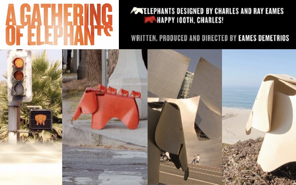 It’s the 100th anniversary of the Eames’ birth, and their grandson Eames Demetrios has made a tribute to them. “This is a double celebration of the Charles Eames centennial (go to the Eames Office site to learn more). The Elephants were designed in 1945 but never went into production. This year, to celebrate the 100th anniversary of Charles’ birth, the Vitra Design Museum in association with the Eames Office, has brought them out in a limited edition.”
To watch the film.
To watch the film and making of with introduction by Eames Demetrios, which is on Eames Demetrios’ DASFilmFest.com (Fortnightly movies on Design, Architecture, and Sustainability plus a blog and a bit more…)
And some of my favorite screenshots are below! And i love that it is shot all over LA ~ lots of LA icons from randy’s donuts, the gehry music hall, santa monica pier and looking down at PCH, the tar pits…. ahhhh, home. And its great they even went guerrilla street art on the crossing signals to make them elephants!
--> to more images
*notcot -
10.03.07
, 18:07 -
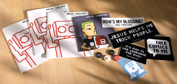 Mmmm Diesel Sweeties. As if its not enough that they amuse me daily, this surprise package just showed up and i can’t stop grinning. The latest comics, stickers, and buttons! “It’s fun to use learning for evil!” ~ i’m currently debating whether to stick this over the the glowing apple on my macbook pro. I’m not even a cat person, but i do love that cat button… ahhh emo emoticons… and rockers do rock out…
OK ~ so since they sent extras, it only seems appropriate to keep sharing the love. So leave me a note, and i’ll pick the most amusing commenter (about why you love diesel sweeties, notcot, pixels, etc) at midnight (PST) tonight to send a copy of Diesel Sweeties Print Dailies Vol. One and some notcot pins! [UPDATE! The winner has been emailed!]
--> to more images
*notcot -
10.02.07
, 13:31 -
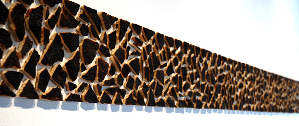
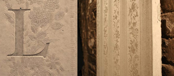 DesignBoom has a great post this morning on Concrete Blond at Designersblock ~ Instead of wallpapering a concrete wall, they apply the wallpaper patterns through texturing the concrete… and the result is a mesmerizingly beautiful unexpected result. More images below both from Design Boom and Concrete Blond.
--> to more images
*notcot - , 13:04 -
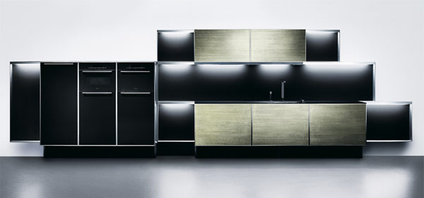 *Swoon* Just got a press release in my inbox saying: “A new kitchen especially designed for men – Miele exclusive supplier of appliances - Poggenpohl presents first Porsche Design kitchen - Herford/Stuttgart. Porsche Design Group and Poggenpohl Möbelwerke GmbH present their first co-designed kitchen P’7340. The kitchen is distinguished for its innovative framework, purist styling and high-quality materials. Kitchen appliances maker Miele & Cie. KG will be the exclusive supplier of all fitted electric appliances.”
Firstly, it cracks me up that they say its for men. Is that sexist? Either way, just b/c its nice and minimal should not make it manly. I want it. It screams calm, organized, and controlled to me. Check out more images below, as well as the full press release with more of their justifications on how this is male oriented and the various materials used and the history of the companies collaboration.
--> to more images

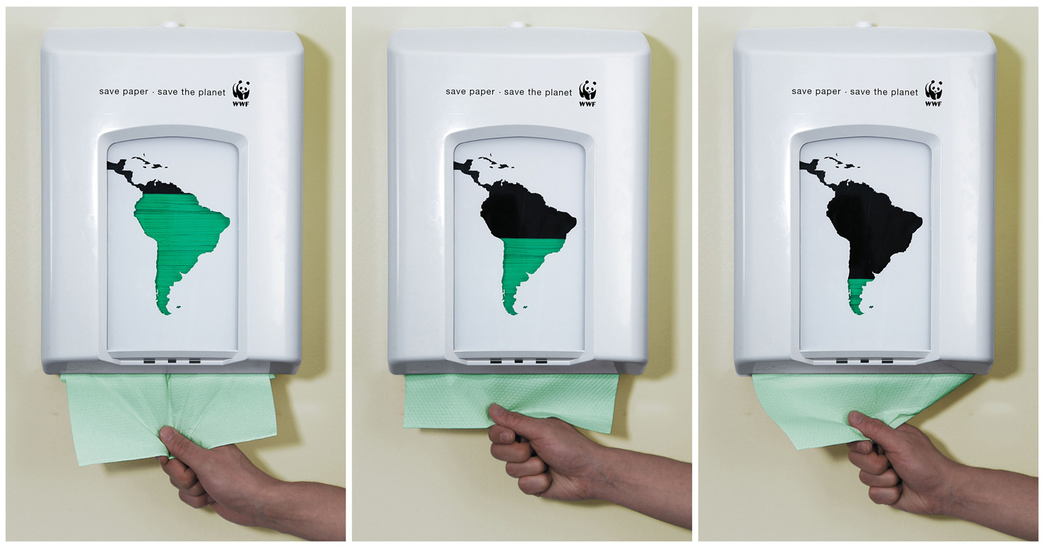 Saw this over as NOTCOT.org #6720 as posted by Daniela Sammartino and the image has been stuck in my head all day. I love these World Wildlife Federation ad campaigns that utilize the existing surroundings so well… remember the one where the shadow cast throughout the day on the billboard showed the ocean levels rising? Here we have a paper dispenser with south america cut out, and green foil to tint your view… clearly conveying that with every piece of paper you take, you’re taking away from the greenness of south america. How multisensory and engaging beyond a simple sticker/poster. By Saatchi & Saatchi, Copenhagen, Denmark.