*notcot -
01.24.08
, 18:27 -
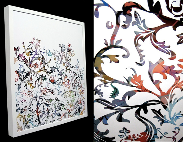
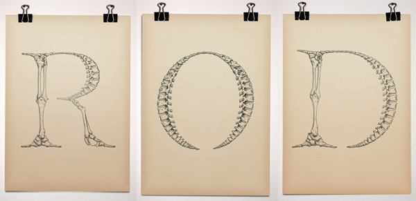 This is Bjorn Johansson’s Anatomy of a Typeface ~ “Triptych made for a gallery exhibition in 2005. The work is playing with the word “anatomy” which in typographic terms is referring to the different parts of a character.” It’s somehow been in an open tab for me all day, and its absolutely mesmerizing, too bad there isn’t a complete font in this style… that could result in some incredible posters! See more close ups after the jump!
--> to more images
*notcot -
01.23.08
, 23:35 -
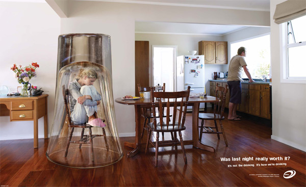 “It’s not the drinking. It’s HOW we’re drinking.” The Alcohol Advisory Council of New Zealand has some great print and tv adverts on creating awareness about drinking. Rather than being completely anti-drinking, they are making people more aware of HOW they are drinking. It seems to be an interesting and effective approach… take a look at their television ads here. Also interesting is their campaign about how its not just kids that drink too much, and show the mirror image of “grown ups”… see the ads after the jump!
--> to more images
*notcot - , 04:10 -
 Following up the Jorge Oswaldo post, i’m excited to continue this trend of artwork that is literally layered to create surreal depths… these are the types of works you really need to see in person to fully appreciate.
Remember Brooks Salzwedel? (Of the incredible belt buckles, resin art pieces, and Shane jewelry?) Well, the real reason i headed out to the Tinlark Gallery Anniversary at the Crossroads of the World on saturday night was to see his debut solo show of “By Fault of Its Own”. And it was incredible to see the layered resin pieces up close, in fact one of the coolest things was to see them from the side! You can actually see the layers! And up close, being able to see the details of which trees and tendrils are floating above and below, and that cloudy haze that surrounds them all… well, i tried to get pictures of the whole room to share, and bring you into the tiny details that delighted me at the show… so check out all the pics after the jump!
--> to more images
*notcot - , 00:50 -
 Can you believe that is layered vinyl stickering? Creating that depth through layering? Such a nice mix of the precision of vector lines cut with a vinyl cutter… yet brought back out from the digital to a physical mixed media piece? I discovered the work of Jorge Oswaldo through his video on Current TV (embedded after the jump for your viewing pleasure along with a few more of my favorites from his work!). Talking about ways NOTCOT has inspired me daily… this one takes it to a new level… i received the vinyl cutter for my birthday, made a limited edition series of stickers, one of the guys who bought the stickers tips me off to this awesome video, and now how can i not push the boundaries and start making crazy art with it? Let’s just say i have some silly street art ideas for reflective vinyl stickering… but until then, check out the video below of Jorge Oswaldo’s walk through his studio, his process, and his incredible work with vinyl… unlikely you’ll ever look at stickers quite the same!
--> to more images
*notcot -
01.21.08
, 00:53 -
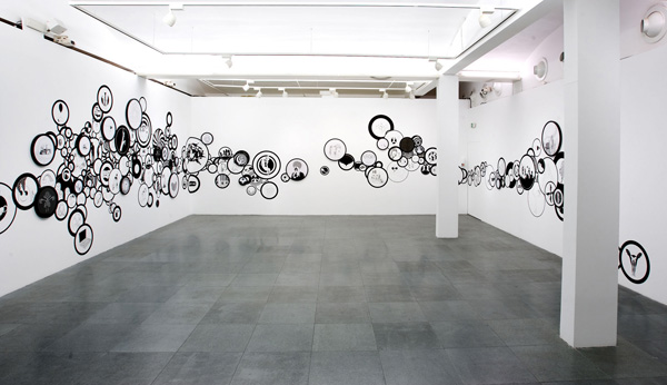 It’s like xmas morning every time i get an email with attachments from artists Petra Mrzyk & Jean-Francois Moriceau ~ i always know inside are jaw-dropping pics of black and white goodness in the form of painting/installation combos. And this latest one does not disappoint! So after the jump you can see many images from their latest show “Golden Eyes” at the Caixa Forum in Barcelona! With a circle motif, this show is a mix “between a wall-drawing and real round drawings framed”… ultimately creating a very surreal sense of depth, while simultaneously appearing incredibly flat… anyhow, it’s mesmerizing to peer into each and every circle to see what unexpectedly twisted/playful drawings are within.
--> to more images
*notcot -
01.20.08
, 10:57 -
 NOTCOT Note: Here’s a post from Justine/RUGenius ~ who is running around with our mom in Oxford and the general vicinity…
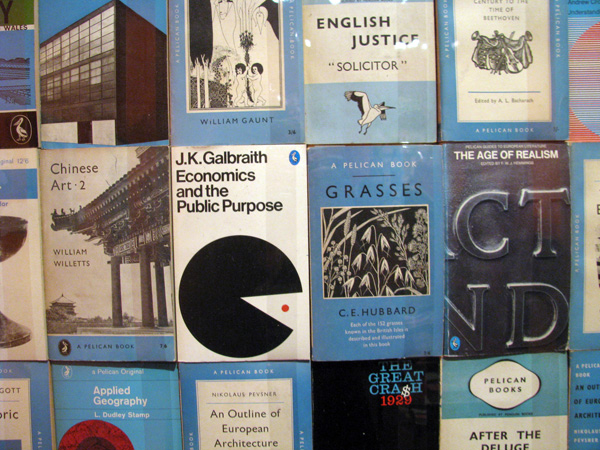
When trying to decide where to take my mother for the day, an ad caught my eye - “Seventy Years of Penguin Design” at the Holburne Museum of Art in Bath. Here was a combination of things we love: books, design…and superficially enough, penguins!
While the exhibit itself was tiny, no more than a room, it was filled with treasures and gorgeously arranged, painted a bright Penguin book cover orange. And what a cover! It’s hard to think of a more iconic design (perhaps the old Campbell’s soup can?). And Penguin has certainly been marketing it design classic, selling Penguin classic book mugs, deckchairs and towels. We all know and love that three panel design, but I, for one, didn’t know much else about Penguin. Did you know that first Penguin paperbacks were just two and a half pence and designed with the goal of making literature affordable and accessible to all. If only that were still true!!! And it’s not JUST penguin, you can also see the development of the Pelican and Puffin lines and logos as well! Read more and see pics of it all after the jump!
--> to more images
*Sub-Studio -
01.17.08
, 20:20 -
 NOTCOT Note: Here’s another article from Anna Corpron of Sub-Studio!
I came across Merdanchik’s work online for the first time tonight and was immediately floored by his amazing illustrations. The colors he uses, the textures…and I’m very curious about the narrative behind the imagery! Unfortunately, I can’t find out much of anything about Merdanchik online, other than that he is a Russian artist with a really impressive body of work and client list. You can see more of his work on his two blogs, as well as on his flickr site. Any tips? Let me know!
--> to more images
*notcot - , 13:05 -
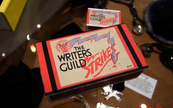 I wandered into A+R last night, and *had* to take pictures of these Writers Guild Strikes vintage-esque matchboxes. The typography, pen nib/lightning, colors, and various angles with which to interpret every all the symbolism… For anyone that’s curious, these are not for sale, but for those who want to see them in person, these are in the A+R store on Abbot Kinney. As for the writer’s strike, its been a long nearly three months, here in LA especially, and i’m sure we’ve all been seeing the effects of the strike internationally - with the hold up on shows, awards shows, tv hosts ad libbing their own shows, etc… best of luck to them!
--> to more images
*notcot -
01.14.08
, 19:26 -
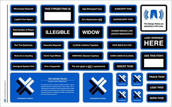 The Design Police want to “Bring bad design to justice.” and they have even provided a Visual Enforcement Kit to help you with your vigilante justice… whether you choose to make that in the form of stickers, stencils, etc… Personally i’m liking the design of the original stickers of the Design Police Guerilla Campaign in Stephen’s portfolio even more! See more imagery after the jump!
--> to more images
*notcot -
01.11.08
, 16:17 -
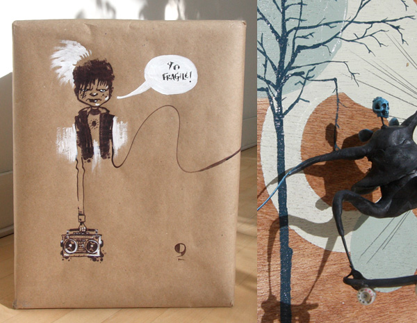 Ok, while the Busy Beaver package had me all giddy ~ even cooler is what JUST showed up on my doorstep… remember the Skate Life show? Skate Life: Skateboard Inspired Sculptures and Paintings by J. Shea and Freddi C Well it turns out that Joe and Freddi loved the pics so much, they were kinda enough to surprised me with one of the pieces!!! And its SO sweet ~ love the little skater guy, and the great shadows he makes, will definitely need to put this somewhere where the light can make crazy shadows and he can be my artistic sundial of sorts. But the other really awesome thing is the illustration on the brown paper wrap!!! I LOVE this ‘YO FRAGILE!’ guy, and am now debating how to save him, frame him, whether to cut him out, fold it up… ideas? Check out more of J. Shea’s work here. Lots of pictures after the jump!
--> to more images
*notcot - , 15:45 -
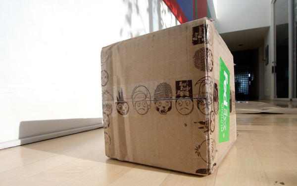 MORE NOTCOT BUTTONS!!! I’m so excited. They are just refills (can’t believe i’m out) ~ was too indecisive to pick what should be on new ones. So for anyone who wants buttons ~ Buy Here. But moving along to the awesome packaging… remember that Busy Beaver TAPE i wrote about? They used it on my box! (Last time my buttons were just in a bag) AND they threw in some fun sticker/tear off calendars too! See more pics after the jump! Yay for Busy Beaver Buttons.
--> to more images
*notcot -
01.10.08
, 03:54 -
 First things first ~ i think my favorite thing about running the NOTCOT sites is YOU. Yes, you readers who find and share the most inspiring and incredible things with us whether it is via NOTCOT.org, email, im, etc. I don’t lie when i say that thanks to you, i haven’t had a day that i wasn’t incredibly inspired by something since the sites launched back in 2005. So, thanks for that!
But moving along, this whole little 4am emotional outburst is triggered especially by the latest TED talk with JJ Abrams that Jason Wishnow was kind enough to enlighten me with. I had never really looked into the background and philosophies of producer, director, screenwriter behind things like Lost, Alias, Felicity, etc… who knew the guy was quite the geek, lives right in my neighborhood, and might have a box/packaging obsession to rival mine? In fact ~ he has a laser cutter! (which he apparently uses to make his own boxes as well as turning his kids sketches into 2D renderings) - all this random info is courtesy of a fun NYTimes interview i just found… and his full TED bio is after the jump.
But if you’re wondering why i have an image of this awesome Tannen’s Magic Mystery Box with the incredible typography up there… well, in his TED talk, JJ Abrams will tell you his story of this 15$ mystery box that his grandfather bought him, that he has STILL YET TO OPEN… and he discusses the concepts of infinite possibility and the power of a sense of potential… how mystery is the catalyst for imagination… and that life altering moment where he realized the possibility that mystery is more important than knowledge… the difference between what you think you’re getting versus what you’re actually getting… and how this applies to movies, storytelling, life… and how incredible it is that todays ubiquitous technologies have made it possible for anyone to instantly try their hand at writing/publishing (i.e. blogging) and movie making to a degree that wasn’t even possible a mere 30-40 years ago. Anyhow, this is an inspiring one to kick off your Thursday with… watch the talk after the jump!
--> to more images
*notcot - , 00:57 -
 Coco just sent over her portfolio, and its a beautiful mixed media assortment of works that begin with “experimenting with old-school processes such as painting, drawing and ceramics” and then pulling them together in our good ol’ photoshop for a perfect mixture of physical and digital collaging. Having studied fine arts in paris, and spending the last few years in london, as well as extensive work that started out for fun illustrating fashion, its no wonder Coco has now been seen in Vogue Magazine, Dazed & confused, Nylon Japan, Plastique & Bon magazine. The London & Barcelona Fashion Week. For some of my favorites from the portfolio, see after the jump!
--> to more images
*notcot - , 00:40 -
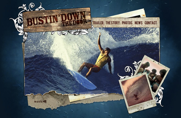 DGTLHYBRD just opened my eyes to the beautiful site (and movie) ~ Bustin’ Down The Door ~ with .org #8029, and between the music, the site design, and the movie itself, i’m terribly tempted to take a drive down along the coast to San Diego tomorrow, and chill out from the buzz in my head that was CES/Vegas. I’m absolutely taken by the layered tea stained paper look over the depths of a school of fish in the ocean, combined with vintage photos and video of a turning point in surf history.
--> to more images