*notcot -
01.09.08
, 13:49 -
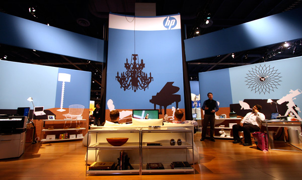 I must say that i was proud to have our sites sponsored by HP when i walked into this booth… it was like a designers wet dream. I was just floored by the intense amount of design classics everywhere, and didn’t expect to find a booth covered in silhouettes of design classics ~ as well as many beautiful design pieces in their settings as well. Can you name/spot all the pieces? I have LOTS of pictures for you below, and it does feel like they might have gone nuts with a DWR catalog. And even down to the tiniest details ~ they have a normann copenhagen WOOFY on a shelf ~ looks like a nava notebook and automoblox on a desk even! And now they have me pondering whether to start printing out silhouettes of life size design classics (like lamps and chairs) with my vinyl cutter! Even the artimide tolomeo mega classic floor lamp is there. My absolute favorite i’m tempted to replicate is their Vitra Algue wall… i never could justify spending enough to make a proper wall hanging of those, but with the push of a button the vinyl silhouette version would be sooooo easy. I think there is even a french bulldog on one of the walls…. and the mix of woodgrain and the various hues of blue for the faux walls in their walls mixed with the crisp black and white of the products…. *swoon* Look at the pics below, let me know what else you spot!
--> to more images
*notcot -
01.04.08
, 00:13 -
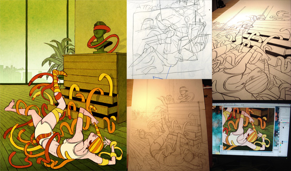 Koren Shadmi is the most inspiring thing i’ve seen today. Particularly his live journal, which gives us all a peek into the madness that comes before the final illustrations, and a chance to see how things evolve from rough sketch to pencil to brush to photoshop and beyond. My exploration through his work today started with his great illustration in the NYTimes today for the article “Putting Your Best Cyberface Forward” about who we are, and the bizarre behavioral adaptations to show our better sides and alter egos on the internet, be it dating sites, facebook, or just emailing. See some of my favorite pieces of inspiration from his work below… and for the Koren Shadmi’s portfolio here.
--> to more images
*Sub-Studio -
01.02.08
, 20:25 -
 NOTCOT Note: Here’s another article from Anna Corpron of Sub-Studio!
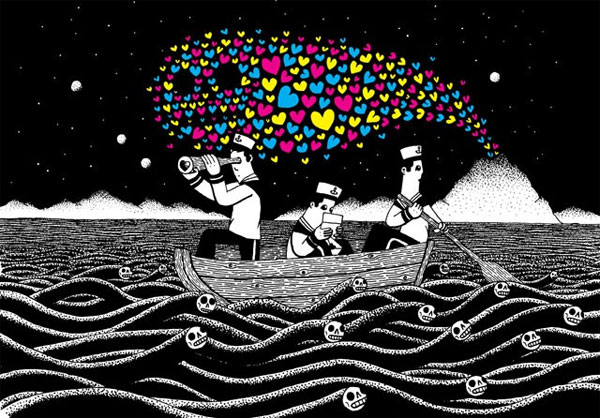
I love Heiko’s illustrations. To me, his work is about contrasts - black and white with a few dabs of CMYK, seemingly innocent scenes with slightly menacing undertones. Sometimes it’s exactly the opposite - a monster or a volcano emanating hearts. The same graphic symbols appear in Heiko’s work over and over again - pandas, hearts, volcanoes, eel-like skeletons, whistled notes, birds, usually reinterpreted per illustration (eel waves, Medusa-locks, eel peacock feathers). And the bonus? Heiko’s work is very affordable, with prints ranging from $15-$35 (via Thumbtack Press), $1 postcards, and buttons for $3.
--> to more images
*notcot - , 18:56 -
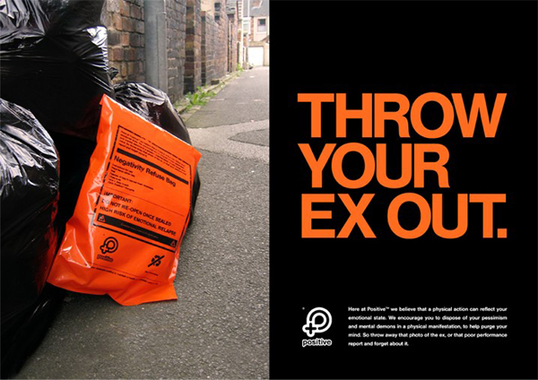 Negativity Refuse Bags would have been the *perfect* New Years gifts! Although merely a Positive* Branding/Campaign Concept… still would be a pretty fun gift, particularly for placing all that baggage emotional and otherwise into before burning at a bonfire? The bag states “Here at Positive, we believe that a physical action can reflect your emotional state. We encourage you to dispose of your pessimism and mental demons in a physical manifestation, to help purge your mind. So throw away that photo of the ex, or that poor performance report, and forget about it.”
Instructions for use:
Place items within bag
Seal
Dispose of bag in nearest trash receptacle
Close Eyes
Take a deep breath
Think Positive thoughts.
IMPORTANT: DO NOT RE-OPEN ONCE SEALED. HIGH RISK OF EMOTIONAL RELAPSE. Contains items of personal significance.
--> to more images
*notcot -
01.01.08
, 17:44 -
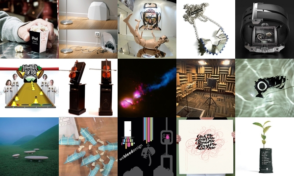
 Click away on the 100 tiny pics to see more! So as you’ve seen from the last two posts, i’m clearly playing with the best New Year’s present ever ~ a new chunk of code to play with that Dan gave me so i can make some crazy automated roundups (versus the ones where we handpick some of our favorites) ~ and this is visualized data even we have never seen before now! ~ for the sake of transparency ~ i haven’t quite figured out how to find the perfect measurement of “popularity” ~ someday it will become some finely tuned algorithm balancing click throughs, votes, reports, time its been up on the site, etc? But for now, these are my test creations ~ and this one is 100 of the most popular posts of NOTCOT.org for 2007!
Also on exciting new features to look forward to in 2008, we’re hoping to find some better ways to let you make use of the “votes/nice/delicious” buttons across the sites… would you be interested if we let you save the ones you liked so its easier to filter the now thousands and thousands of posts? sort them? group them? make your own little collections? We’ve been bouncing lots of ideas around, and now that dan is working with me full time, we’re really hoping to have some fun in the design/development dept for 2008! Happy New Year, and thank you so so sooooo much for supporting the sites!
p.s. b/c i couldn’t help myself below is a super crazy tiny top 1200 ever on .org…
--> to more images
*notcot -
12.30.07
, 13:39 -
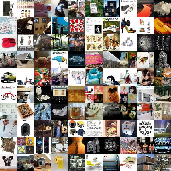
 Will Ashford’s Recycled Words do just that… literally. In an obsessive compulsive pattern recognition, pencil doodling, word in words spotting, ‘art’ loving way, he brings out what was already there but not even seen from your every day book pages, and it blows my mind. I love it when i wake up to emails like the one from Ryan with images of Will’s work where i can’t help just sitting here and staring at image after image for a while… and as Ryan said “It’s like he’s made the old study technique of highlighting into an advanced art form… or something.” I concur. Imagine if we reverse highlighted our books to only show the most critical of information! I guess at that point it would look more like art, and as far as info goes you might as well just carry the cliffnotes around? But this would be an incredible daily exercise, the reverse journal basically ~ granted you picked the right book? Anyhow for those of you squinting to read, in that first image the yellow says LOOK FOR the orange says ART the red says AND the purple says IT the teal says WILL APPEAR and the binoculars say THE END. But really, just click through to see more below! My other favorites are there as well!
--> to more images
*notcot -
12.28.07
, 14:22 -
 I was just checking out Andy’s site and came across this beautiful silhouette animation all about the a fountain of youth in a bottle and the man who goes through the ages keeping it to himself… only to teach the lesson of “how loving a gift isn’t complete until its shared” as Cory Godbey intended with this piece - Le Cadeau du Temps, view the animation below! And read more at Zune, where they even have wallpapers for computers as well as zunes, icons, etc for your downloading pleasure.
--> to more images
*notcot - , 00:56 -
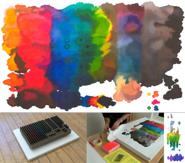 Sometimes the simplest of things combined with some patience render the most beautiful results… and in the case of Daniel Eatok’s Pantone Pen Prints ~ 73 results… and i wish i knew about these back in 2006 ~ because they are not only beautiful but incredibly cheap as well! The bottom layer being 1₤ and working its way up to the top laying being 73₤. Basically, he balanced a set of 288 Pantone Pens on their nibs and let the paper soak it all in over the course of a month. More images below, i can’t stop staring at them, and am dying to run out and set up my own to try! Found this over at Bobby Sattler’s Whole lot of BS.
--> to more images
*notcot -
12.27.07
, 00:10 -
 Click the images to find out more! NOTCOT.org roundup time! Just some goodies i liked that have shown up recently ~ so click and browse away… there are only 4 more days of 007 left!
*notcot -
12.25.07
, 12:36 -
 Merry Christmas ~ and for everyone curious at spying on other’s cards that came into the inbox this year, below are a bunch of nice digital xmas cards with fun graphics and ideas…
--> to more images
*notcot -
12.24.07
, 12:42 -
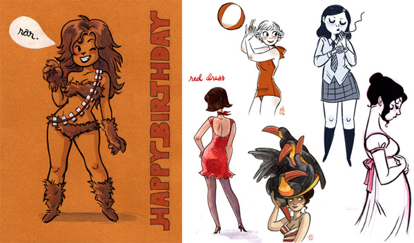 Could it be? That you readers are right and the image below is the work of the incredibly inspiring Verabee? Aka Vera Brosgol? And even if it isn’t, i’m so glad that the comments on the last post have opened my eyes to her breathtaking body of work! That combined with the music on the gift guide have somehow managed to perk me up substantially today in what has otherwise been a rather drab holiday week. So go check out her seriously impressive portfolio at Verabee.com. Thanks, Robbio and Miss Madeline!
*notcot - , 11:06 -
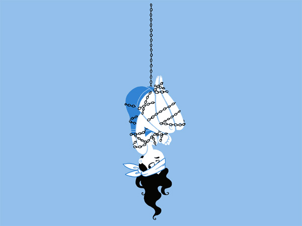 I’d like to take this xmas eve to have a totally random nonsensical post. This image popped up when i was cleaning out old emails, i have no clue what it is other than escape.gif… rstevens of Diesel Sweeties tends to leave random images to sign off emails. And its been mesmerizing me on my desktop… i feel like she looks some days! And on more randomness ~ HAPPY BIRTHDAY! To dan, who’s taking this cofounder/dev/save-the-day role for NOTCOT fulltime and letting that corporate silicon valley gig go.
*notcot -
12.23.07
, 16:02 -
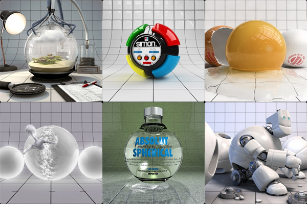 If you’re ready to lose a few hours going through a massive gallery of drool worthy CG ~ check out CG Sphere. Here are a few of my favorites from the little i went through ~ more below as well!
--> to more images
*notcot -
12.22.07
, 15:47 -
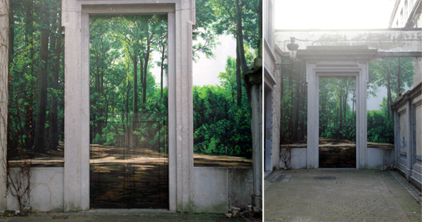 Dara is back in Brussels for the holidays, and just sent me a quick email with the most incredible mural she wandered past… “I was out in town yesterday during the day in this chic area called Sablon, where they have all the famous chocolate shops, on my way to the grand place, i stopped at this beautiful mural on a door out in the middle of nowhere!” Anyhow, it was such a nice combination and a great use of the physical space, i had to share it with you as well! She’s also attached a picture of the infamous manneken pis all decked out in his santa gear… Now she’s making me think of those climbing santas i saw all through belgium last time i was there in the holiday season!
--> to more images
*notcot -
12.19.07
, 17:24 -
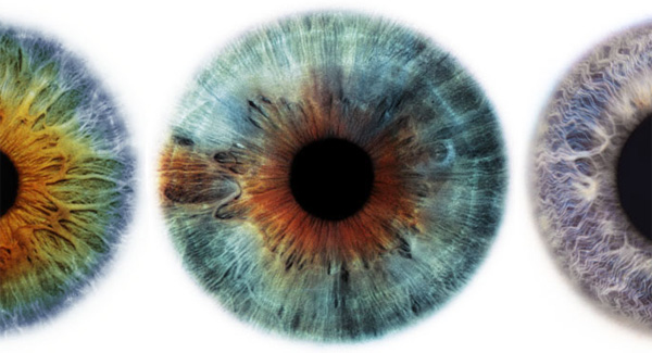 Rankin is an incredible photographer who has shot celebrities, covers, editorials, etc… but these Eyescapes at the Art Department are absolutely mesmerizing. It truly changes what you imagine when talking about *really* looking into someone’s eyes.
--> to more images