*NOTCOT in
design - 04.06.08 -
 NOTCOT Note: Here’s another post from Anna of the lovely Sub-Studio! You can also see her artwork in the tags on the side of the page right now!
Little Fury is the design collaborative of Esther Mun and Tina Chang. The two met in New York at Pentagram, and after a few stints at different offices, started Little Fury with the design philosophy:
No design for the sake of design.
No “overdone” products.
No “cutesy doodads”.
Simplicity. Functionality. Practicality. Innovation. Individuality.
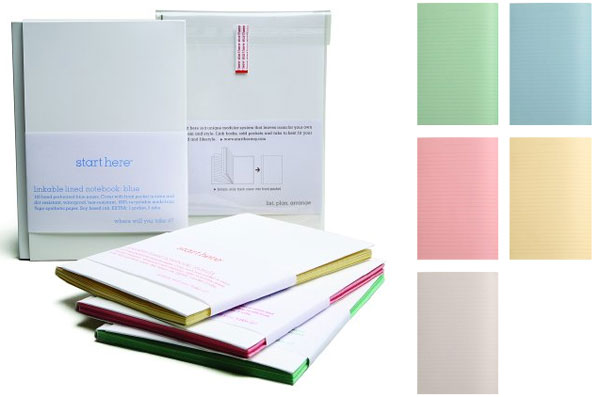
The result is an impressive portfolio of branding/identity projects and gorgeous product packaging, including the product series Start Here - a set of linkable notebooks and planners. Individual notebooks can be linked together as you need and customized with self-adhesive pockets and colorful tabs. The cover is stain resistant, waterproof, and tear-resistant, and the interior paper is available in blue, grey, white, pink, manila, and green.
Check out more great projects after the jump.
TO PAGE 2 of "Start Here / Little Fury"! ----->
*NOTCOT in
design - 04.05.08 -
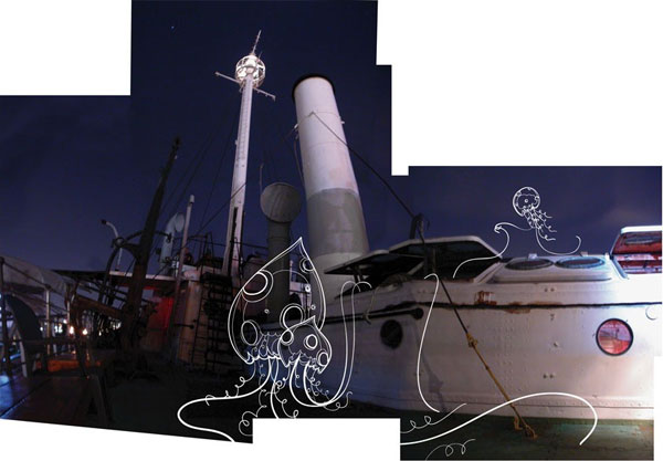 Look left. Look right. I’m excited to announce that we are showcasing the works of Sub-Studio in the gallery hang tags!!! While most of you should be quite familiar with Sub-Studio (anna has been contributing some pretty amazing posts to NOTCOT)… for those who don’t know, Sub-Studio is the dynamic husband and wife duo - anna corpron and sean auyeung - with some incredible illustration/print skills, an adorable online shop, and a very cool blog. So explore an excerpt of their work through the tags - click away to see full pics in the gallery!
 Click the images to find out more! And as always - TasteSpotting and NotCouture roundups after the jump! Here are the most popular 25 posts over at NOTCOT.org this week! I’m still up in norcal, but theoretically heading back down to LA in a few hours… see some of the deliciousness on tastespotting and notcouture below - the bacon bra is particularly horrifying/fascinating.
TO PAGE 2 of "Roundup of Roundups!"! ----->
*NOTCOT in
wearable - 04.04.08 -
*NOTCOT in
design - 04.03.08 -
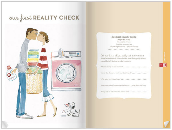 So my mother sends me an email linking Target’s Club Wedd Catalog. Yes, a catalog for those prepping for their vows. No, i’m not at all anywhere near that stage of my life… and i don’t *think* she’s hinting at anything (she’d be skipping a major step, seeing as i’m single). Anyhow, turns out what she claims to have wanted to point out is that she really liked page 74 which has a nice “what you need in your kitchen drawer” type diagram… i love that they have things like Silicone Gadgets, Angled Measuring Cups, Potato Ricer, Zester, etc… really the whole guide could be an easy way to catch your bachelor friends up on what they need in their houses…
ALSO noteworthy… when two giants converge, as soon as i started flipping through this digital catalog, i kept feeling like i was at Daily Candy, but i knew i was at Target, naturally i thought i was losing it… Turns out i’m not completely crazy, and they enlisted Daily Candy’s signature illustrator, Sujean Rim to paint the adorable images of newly weds in various stages… see more images below of my favorites!
TO PAGE 2 of "Target’s Club Wedd Catalog"! ----->
 NOTCOT Note: Here’s another post from Anna of the lovely Sub-Studio! I can’t decide whether Julie’s work here creeps me out and/or is incredibly awesome…
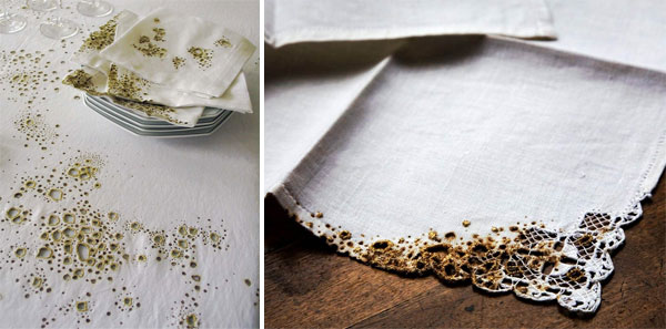
Julie Krakowski is a designer creating conceptual textiles. Take Coffee and Cigarettes I - a series of textiles based on the marks typically left on linens by everyday life, such as cigarette burns, and food stains. Each mark is painstakingly embroidered into the linen. This series seeks to “accentuate the importance of the random and the ambiguity between the worn and the precious”. Other textile explorations look at material transformation, such as molting and shedding, as well as textiles based on the organic world of mosses, vines, flowers, lichens and shells.
Check out more of Julie’s work after the jump.
TO PAGE 2 of "Julie Krakowski"! ----->
*NOTCOT in
design - 04.02.08 -
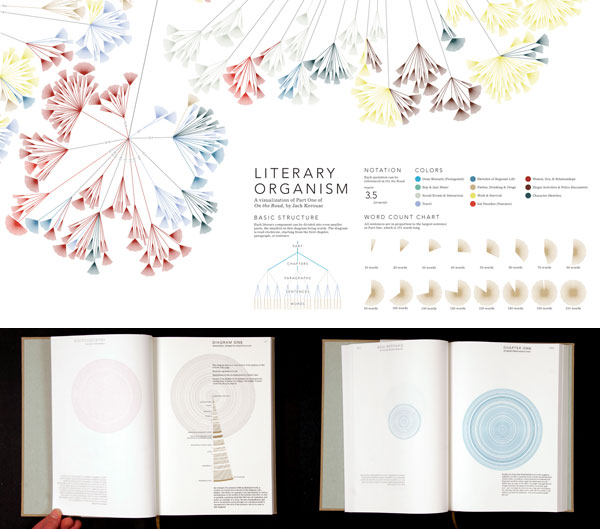 NOTCOT Note: Here is another post continuing on Justine’s (aka RUGenius’) adventures in Sheffield, it took a bit of researching, but she’s come back to me with some MIND BLOWING infographics from Stephanie Posavec, you definitely need to click on the images after the jump to see them in full resolution where you can see what every curve and color represents. I kid you not, you will not see Kerouac’s On The Road the same again…
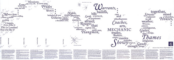
During my recent trip up to Sheffield, I was fortunate enough to be staying next door to the Millennium Galleries, who hosted a portion of the citywide Art Sheffield event. Among the exhibits, was one called “On the Map” (more info here as well), which uses craft and design to understand the symbolic and representative nature of maps. Works included a dress made of maps, numerous old maps of London, a gorgeous Kerr | Noble representation of the River Thames through graphic design and the words of the John Banck’s Description of London. Seen here:
However, the works that caught my eyes was that of Stefanie Posavec. Stefanie’s maps capture something above and beyond that of the others. Rather than mapping physical geography, her maps capture regularities and patterns within a literary space. The pieces featured in On the Map focused on Kerouac’s On the Road. The maps visually represent the rhythm and structure of Kerouac’s literary space, creating works that are not only gorgeous from the point of view of graphic design, but also exhibit scientific rigor and precision in their formulation: meticulous scouring the surface of the text, highlighting and noting sentence length, prosody and themes, Posavec’s approach to the text is not unlike that of a surveyor. And similarly, the act is near reverential in its approach and the results are stunning graphical displays of the nature of the subject. The literary organism, rhythm textures and sentence drawings are truly gorgeous pieces. It’s not often that I am so thoroughly impressed by the depth of an artist’s work, but somehow, for me, these pieces do it all. I know, who would’ve thought I’d have stumbled upon such incredible work in the gallery across from our hotel in Sheffield! It just goes to show the world is full of surprises.
High-res images below not to be missed!
TO PAGE 2 of "Stefanie Posavec “On the Map”"! ----->
 NOTConcept 002: Outdoor Sound System - [1: Idea Sketching] [2: Concept Dev] [3: 3D Renders]
NOTCOT Note: Here’s part two of NOTConcept 002 ~ more thought out sketches exploring the idea of the tiki torch styles and gnomes to create a modular ambient multi-sensory experience outdoors… and i must admit, as i go through the sketches that Leo Corrales and Jenny Lemieux from HERO Design Lab have done for this round, i can already imagine how much fun a garden party or dusk, movie on the lawn party would be with these surrounding you and helping create that perfect outdoor musical/projector experience.
To start off - here’s the Alfa gnome (there are also alfa trees), which will incorporate a projection unit… either to create flood light or to project your last trip vid (alright maybe the match of the day that you’re watching with your buddies)… See the rest of the clan of gnomes and their corresponding tiki torch speaker trees after the jump!!!
TO PAGE 2 of "Outdoor Speakers (part 2) - NOTConcept 002"! ----->
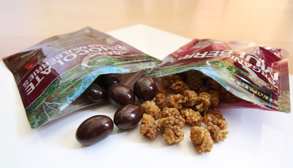 On random buying based on pretty graphic design/typography/packaging… i couldn’t resist snagging two packs of the Kopali SUPERGOOD SUPERFOOD (no, seriously, that’s what it’s called). And also how intriguing do these dried mulberries look? (they were new to me… and once i grabbed those i also HAD to try the Dark Chocolate Covered ones too.) They also have dried Mango, Pineapple, Goldenberries… and in the choc covered range - Cacao Nibs, Espresso Beans, Goji Berries, Mulberries and Bananas (i think i need to try the bananas next time). The site says “They’re “Supergood” because they’re so delicious, nutritous and righteous. They’re “Superfood” because they’re packed with energy and essential phytonutrients. ” Also interesting is their “three bottom line” business plan, focusing on reaching not only financial goals, but also eco/sustainable goals and personal goals to support the people involved. Check out the video below with their company’s fascinating business story, bus tour, and how Whole Foods have really helped get the ex-programmer and horticulturist working out of the beaches of costa rica on the map…. and a few more fun close up pics of these crazy mulberries.
TO PAGE 2 of "Kopali SUPERFOOD"! ----->
*NOTCOT in
design - 04.01.08 -
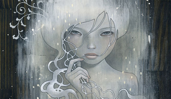 Would it be terribly bad of me to go to Rome just to see Audrey Kawasaki’s solo show at Mondo Bizarro in sept? She has just shared her latest - ‘She Who Dares’ 18x21 oil and graphite and gesso on stained wood panel, and as you know, i’m a huge fan, but now i’m even more excited to see she’s gone to a darker place with the paintings! See more close ups here… and behind the scenes pics after the jump!
TO PAGE 2 of "A Darker Audrey Kawasaki"! ----->
*NOTCOT in
home+decor - 03.31.08 -
 I seldom LOL when reading design sites… but when i hit this entry on Pan Dan, i couldn’t help myself. Ole Jensen’s known for his many simple, vibrant, designs with Normann Copenhagen - and perhaps one of his most iconic is the rubber washing up bowl and brush from back in 2002. So imagine my surprise when i see either a HUGE version of the bowl with a naked man sitting in it …. or the bowl, with a teeny tiny man in it. Upon closer inspection this is infact the bath tub version of the bowl, and it even has a tail hanging off of it with a cork stopper.
Turns out that this Rubber Tub is Ole Jensen’s latest piece for the Salone in Milan at the MINDCRAFT Exhibition. The Danish Crafts site says: “For the MINDCRAFT exhibition Ole has developed a soft bathtub, exploring the EPDM rubber material in new dimensions, taking his artistic point of departure in his success design; The washing-up bowl, for Normann Copenhagen.”
“A soft tub for the body. For children and adults. For play and healing.
In the garden or the stylish bathroom.”
———— Ole Jensen, ceramist and designer.
See more images after the jump! As well as the story behind the original bowl and brush…
TO PAGE 2 of "Ole Jensen’s Rubber Tub"! ----->
*NOTCOT in
wearable - 03.30.08 -
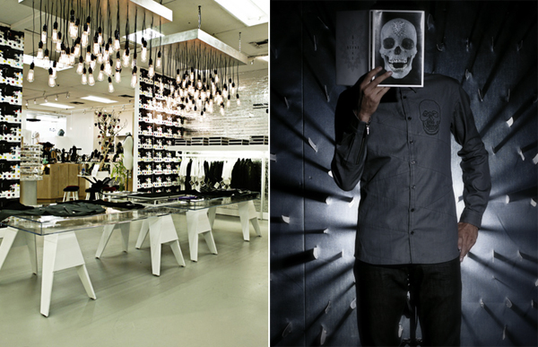 DAMIEN HIRST x WARHOL FACTORY x LEVI’S POP-UP SHOP & BOOK LAUNCH AT FRED SEGAL MAN, Santa Monica on April 3rd, premiering two original Damien Hirst Art Pieces. That invite just popped into my inbox, as well as some sneak peeks into what this hot new pop up shop has in store for us! Take a look below for more pics and to get a glimpse of the silver brick walls, playfully Warhol-esque colors and Hirst’s signature skulls blended with the classic denim from Levis.
TO PAGE 2 of "Hirst + Warhol + Levis"! ----->
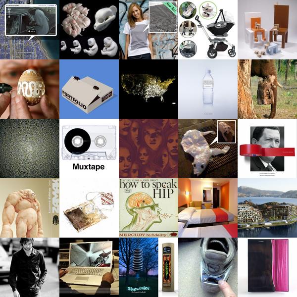 Click the images to find out more! Roundup Time! I just found out tomorrow was a bank holiday… apparently its Caesar Chavez Day? So i guess its a long weekend! (Not that life on the internet really takes weekends.) Anyhow, its been a fun week across the network, with everything from - skulls hidden in black and white line drawings, a hilarious record of a hipster teaching you “how to speak hip”, a viral game in the making where you tilt your laptop to drive a motorcycle, a man with the patience to drill insane holes into egg shells, elephants carrying spy cams, backless bras that atatch like a baby carrier, egg filled nest cupcakes, and so much more… see the full roundups after the jump!
…and for TasteSpotting news, the Daring Bakers have just struck again with their latest March Challenge: Dorie’s Perfect Party Cake, and the best are popping up as we speak… fascinating to see how all these different people have interpreted the same recipe.
TO PAGE 2 of "Roundup of Roundups!"! ----->
*NOTCOT in
nature - 03.28.08 -
 As i’m sure you know by now, yesterday i disappeared to the Monterey Bay Aquarium on my spontaneous roadtrip up california. Normally i’d think on a weds/thurs this should be a breeze, avoiding the crowds, etc… but no. I seem to have overlooked that it is spring break week for most kids, and it was INSANE! None the less, we had a good time oooooohing and aaaaaaahing and remembering why i really need to take more random excursions and maybe get to some scuba diving all over the world again… (hey, i’m sure i can find inspiring things to post down there too!). Additionally Dan took over my Canon 40d and showed me how its really done (as you may have noticed, i’m more a shoot fast, photoshop later kind of girl, whereas he’s more of a technical, play with settings, take your time kind of guy…) - so here’s a post *mostly* of his incredible pics of the inspiring jellies (and some fish, and some crazy splashing, and a bit more).
But before we jump into the pics ~ anyone in the bay area (or california and neighboring states that can just pop over here) ~ you creatives HAVE to come check out the Jellies: Living Art exhibit… they put the jellyfish tanks in these overly ornate frames, and have them in the context of the works of calder, pollock, chihuly, and more. Its really fascinating - not to mention absolutely mesmerizing - i shot some video i’ll add on when i have time… but for now… To the pics below!
TO PAGE 2 of "Jellies and Other Inspiration"! ----->
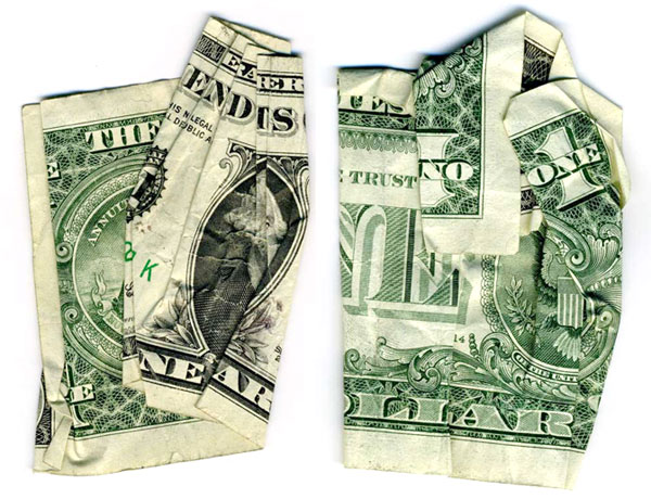 I bet you’re having one of those “i wish i had thought of that first” moments… yes we all have $$$ bills and scanners, have probably played with origami or silly money folding tricks in our childhood… but Dan Tague has stepped up and taken it to the next level using this combination to make politically provocative prints 20 something inches wide (and bigger!).
 NOTCOT Note: Here’s another post from Anna of the lovely
  Look left. Look right. I’m excited to announce that we are showcasing the works of
  Click the images to find out more! And as always - TasteSpotting and NotCouture roundups after the jump! Here are the most popular 25 posts over at
 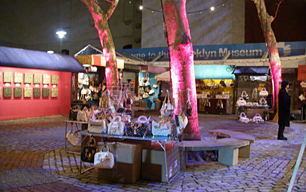 Louis Vuitton is really fighting back against counterfeiting these days. Did you hear about how the
  So my mother sends me an email linking
  NOTCOT Note: Here’s another post from Anna of the lovely
  NOTCOT Note: Here is another post continuing on Justine’s (aka
 NOTConcept 002: Outdoor Sound System - [
 On random buying based on pretty graphic design/typography/packaging… i couldn’t resist snagging two packs of the
  Would it be terribly bad of me to go to Rome just to see
  I seldom LOL when reading design sites… but when i hit this entry on
  DAMIEN HIRST x WARHOL FACTORY x LEVI’S POP-UP SHOP & BOOK LAUNCH AT FRED SEGAL MAN, Santa Monica on April 3rd, premiering two original Damien Hirst Art Pieces. That invite just popped into my inbox, as well as some sneak peeks into what this hot new pop up shop has in store for us! Take a look below for more pics and to get a glimpse of the silver brick walls, playfully Warhol-esque colors and Hirst’s signature skulls blended with the classic denim from Levis.
 Click the images to find out more! Roundup Time! I just found out tomorrow was a bank holiday… apparently its
  As i’m sure you know by now, yesterday i disappeared to the