*NOTCOT in
design - 09.11.06 -

Posting this as a reminder to anyone who’s in or near enough London to attend the festivities, i know i wish teleportation was not simply a thing of the future. And if you are going to be there, end up there, get dragged there, show off designs there - take some pics! Share some stories! and feel free to make me jealous. London Design Festival.

This YouTube will blow your mind on multiple levels… but here’s why it does it for Shade Elaine and me… a) It’s Frank Lloyd Wright’s Falling Water. ‘Nuff said. b) well, she and i spent a quarter in college modding half life and learning c++ in doing so. Seriously, you can’t even imagine the silliness we came up with, the surreal creepy worlds we’d make where you’d be wandering and exploring as scientists and zombies alike were functioning as performance artbots - or you were swimming through random CUBES of water till you fell off the ends of the “world”. So here you have a Frank Lloyd Wright’s Falling Water as rendered in Half-Life so gorgeous and detailed you can even browse your way into the bathroom. See the real thing here. [via the incredibly inspiring Hulger blog.]

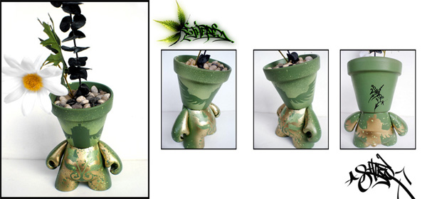
These green pot heads just made my night - and don’t they remind you of those Buzzy Mini Pots i wrote about earlier? VinylPulse really is one of my biggest sites for unexpected design inspiration… These are DJ Shiro’s Botanical Angel Can Pot Head ~ a gorgeous custom job, plants and all! And to segue using those mini pots - part of why i’m slow in the posts the last day or so is ThisNext is really growing - (today they were featured in NY Times + TechCrunch) - and i’m transitioning to help them further with design/conceptual development especially focused on bringing you a better way to discover and share worthy products. (You know how adamant i am against traditional ad banners, and how painful some site design can be - so feel free to let me know what you really think about their ideas ~ i’m hunting for ways to take it to the next level). OH, and on the buzzy pots - those insane sunflowers i planted in them under my studio display, they sprouted and grew so fast i had to repot them in like 5 days!!! So i’ve been looking for something to do with those pots…. perhaps time to make NOTCOT pot heads?
*NOTCOT in
wearable - 09.09.06 -

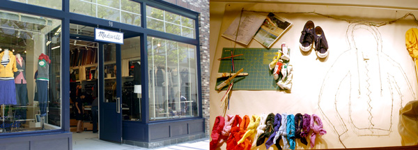
There have been hype and rumors flying around about Madewell, which just opened its second store (ever) in Century City Monday ~ and despite their terribly blah website, went and took a peek today. For those who don’t know this is the brainchild of Millard Drexler, the former CEO of Gap who joined J. Crew in Dec. 2003, and yes, nearly everyone who walks in there asks “Is this by J.Crew?” and the answer is “Yes, but we only share a CEO, Madewell has it’s own distinct feel.” to which i heard a few “Ah yes, it feels like J.Crew.” and they walk away and poke at more clothes. To put this in shopping context for you, this store is placed across from a sleek simple Bloomingdales’ facade, next to it is Abercrombie and Cole Hann, and to the other side of Abercrombie is its relative, J. Crew on the corner. Abercrombie is blasting music, and has it’s attractively chosen representatives out front, and then you see Madewell, with its transplanted East coast brick facade and what feels like an Old Navy meets Dawson’s Creek meets a very crammed space? So for those who are curious, and got little from the look book they have online, a few shots below. They have some interesting wall displays, had to show you the cutting board and artsy panel they put up.
TO PAGE 2 of "Madewell = J.Crew + ???"! ----->
*NOTCOT in
design - 09.08.06 -

My first foray into design was advertising - before i got jaded in college, print advertising was torn out, collected, analyzed the way some kids had baseball cards. There was something about seeing a way to turn something so capitalist into something so artistic, yet still get a legitimate point across that appealed so greatly… yet sadly somewhere my real world experience with graphic design went sour - and thus began my exploration further into technology/products/art…
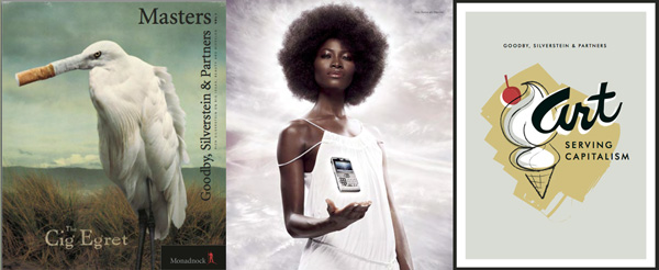
But it is hearing interviews like this one with Rich Silverstein from Goodby, Silverstein & Partners that make me think about going back to it. And for all fields of design, his messages are refreshing and honest - and remind you how important passion for creating really is. I fully agree with him on PAPER, there really is something more substantial about it, and i don’t see it going away… how else can i explain that the more tech i accumulate never seems to cut down on my sketchbook consumption? Anyhow, there are so many great points in this chat, just let it run in the background while you work, i guarantee you’ll love it. This is the first of a series of Masters Interviews by Monadnock Paper Mills. (Thanks, John)

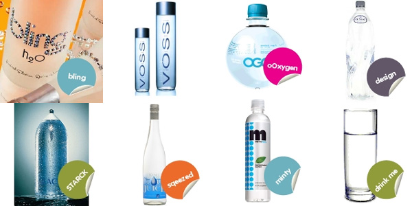
Some people are natural list makers. Some of those lists are more linear - others more organic/messy - others more visual. But for any list makers out there who like image based, simple to use, product oriented interfaces - ThisNext seems to be a comfortable fit… for people like me anyhow, and some of our other NOTCOT regulars. Take oO’s new “Who needs designer water?” list - i’ve been drooling over the gorgeous bottles all morning, so decided it was worth collaging. He’s got everything from SEI to Swarovski to Stark… but he does leave out my obsession with Smart Water. If you have more contributions to the designer water bottles, go recommend it at ThisNext and tag it ‘notcot’ and ‘water’ so it will show up in the tags below. [oh and i still think the stickers are far too fun]
*NOTCOT in
me - 09.07.06 -

“It’s an industrial kind of week” says Colin… or as industrial as it can really get on .org anyhow.
Sorry there has been TOO MUCH real life excitement today, that i got slow here. All will be exposed in good time. But for now - enjoy .org when things are slow on .com ~ it’ll keep you refreshed and inspired. GUARANTEED.
(l-r, 1258, 1240, 1237, 1264, 1262)
*NOTCOT in
playful - 09.06.06 -

While working my way through 3am emails - PSFK points out another big brand + designer mashup, this time in the form of Samsonite and Marc Newson. Loving the trend of brands focusing and placing greater value on the design aspect of products ~ and Samsonite’s version of this is worth checking out. The Newson Scope collection and the X’lite collection have caught my attention in particular. Black Label side of Samsonite.

Here is an interesting event concept that just showed up in my inbox… Amex is having Colorista ~ basically each week you can get 25% off at participating LA and NY stores…. the interesting part? Each week you get that discount on items of a specific COLOR. As someone who is obsessively visually driven - i’ve been debating whether some kind of color sorting of imagery/posts for .org would be beneficial to anyone (other than being fun to play with, like that color sorter on etsy). So any ideas or opinions on the value of sort by color would be greatly appreciated. Oh, and this weeks color is RED for Colorista as you can see above. Fun imagery too…
*NOTCOT in
tech - 09.05.06 -
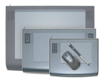
 Wacom announces the new WIDESCREEN Intuos 3 line. Funny thing is that while i’ve been working with my old massive first gen Intuos tablet with the 23” Studio display, i never really considered why i had issues when i set it proportional to the screen… and it all just clicked now. And i guess i kind of want a widescreen tablet to go with my widescreen! Pity they aren’t stretch to desired proportion… maybe the next gen will be!

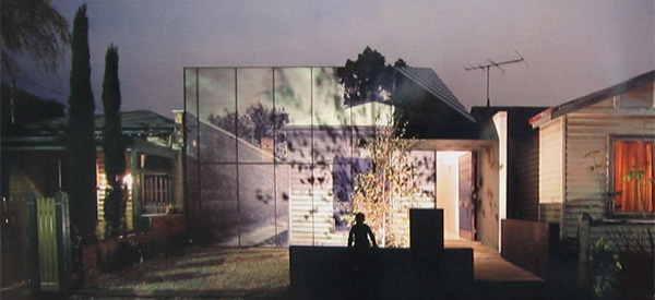
Our Melbourne corespondent, Lucy Feagins has another delicious dose of design for you ~ and this one really took my breath away - you must go stare at the pictures after the jump, i can’t stop.
Melbourne architects Jackson Clements Burrows faced an interesting challenge in replacing a decaying single-fronted weatherboard cottage in the backstreets of Richmond, Melbourne. The area’s heritage overlay restrictions meant that in replacing the existing cottage, the architects were required to respond in form, scale and detail to the surrounding buildings which make up the heritage streetscape.
The unique solution was to create an image of the original house as a graphic overlay, which was then superimposed onto the glass façade of the new building at 1:1 scale. The result is an unquestionably modern home which succeeds in preserving the character of its predecessor, whilst also offering a witty critique of the planning processes that often limit architecture in heritage zones.
Look closely – even the gum tree depicted in the façade image grows out of the graphic and into the sky!
TO PAGE 2 of "Melbourne Facade"! ----->

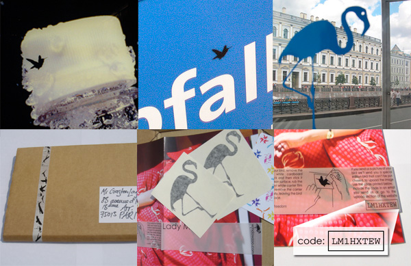
WINDOW ZOO!!! Brilliant idea - great packaging - in a nutshell, you buy some bird silhouette decals - they come, you place them where you want - take some great shots of it - and if you send pictures back, they send you more! In one sense its mass produced street art - in another sense its a great distributed consumable form of city beautification.
p.s. don’t they remind you of our tags?
& RUGenius woke me up with this find, and we’ve been chatting about it for a while - it is also up at Wooster. Additionally - sorry about the spontaneous posting hiatus i took this long weekend. Been overworked and overextended with too much to look at and do lately - so when i suddenly found myself in Santa Barbara Sunday… realized i just needed a day or two away from emails/web to get reset. So i’m back!
*NOTCOT in
home+decor - 09.02.06 -
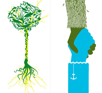
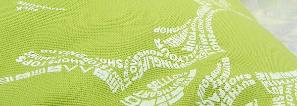
 I woke up to the poster that RUGenius put up on .org… and it’s been stuck in my head since. This eco-war of sorts we are globally dealing with - often seen like man and machines against nature - i love the way Substratum has taken on the subject of nature in these two posters (might actually need to purchase them both for the studio when i’m done posting this). Their “personified representation of the harmony nature intended between Land and Sea” is just perfect… as is this unison of sea creatures to represent a tree of life…
[While i’m obsessing about their posters - they also have shirts, as seen over at Josh Spear’s]

Michelle S posted the work of Hong Kong Artist Tsnak Kin-wah to .org and he has some amazing work on his site. It reminds me of the way Hirschfield would hide his name and words in his ink drawings, only theses are far more obvious - but there’s something so appealing about using text to create imagery. He was the winner of the 2005 Sovereign Art Prize, the most prestigious art award in Asia, and the Prize of Excellence at the 2001 Hong Kong Art Biennial.

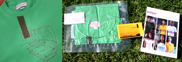
I introduced you to SoftService earlier here and here. And that green tee i was loving showed up in the mail yesterday! There is something far to amusing about a vacuum packed teeshirt - i must admit that it was rather anticlimactic when i made the first puncture with the knife and the shirt looked normal, as if it were merely trapped in plastic… BUT its a great shirt! American Apparel, with the embroidery and hand painted stripe. One thing i didn’t realize though - was i completely forgot there is backing when people embroider - so it looks fabulous, but remember you will feel that inside piece against your skin when wearing it. Also, each shirt is unique and limited edition with its own number - mine is 138661. More images and close ups below!
TO PAGE 2 of "SoftService Review"! ----->


